Quick Access
I want to ..
Content
│Overview of the Virtual Materials Toolset
│How to use activity packs with clients
│Module I: Launch Local and Remote Sessions
│Test Remote Session with Video and Audio
│Test Remote Session only with audio
│Test Remote Session without Video or audio
│”Save & Close” and “Save & Reload”
│Understanding the Session Summary Report
│Consulting Session Summary Reports
│Using the “Saved Session Data” menu
Follow these steps to export a report:
│How to use the Calendar Filter:
│Using the UnitusTI’s Virtual Materials Dashboard
│Change the pack during the remote session
│View client preferences for a pack
│Edit client preferences for a pack
│Select preferred cards for a specific deck
│Edit the size of the camera screens
│Resize, move or rotate a card during the remote session
│Flip a card during the remote session
│ Hide or show a card during the remote session
│Shuffle the cards during the remote session
│Versioning & Publishing Packs
│View the decks and cards available in a pack
│Available layouts to create a slide
│Create a slide with an anchored card
│Editing the two sides of a card
│View cards available in each deck
│Copy cards to a deck (Copy to…)
│Move cards to a deck (Move to…)
│Types of variables (Data Types)
│Data Type “True/False” Example:
│Data Type “Simple Choice” Example:
│Data Type “Multiple Choice” Example:
│Overriding Card Values in Slides
Override Value in Random Cards
│Using Wheels for Automatic Data Capture
│Case 1: Recording the selected option in a Note.
│Case 2: Recording Success or Failure only
│Other cases for Automatic Data Capture with Wheels
│Areas where you can filter packs by tag
│How to add a tag to a picture
│Areas where you can filter pictures by tag
Assessment advanced configuration
│Custom HTML Generator for Assessments
│Using Pictures in the custom HTML code
│ Overview of the Virtual Materials Toolset
The Virtual Materials Toolset is an interactive remote tool that allows users to create flash card activities and launch local or remote sessions with clients.
You can also record data during your sessions using different kinds of Data Variables, and even connect some of them to widgets for Automatic Data Capture.
This guide will walk you through the different scenarios where this tool can be of help, including:
- Users who want to launch activity sessions with their clients using premade activities (“Packs”) , created by third-parties (Subscribed Content).
- Content Creators who want to create or customize their own set of activities (Packs), either for use in their own organization or to offer for subscription to other organizations.
- Users who want to run live sessions (either local or remote) using premade or custom made activity packs.
│ How to use activity packs with clients
(Prerequisite: created activity packs - your VM account can be preloaded with packs by subscription or you can create your own. To create your own activity packs, skip to the section For Content Creators )
Whether you have created your own activities or subscribed to a premade set, when you are ready to use them in a session with your clients, the VM Toolset in your UnitusTI account offers two different approaches:
- Local session: when you are in the same space as your client.
- Remote session: sessions conducted via an online meeting service.
The next module will explain how to launch Local and Remote Sessions
│ Module I: Launch Local and Remote Sessions
Tags : local, remote, session, camera, pack, link to join, audio, video
Using activity packs that you have created in the “Packs” menu area or using the packs that have been pre-loaded into your account by subscription, users will use the Launch Session area of the Virtual Material toolset to conduct online instruction with clients. The tool allows you to run sessions locally or remotely depending if you are in the same or different location with the client. Follow the instructions below to get started.
│ Local Session
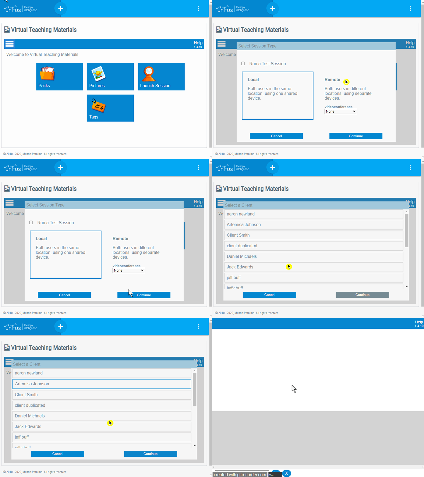
If both user and client are in the same location using one shared device, start a local session. To start a local session with your client, please follow these steps:
- In the main menu, navigate to Toolsets ,
- In the Virtual Material toolset, select Manage Toolset
- In the welcome screen, select Launch Session
- Select Local Session
- Select the client (“client”) you wish to work with. (Note that clients are added by administrators to the account from the Center Clients list and assigned to the user conducting the remote session.) (See an example in the gif below)
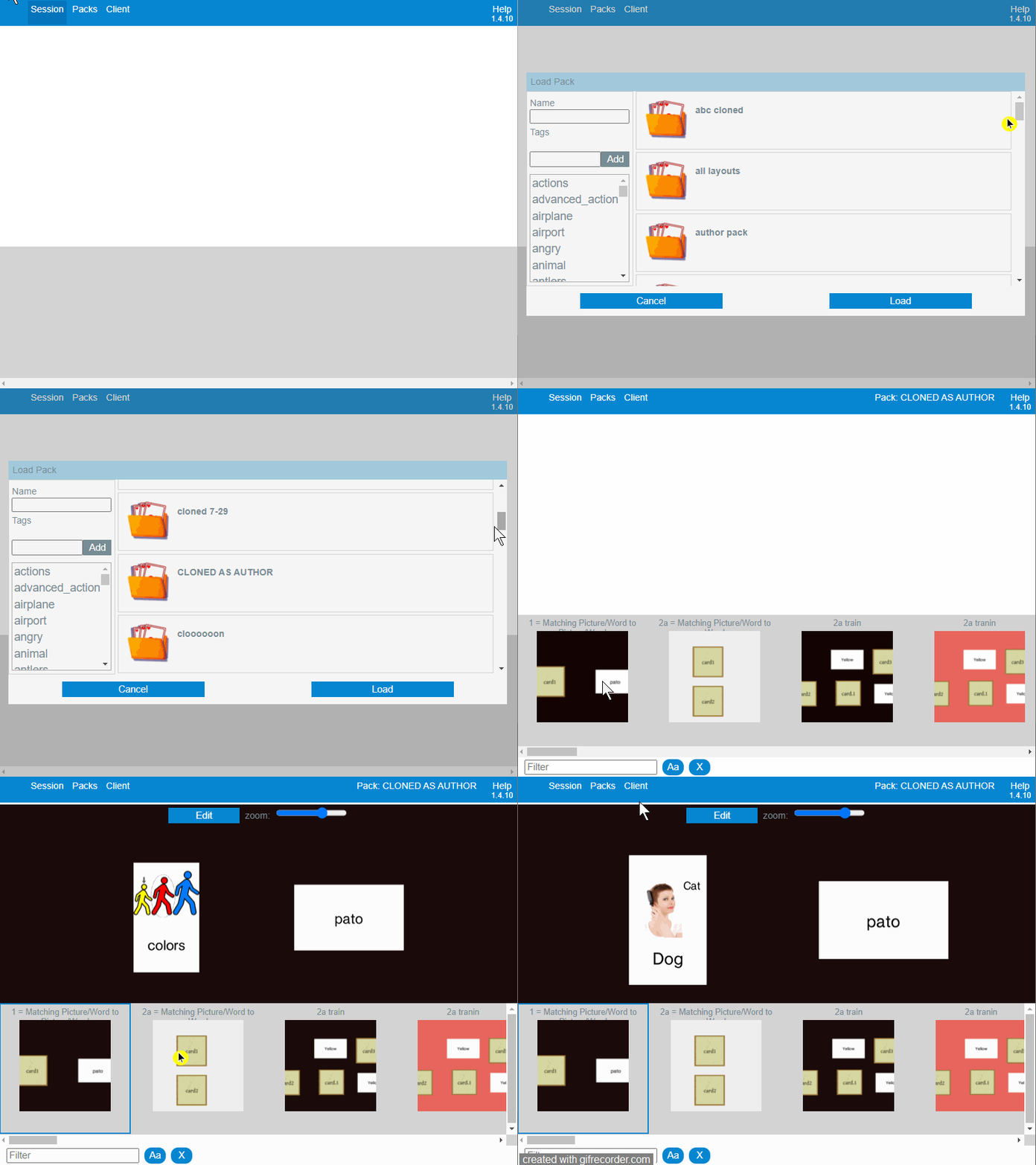
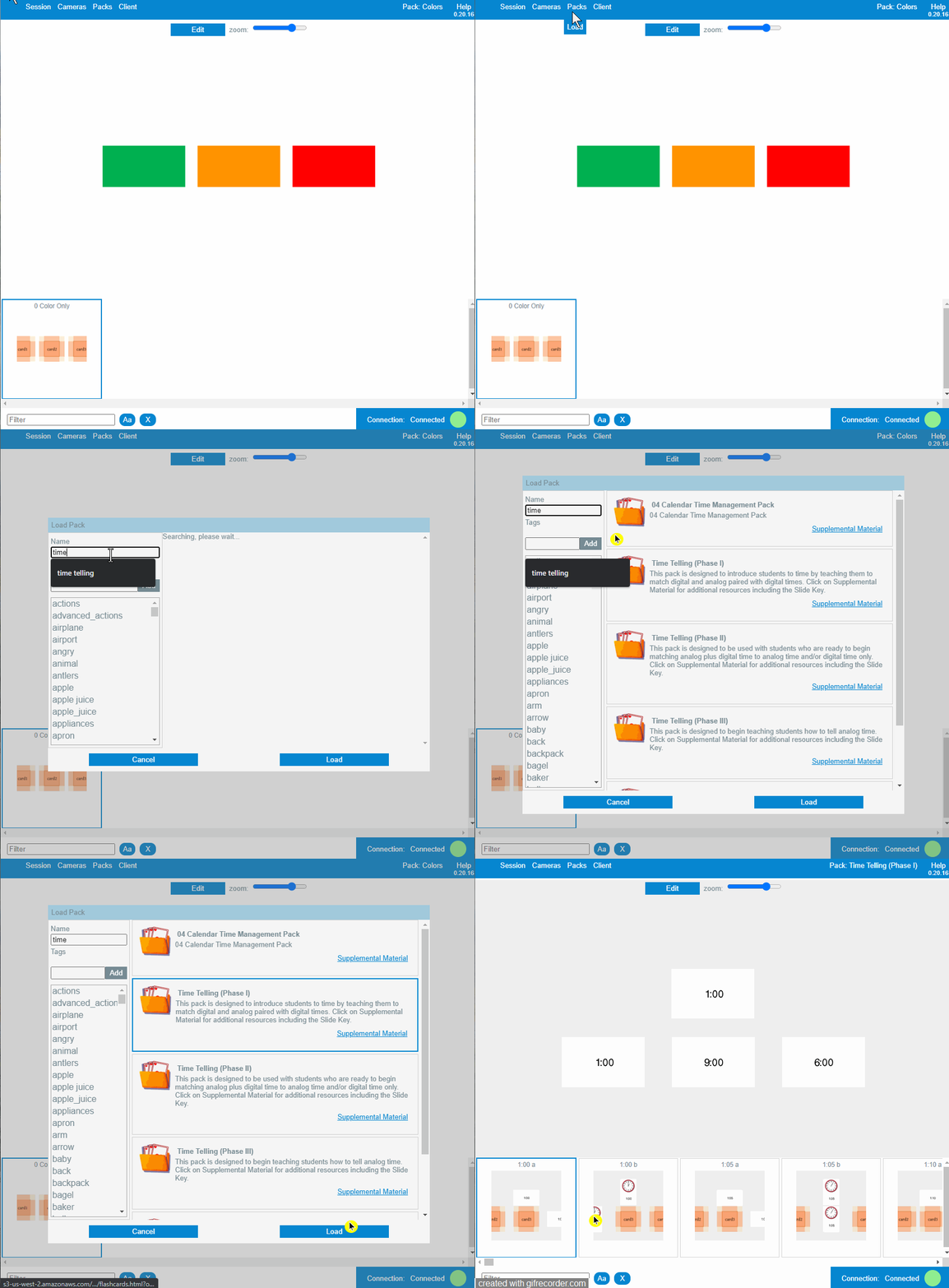
- In the menu bar, at the top of your remote session screen, select Packs , then Load , to explore the available packs.
- Search using keywords in the Name or Tags fields. Select a pack that fits your criteria and then select the Load button at the bottom of the window.
- Adjust the zoom level, as needed, using the zoom bar at the top of the window for the best view of the cards.
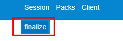
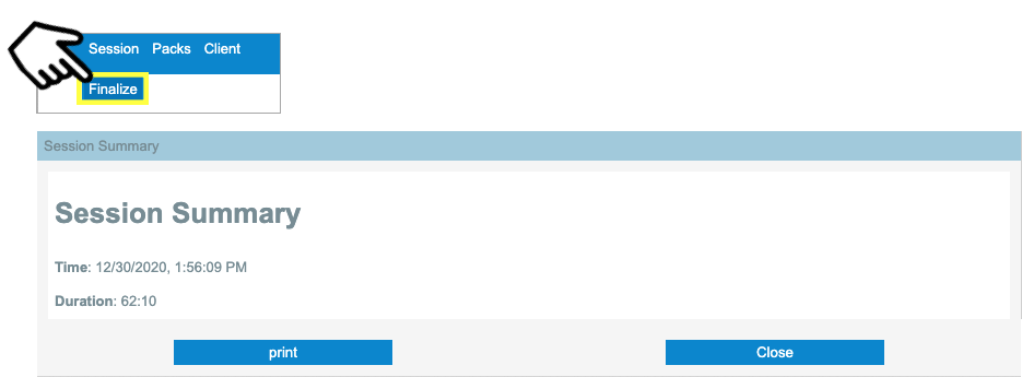
- To end the session, select Session in the main menu, then select Finalize.
│ Remote Session
If both user and client are in different locations, using separate devices, start a remote session. To start a remote session with your client, please follow these steps:
- In the main menu, navigate to Toolsets
- In the Virtual Material toolset, select Manage Toolset
- In the welcome screen, select Launch Session
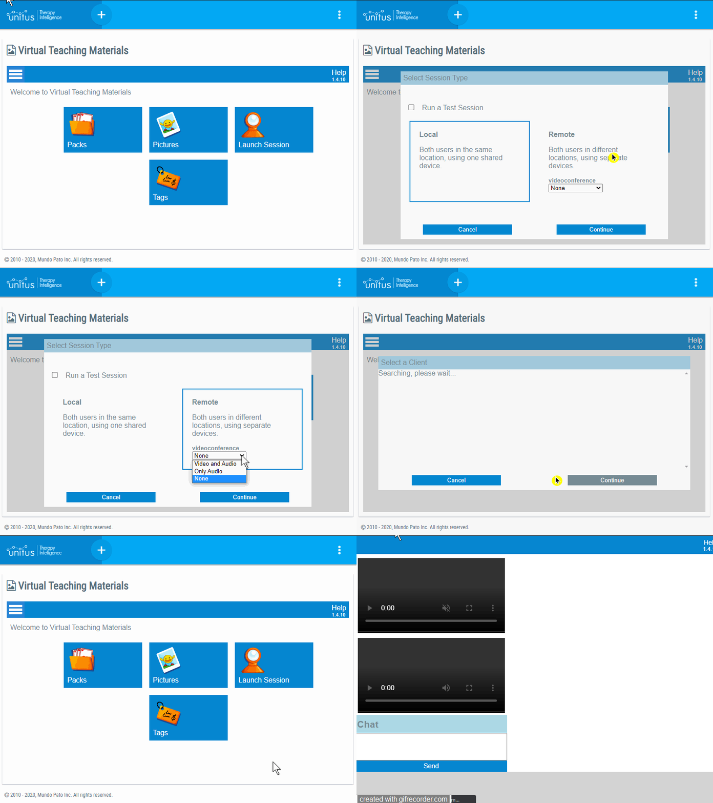
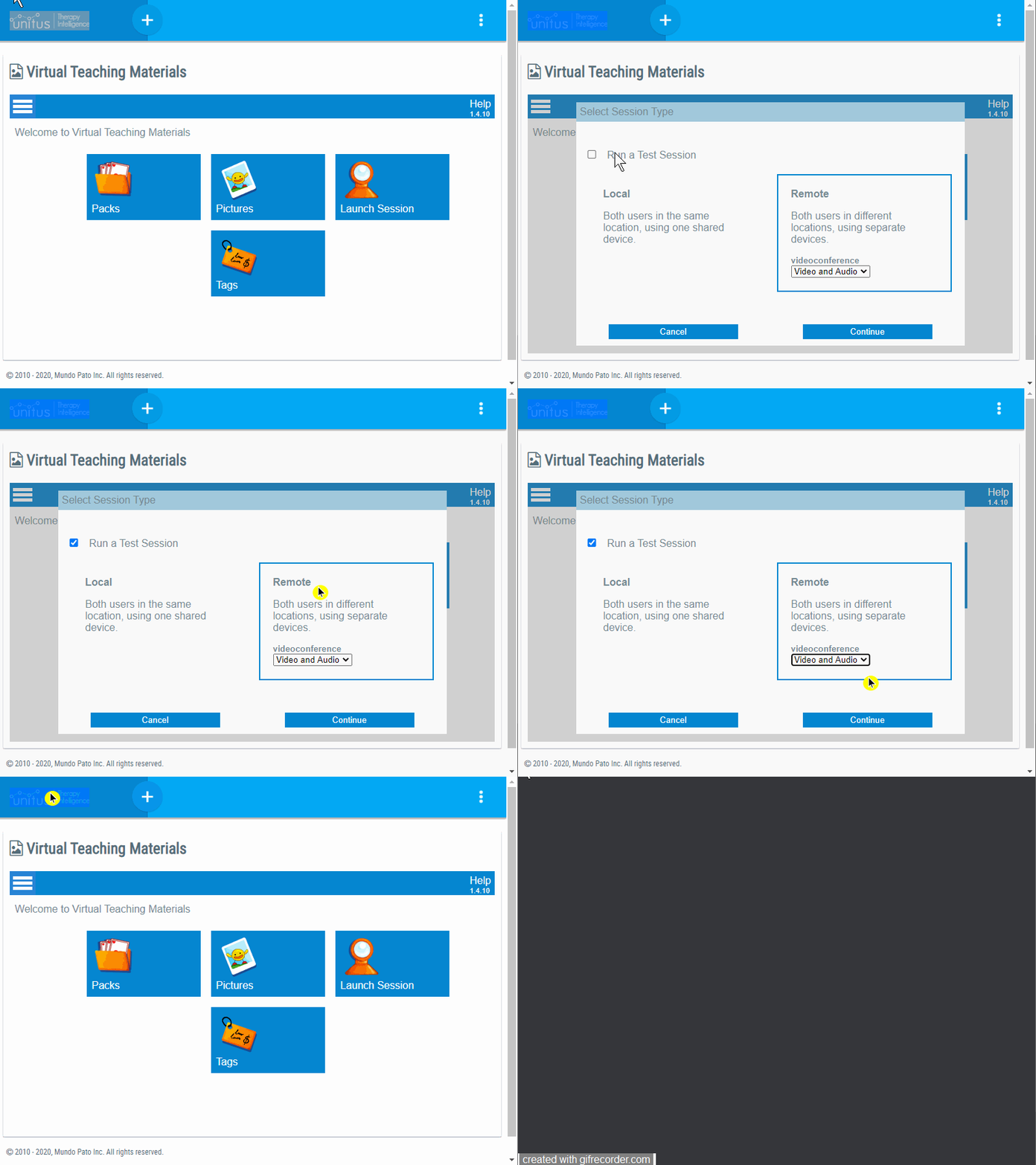
- Select Remote , the type of videoconference you would like to use, then select Continue
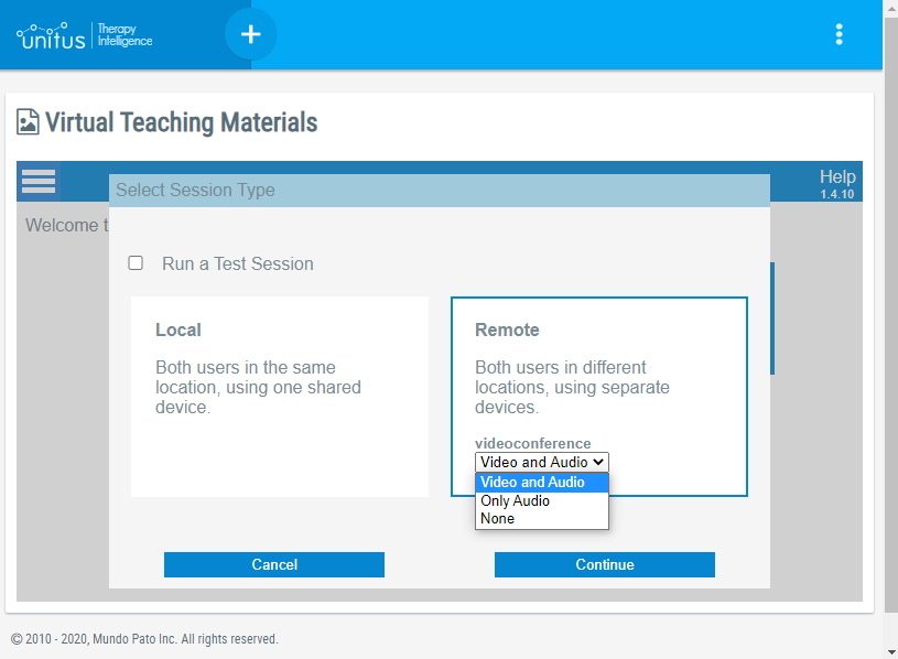
- Video and Audio
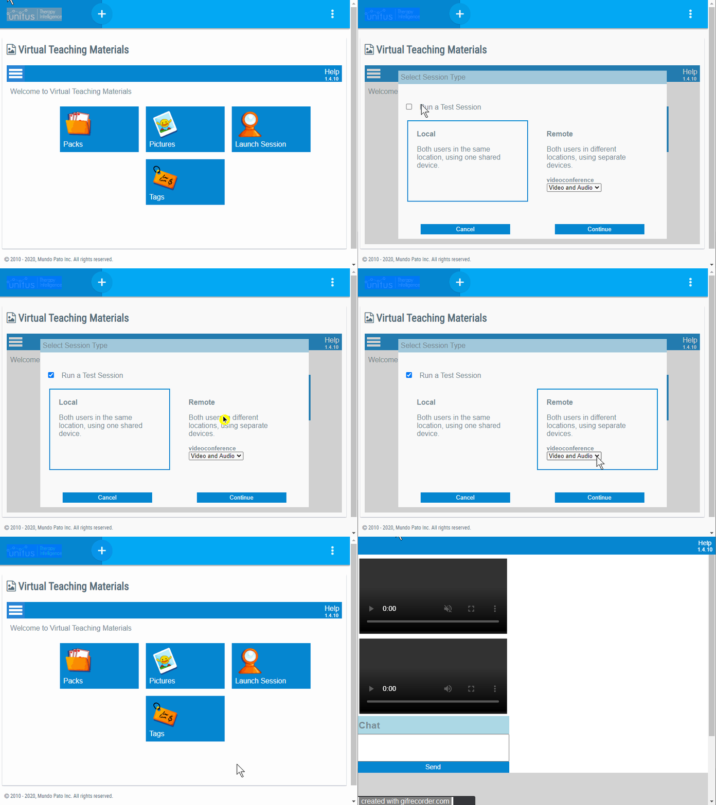
- Only Audio
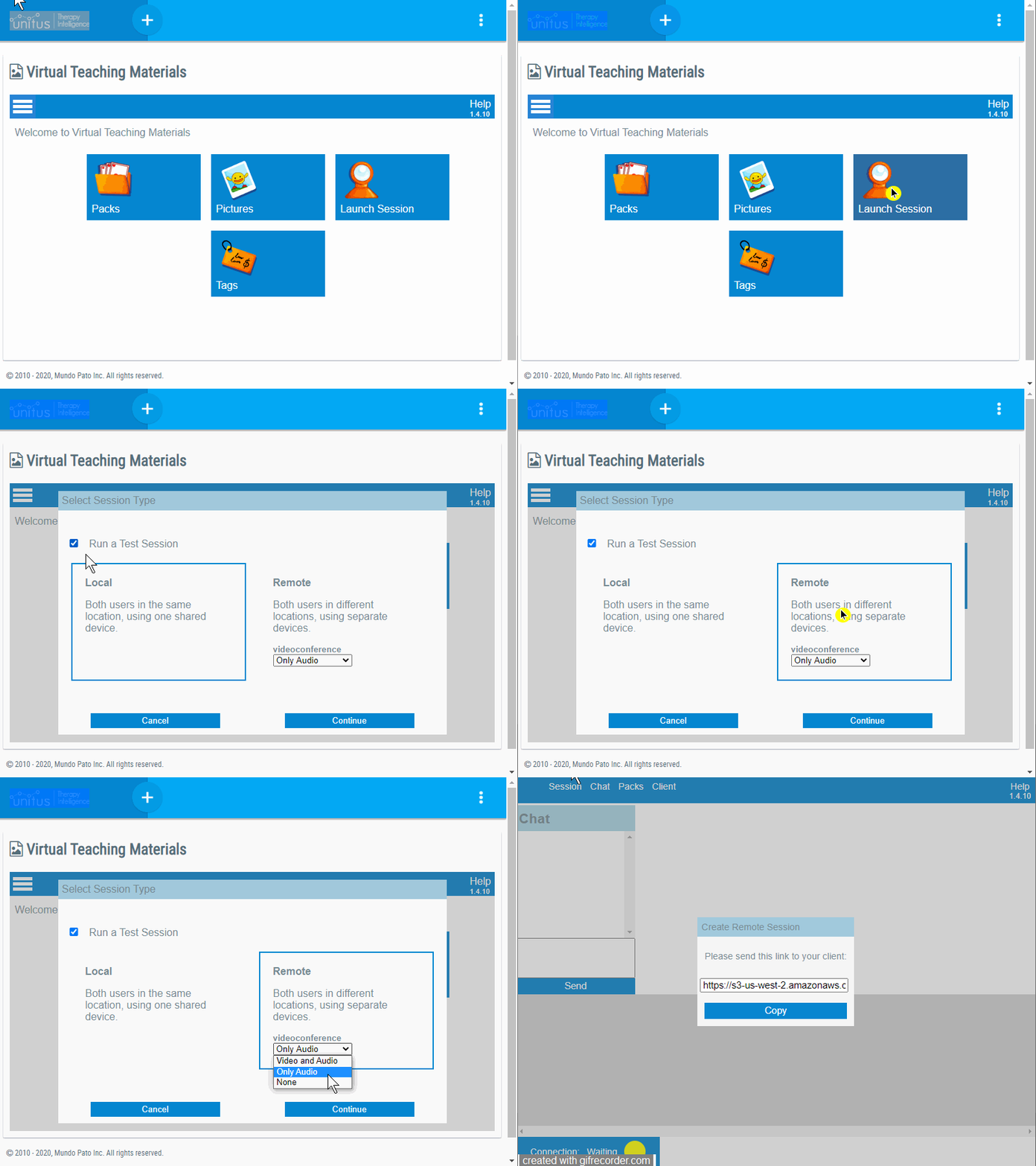
- None: This option is recommended if you would like to use simultaneously Virtual Teaching Materials and another videoconferencing tool (e.g. Zoom)
- Select the client (“client”) you wish to work with.
(Note that clients are added by administrators to the account from the Center Clients list and assigned to the user conducting the remote session.)
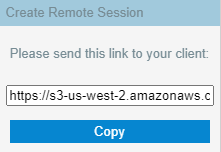
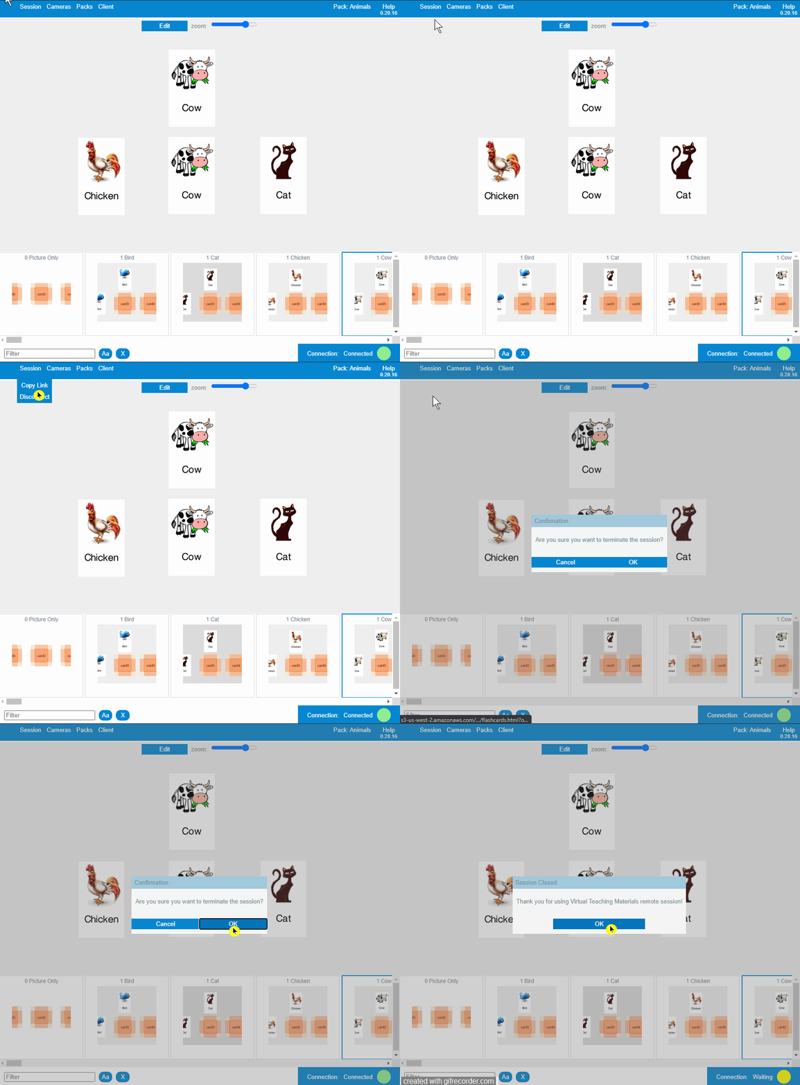
- A popup window will appear; copy the link and share it with the client (e.g. via email, text or another communication service).
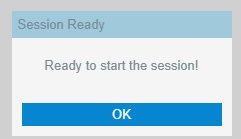
- Guide the client to select OK when they are ready to start the meeting.
- In the menu bar, at the top of your remote session screen, select Packs , then Load , to explore the available packs.
- Search using keywords in the Name or Tags fields. Select a pack that fits your criteria and then select the Load button at the bottom of the window.
- Adjust the zoom level, as needed, using the zoom bar at the top of the window for the best view of the cards.
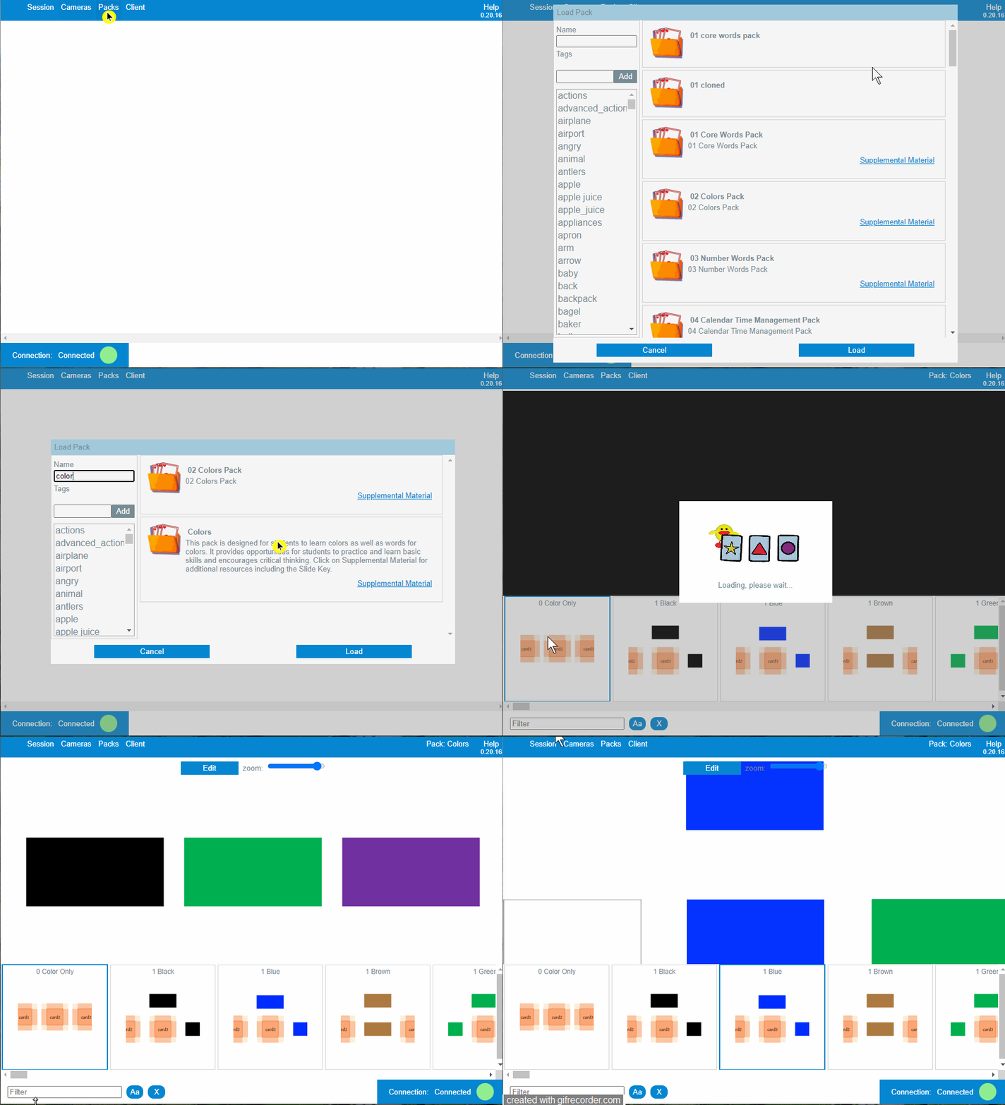
- A row of available slides will display at the bottom of the window. Use the scroll bar to view slides that are hidden from view, depending on the size of the screen.
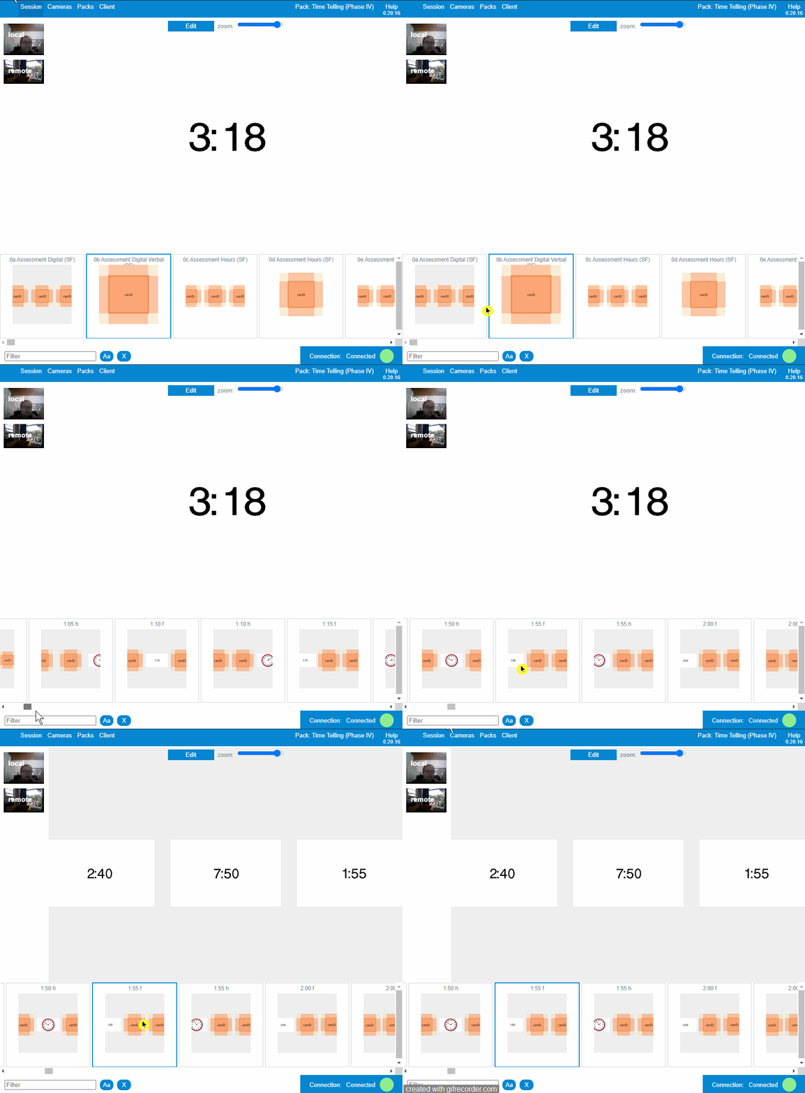
- You can filter the available slides using the text box at the bottom of the screen.
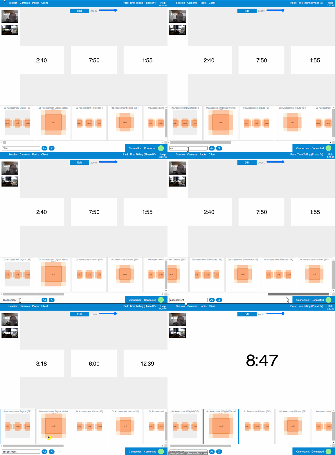
- The client will not be able to see the row of available slides. Choose a slide to present to the client by clicking on it. If the client one of the cards in the slide you are presenting, that slide will be highlighted on your screen.
- To learn more about the other functionality available from this screen, keep reading below!
- To end the meeting, select Session in the main menu, then select Disconnect.
│ Start a test remote session
If you would like to test if your browser, camera, and microphone configuration is working well in the remote session, or explore the content of the packs available to your account, test the functionality within the remote session, you can launch a Test Remote Session, so any change made will not change the preferences of the actual clients.
│ Test Local Session
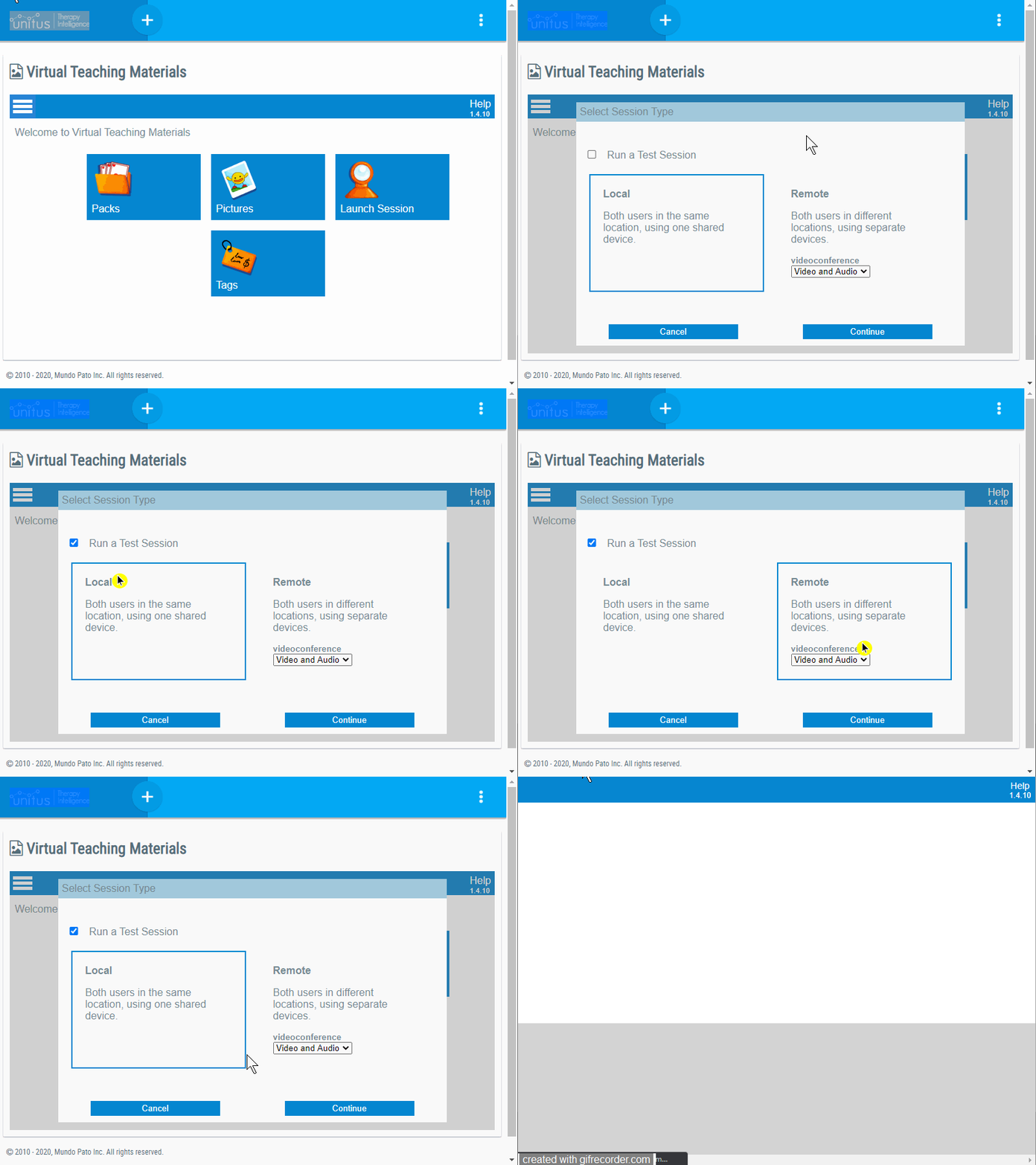
│ Test Remote Session with Video and Audio
│ Test Remote Session only with audio
│ Test Remote Session without Video or audio
│ Taking Data
Once your session has started, load your pack. At the bottom of the screen, you will now see a data option. Click on Data before selecting a slide.
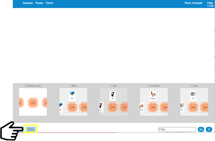
Because you have not selected a slide, you will only see the Session and Pack data appear. All data for both scopes will be presented in alphabetical order.
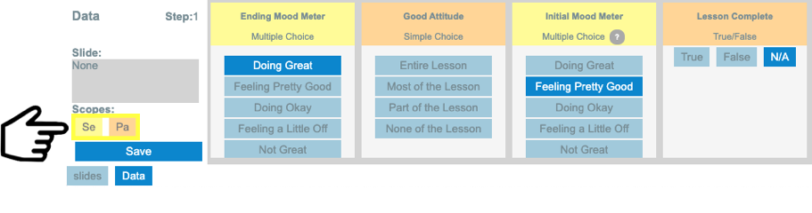
Next, click on Slides next to Data, select a slide, and then click on Data again. You should now see data in alphabetical order for all four scopes.
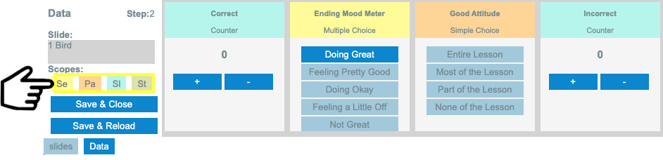
The listed Scope abbreviations are also filters. Deselect scopes to narrow the data. In the screenshot below, notice that the only scope that is selected is the Step scope. Therefore, the only data showing is the Step data. You can show as many or as few scopes as you would like at one time.
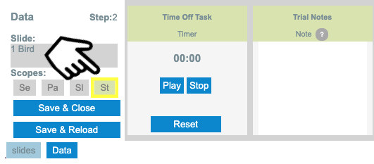
No matter what screen you are currently on within your master data pack, click on the Data tab and filter so only the Session scope data is showing. Go ahead and complete the data and save. Make some kind of session note so you can see where it shows up on the data summary.
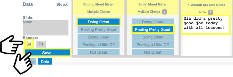
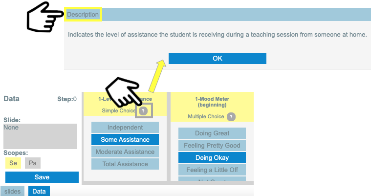
Note: To access the description of any variable during a session, click on the question marks found on the data boxes and the description will pop up:
│ ”Save & Close” and “Save & Reload”
The Save & Close function allows you to navigate between different slides while the Save & Reload function allows you to present multiple trials of the same slide without leaving the data screen.
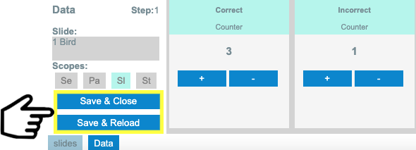
In both cases, a new “step” record will be added to the final report.
│ Understanding the Session Summary Report
You will arrive at a Session Summary Report either when you finalize a Session, through the VM’s “Saved Session Data” option, or through the UnitusTI’s Virtual Materials Dashboard.
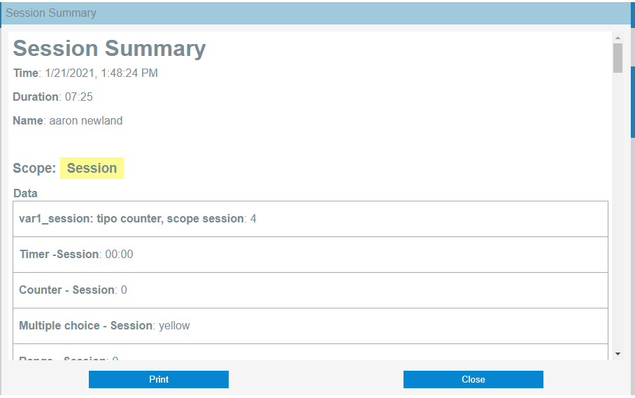
All of the data that was taken during a specific session will be summarized in this report. If you did not take data for a particular reason, it will not be added to the summary with two exceptions. First, any data type with a default field (i.e., Timer and Range) will, by default, display what was entered in that field on the report when no data is taken. Second, when a data type with the scope Step is made Mandatory, all steps will show up on the report regardless of whether or not you take data.
Below is a sample of the various components of the summary.
- All Session Summaries present the time and duration at the top.
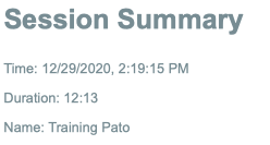
- The overall session data is the first section to appear on the summary following the automated summary details.
- Following the session data, you will find each pack presented in the order they were run. Each Pack contains the following information:
- Automated Pack Details: The title, date, time the pack was started, and overall time spent on the pack are all automatically generated for you.
- Pack Data: Next you will find the values of the variables recorded in the “Pack” scope.
- Slide Data : Here you will find the values of the variables recorded in the “Slide” scope.
- Step Data: Finally, you will be presented with a detailed list of each step during the session, including the slide visited, time spent in the slide, and the values for all the variables in scope “Step”.
│ Consulting Session Summary Reports
There are different ways to obtain a Session Summary Report:
- At the end of a session, you will be presented with the report for that specific session:
- Through the “Saved Session Data” menu in the initial VM screen, you will be able to obtain a list of all the Sessions for a given Client.
- Through the UnitusTI Dashboard, you can explore all the sessions for all the clients associated with your account.
It doesn’t matter the path followed, at the end you will be able to view the same detailed Session Summary Reports for each session.
│ Using the “Saved Session Data” menu
In the main screen and the side menu of VM, you will find the icon “Saved Session Data”.
This option allows you to view and print reports from previous sessions for a selected client and specific time ranges. You can only see reports of sessions made by you, you cannot see other users’ saved session data even if they were made for the same client.
Follow these steps to export a report:
- Select the option “Saved Session Data”
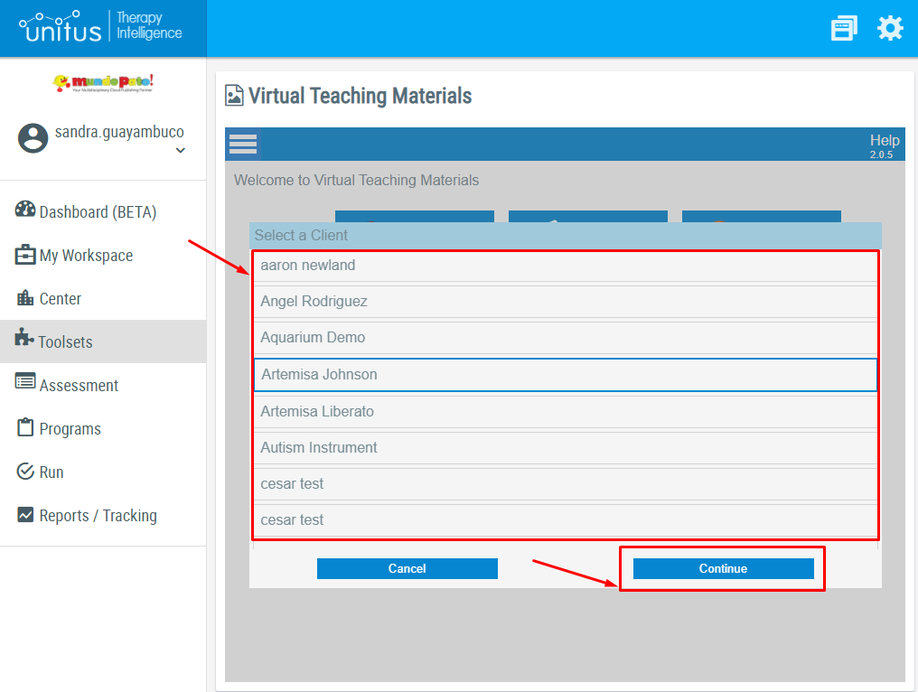
- Select the client and select “Continue”. Important: You only can view the clients that are active and assigned to you.
- In the following screen, you will see a calendar filter made of blue squares and a table with the information of all the saved session data. From there you can view and print any report.
│ How to use the Calendar Filter:
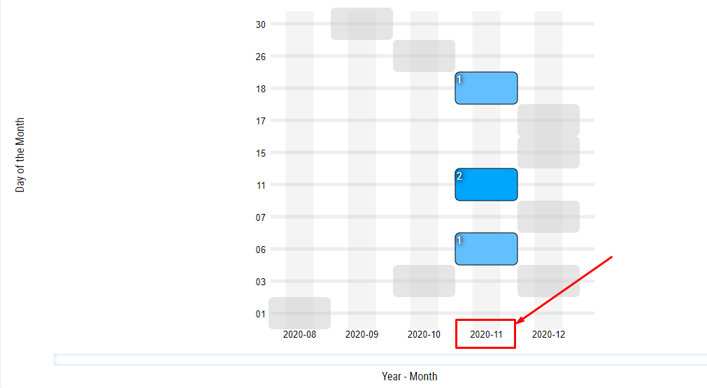
- Each square represents a date in the calendar, the x-axis is the year-month of the date and y-axis is the day:
- The number inside the square is the number of sessions run that day for the selected client. Color shading from light blue to black is a visual indicator of the number of sessions; a darker color indicates a higher number of sessions:
- By tapping/clicking on the square you can filter the table below to only show the summary reports of the sessions run that day:
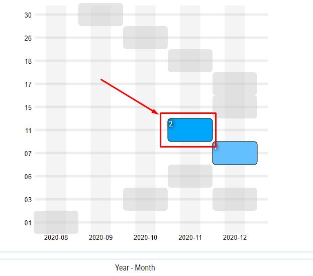
- By tapping/clicking on the x-axis label you can filter the table below to only show the summary reports of that month:
│ Saved Session Data Table
After you have filtered the preferred dates, the table below displays all the sessions executed for the selected client, they are grouped by date and sorted from the least to the most recent. The time displayed is the time that the session ended.
Select Print to view the summary of that session and print the data recorded.
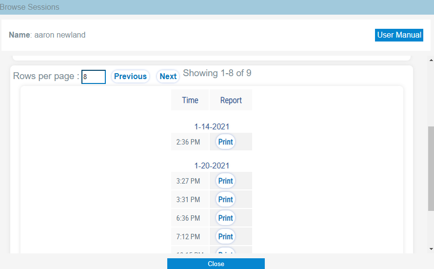
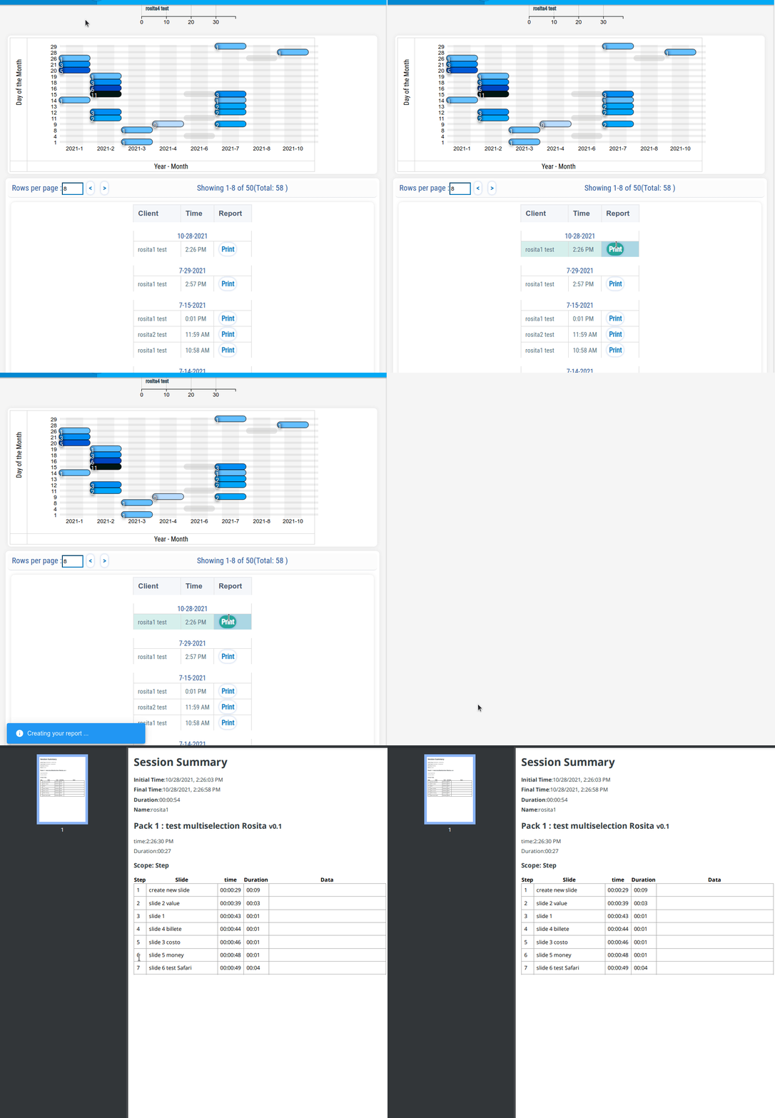
By clicking on the “Print” button you will be able to see the selected Session Summary, along with a button to download a PDF version.
│ Using the UnitusTI’s Virtual Materials Dashboard
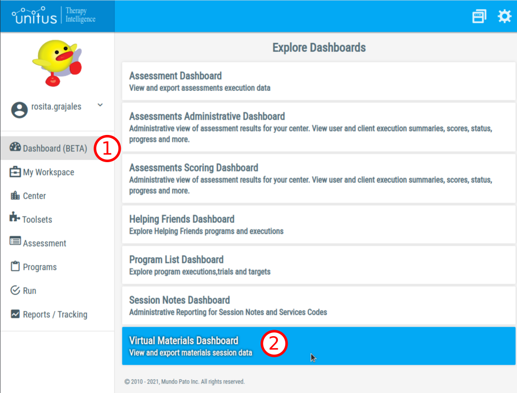
You can explore the saved Session Summaries for all of the clients associated with your account. First, visit the option “Dashboards” in the UnitusTI left menu, and then click on “Virtual Materials Dashboard”.
Note: this action will close the Virtual Materials Toolset!
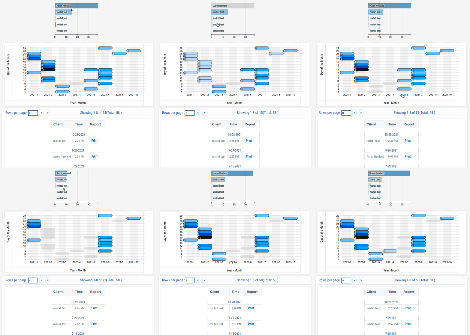
Once the Dashboard is loaded, you will see the following information:
- A list of your clients with horizontal bars that indicate the number of sessions executed.
- A Calendar view, where you can see the number of sessions per day and month.
- A table with the list of Sessions per Client, along with the date and time of the Session.
By clicking on the list of Clients and the Calendar View you can filter the records presented in the table.
For example, clicking on a month’s name will include or exclude all sessions for that particular month.
The “Print” button in each one of the table’s rows allows to retrieve and preview a particular Session Summary in PDF format:
│ Chat
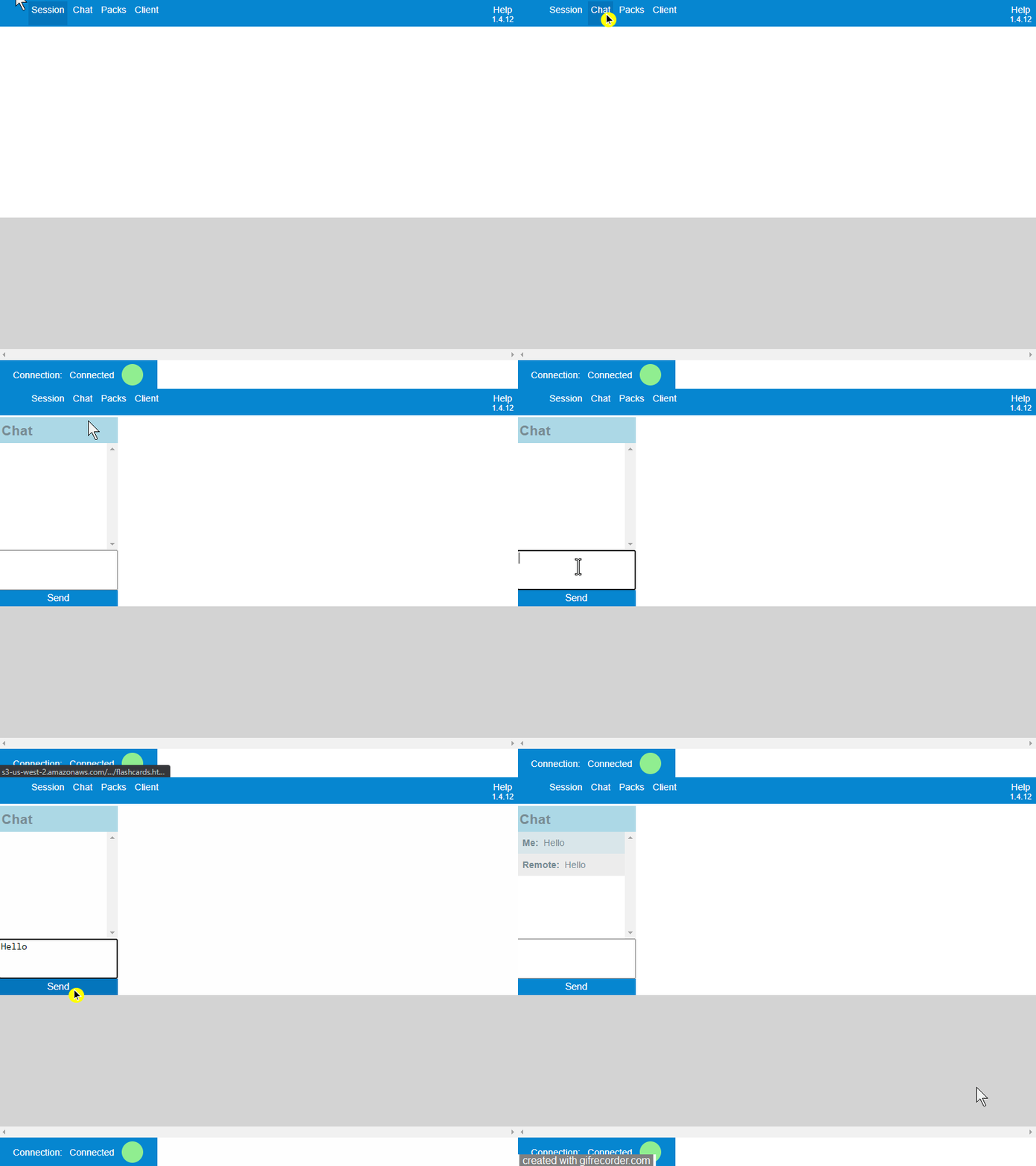
When running a remote session, users have access to a chat box to communicate with the remote part. To chat with the user or the client please follow these instructions:
- Select Chat in the menu bar, at the top of your remote session screen.
- Then select Show to see the chat window, write the text in the empty box above the button Send.
- Select the Send button to send the text (see an example in the screenshot below).
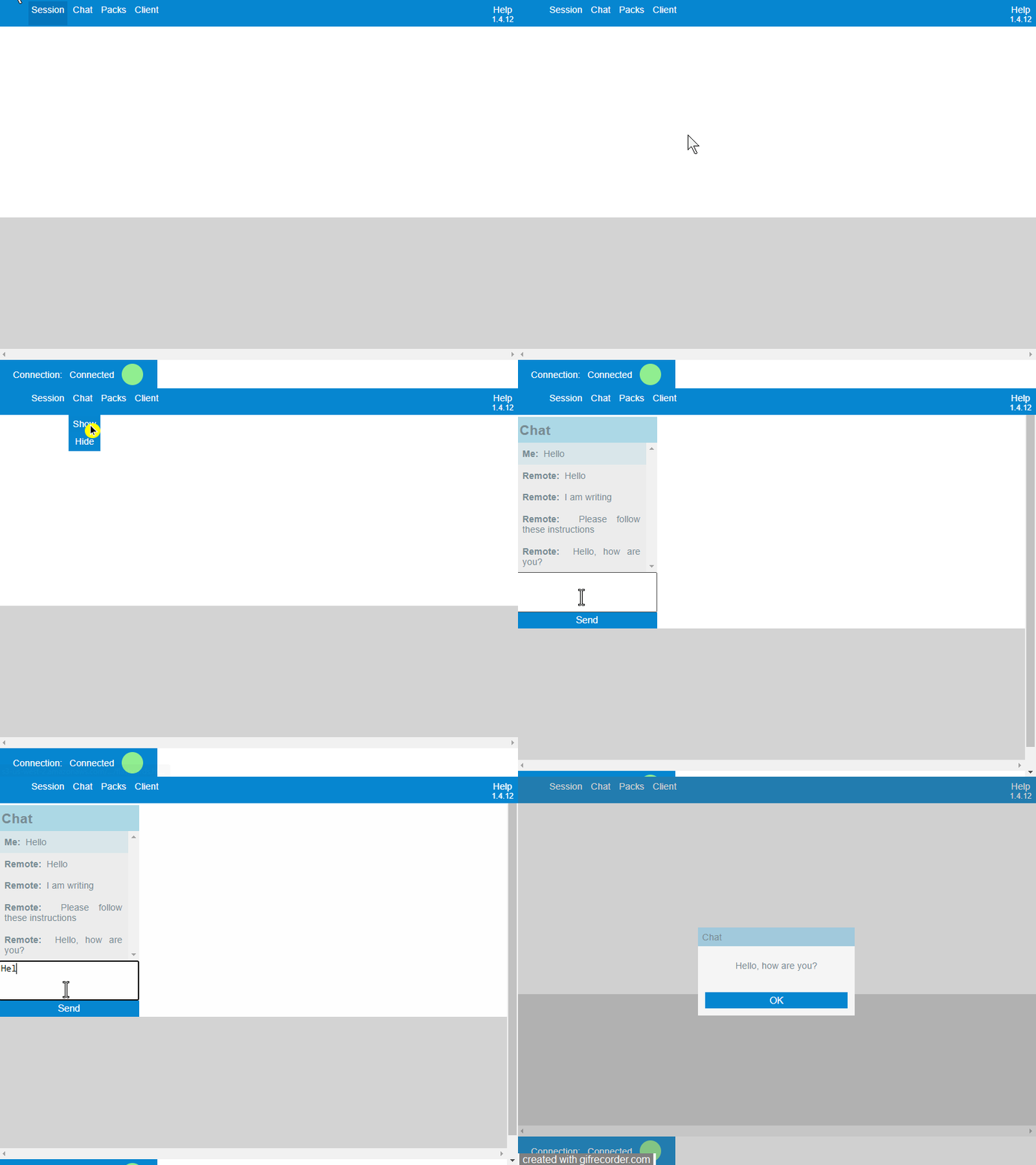
- If you would like to hide the chat window, select Chat in the menu bar, and tap Hide.
- If your chat window is hidden and the remote user sends you a chat message, you will see an alert on top of the screen, you can reply by opening the chat window in the chat menu. (see gif below for an example)
│ Change the pack during the remote session
tags : remote, session, pack, switch
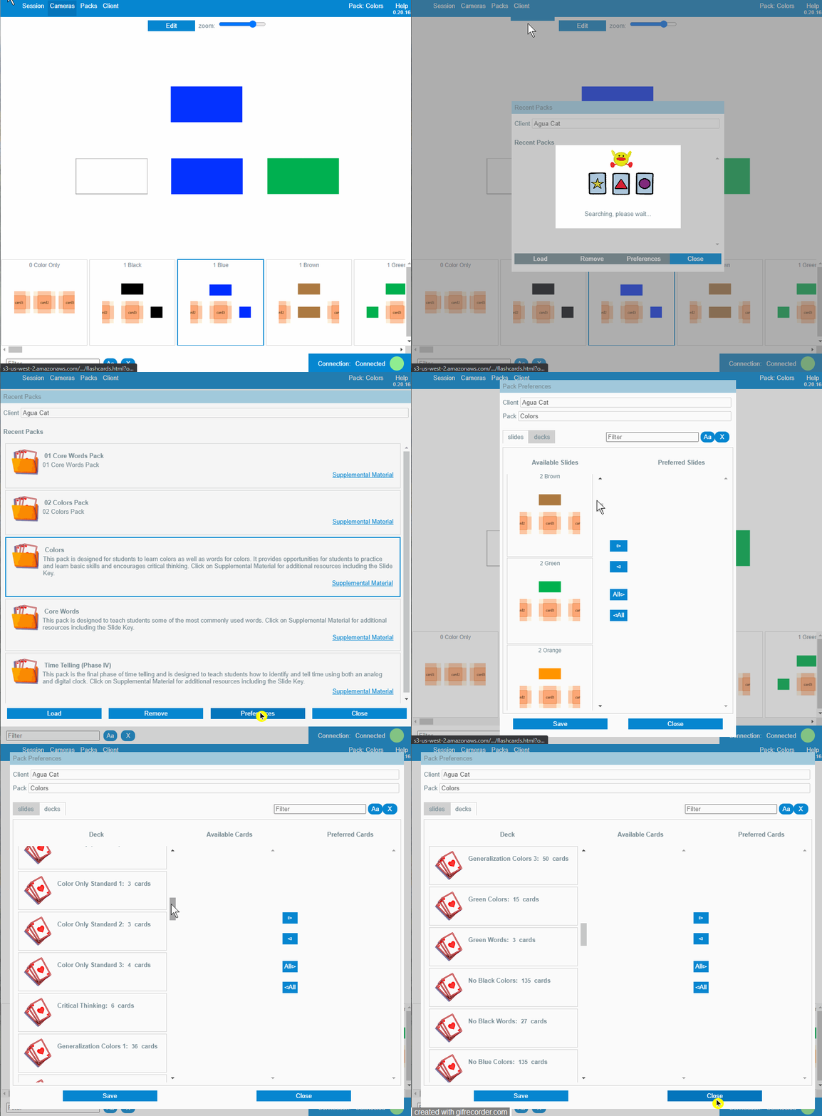
Select Pack in the menu anytime to switch to another pack.
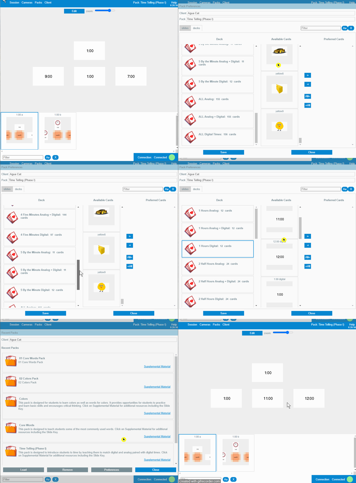
│ View client preferences for a pack
tags : remote, session, client, client, switch, settings, preferences, custom
Pro Tip: Want to set your client preferences up ahead of time? Just start a remote session, choose your client and copy the link that pops up but don't send it to anyone, then follow the instructions below to set your client preferences, then end your session. They'll be ready to go the next time you start a remote session.
│ Edit client preferences for a pack
tags : remote, session, switch, settings, preferences, custom
│ Select preferred slides
You can select a subset of slides that a pack shows during the remote session
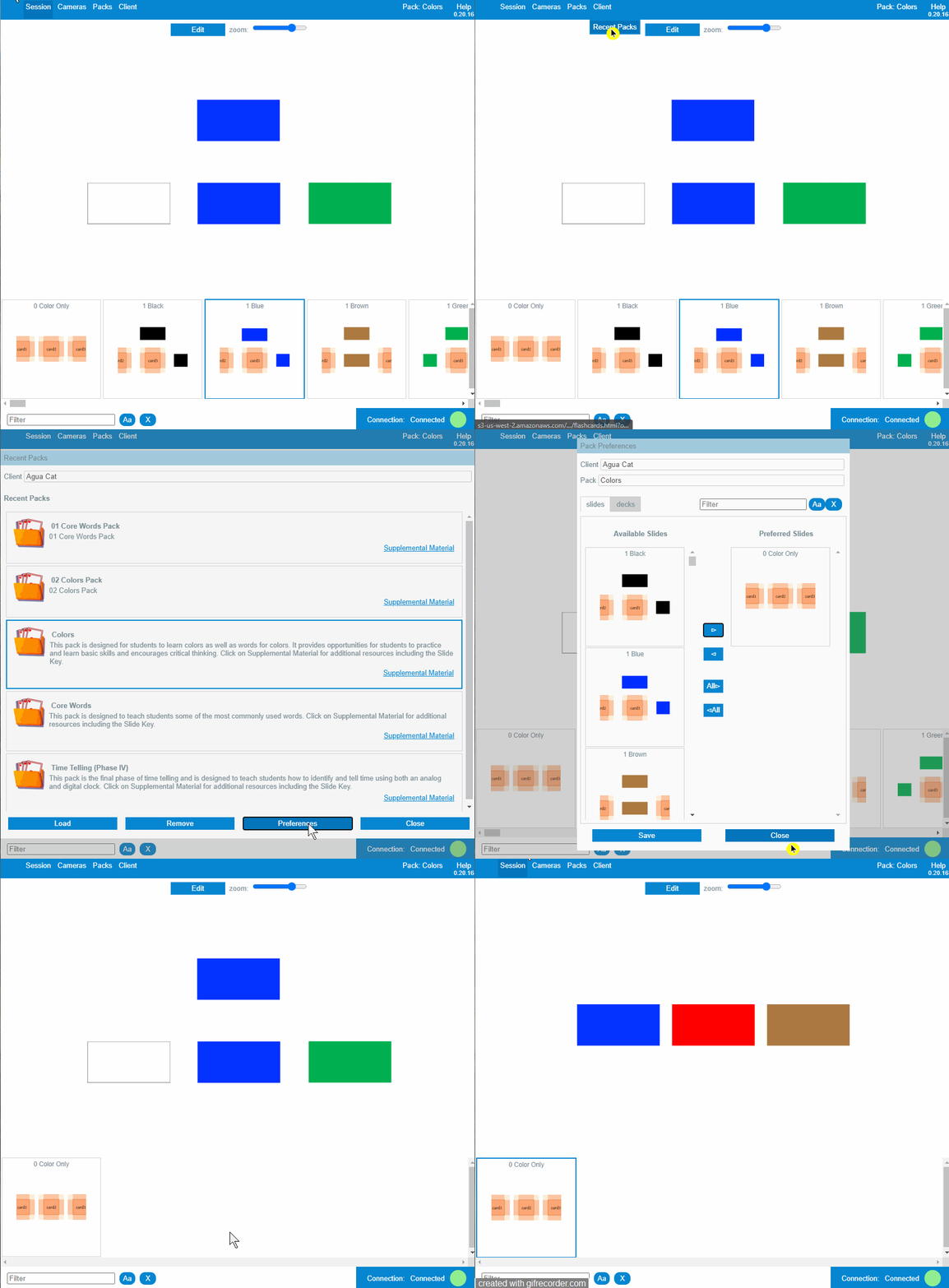
You can filter the slides using the text box in the right top corner, you can select them all at once
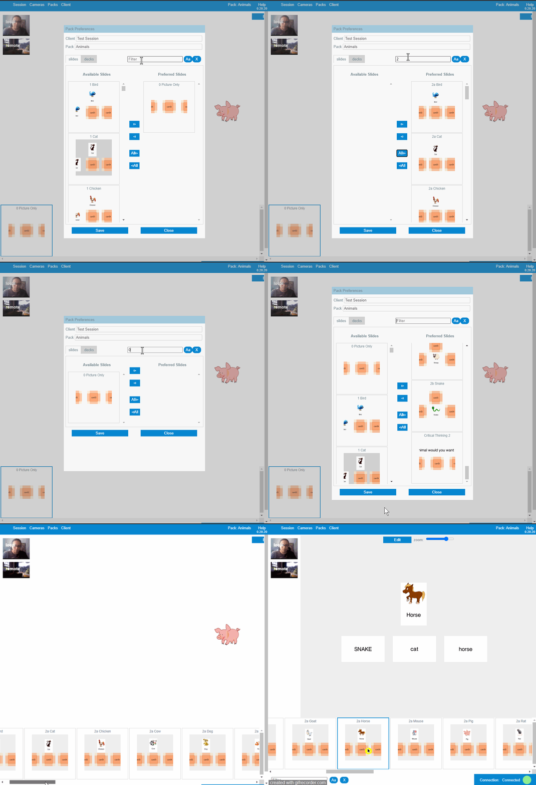
│ Select preferred cards for a specific deck
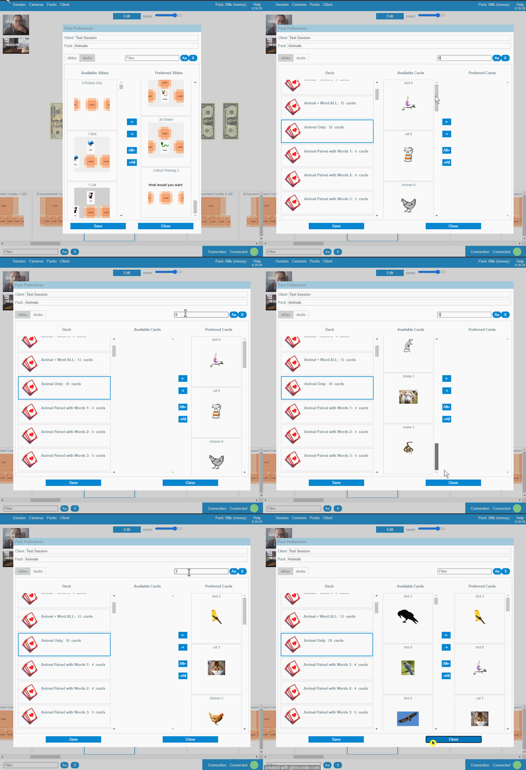
Many slides use random cards that choose cards from a set of cards named decks, you can select which cards add to a deck and narrow the set of cards where a random card picks the cards.
You can filter the cards of a selected deck using the text box in the right top corner, you can select them all at once
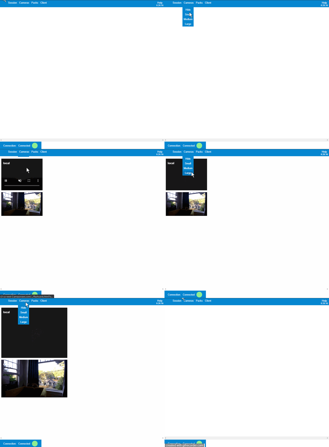
│ Edit the size of the camera screens
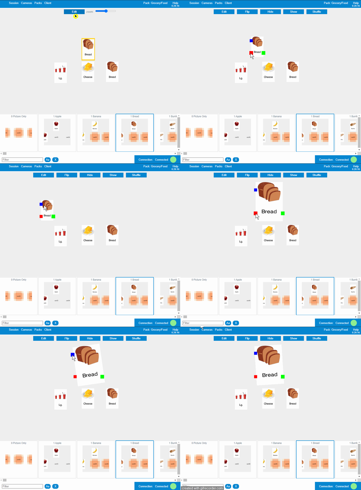
│ Resize, move or rotate a card during the remote session
│ Flip a card during the remote session
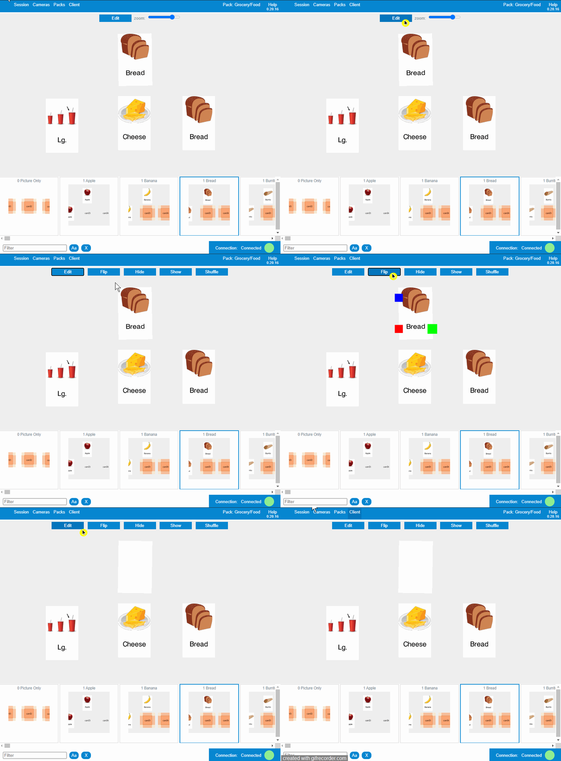
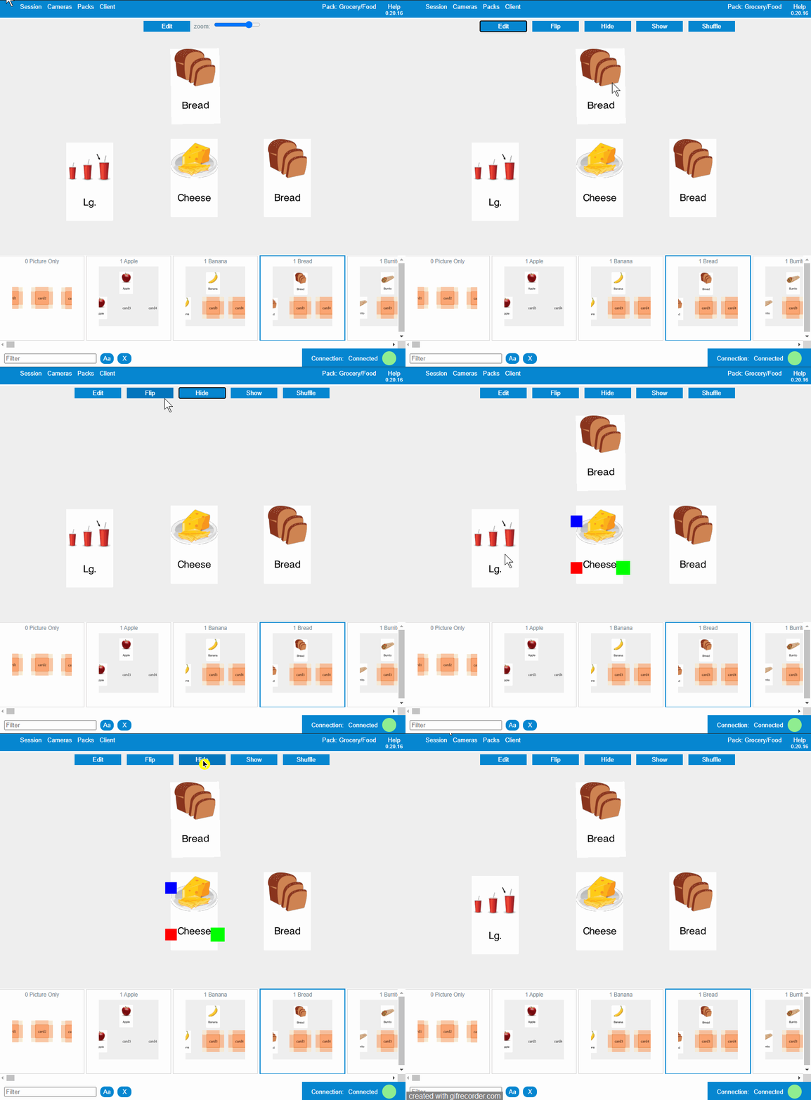
│ Hide or show a card during the remote session
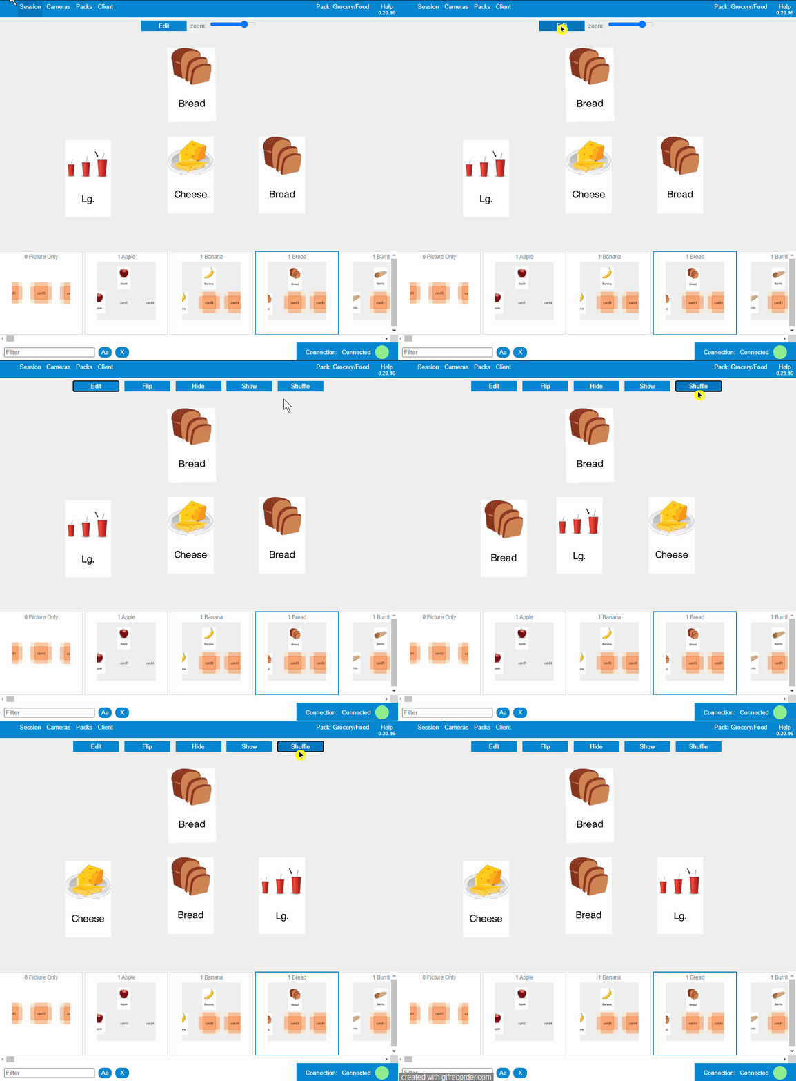
│ Shuffle the cards during the remote session
│ Edit Network configuration
When running a remote session, this setting changes the internal protocol used by the system to connect to the participant and it can improve the connectivity in your specific network setup if you are having issues like remote session ending unexpectedly, or delays in transitioning between slides, and/or you need to refresh multiple times in order for slides to change.
To change the network settings, please follow the next instructions:
- In the remote session, please select “ Session ” on the menu, then select “ Network ”.
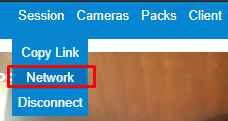
- You will see a new popup window with two options available. The default value is “ Trickle ICE ”
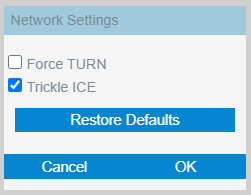
- Please check both “Trickle ICE” and “Force TURN” (as shown in the screenshot below), reload your page
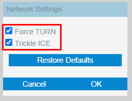
- When the reload has been completed, and the popup to copy the link shows up, please ask the participant to reload their page as well.
- Continue running the remote session with the client. Hopefully the network issues are resolved.
│ For Content Creators
│ Module I: Packs
The Virtual Materials toolset (VM) lets you create card-based activities organized as “Packs”. The primary component of a pack is a set of slides (one or many) upon which you organize cards (cards have pictures and/or text and can be arranged on a slide in a number of different layouts). Each pack may contain up to 450 Cards and 450 Slides, along with custom Variables used for Manual Data Capture. Cards are created to be used in slides and can include pictures and/or text. Cards are created and stored in the “Cards” section of a pack. While creating Slides, you will choose which cards to add to your slide and you may format your slide with a variety of layouts to display your cards.
Depending on the role of your user within the organization, you will be able to preview and launch Sessions, create and edit your own Packs or (for administrators) edit the Packs of other users in the same organization.
Your organization may have received access to Packs from other Organizations. Those packs will have read-only access, but you will be able to clone them and edit your own copy of the external Pack.
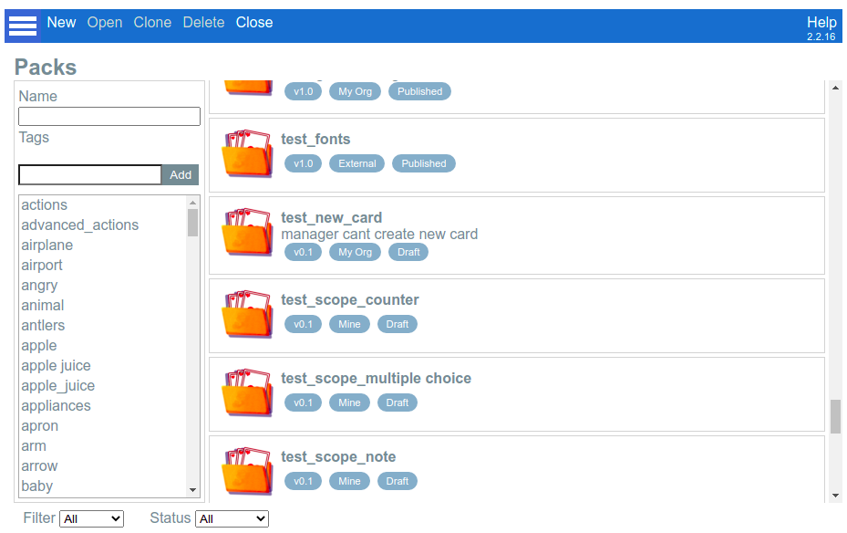
In the screenshot above, you can see all the packs available for your organization to the left of the search area. Scroll through the list or search for a specific pack by name or by its tags, using the search options on the left side of the screen. Each Pack will display three indicators below the pack name: the version, the ownership and the status of each Pack.
Version : This number indicates the current edit version of the pack.
Ownership is one of three values:“Mine” (packs created by you), “My Org” (packs created by other users in your organization), and “External” (packs created by other organizations that have been granted access to yours.
Status : “Draft” or “Published”. “Draft” packs can be edited (as long as you have permission) and “Published” packs can only be opened in read-only mode. Also, only published packs can be granted to other organizations.
│ Create a pack
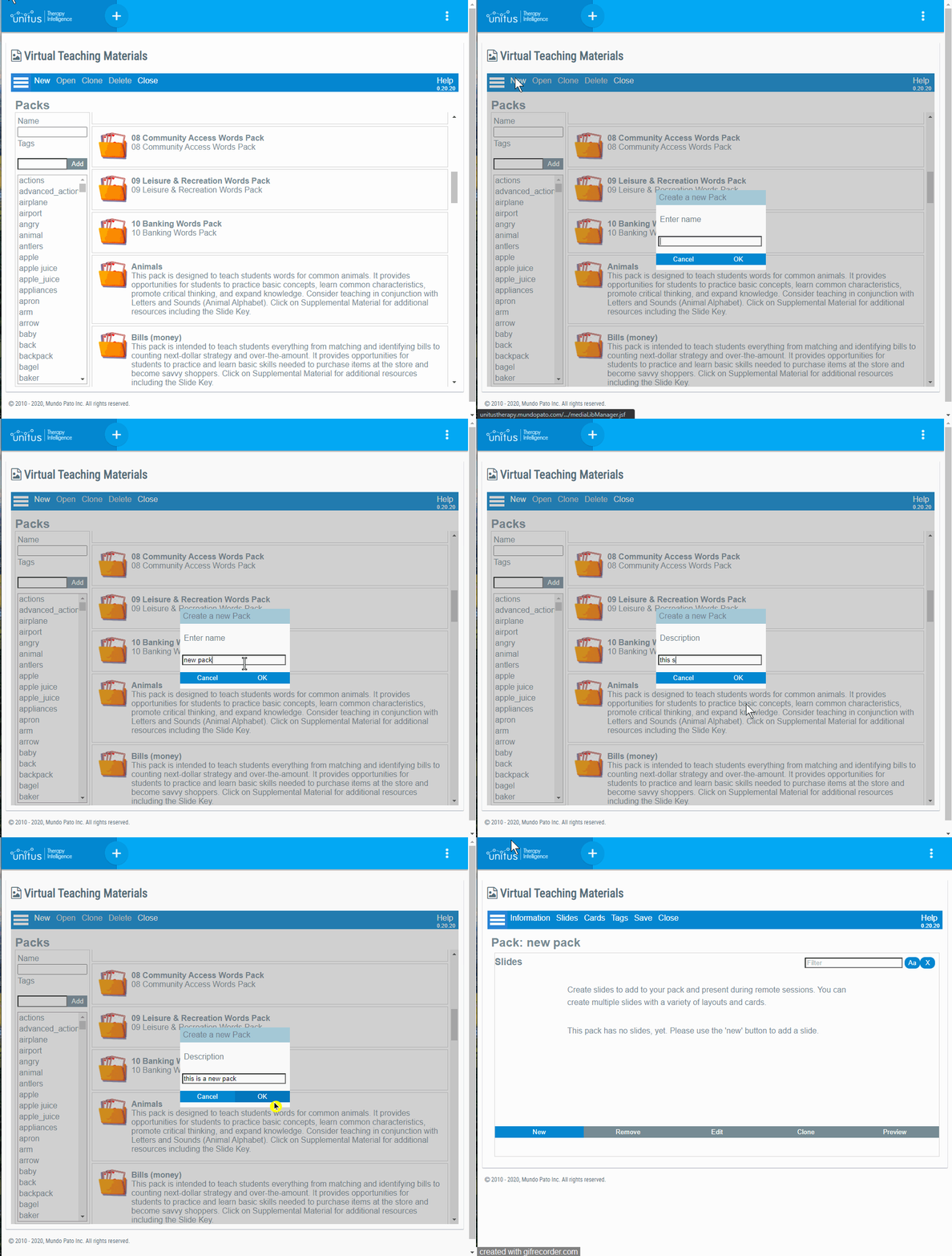
│ Versioning & Publishing Packs
If you are the author of a Pack and you want to give access to other organizations, the first step is to Publish the pack. The “Information” menu offers access to both the status and the version of the pack.
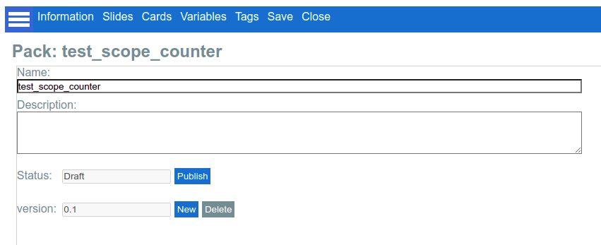
Remember that once a Pack is marked as Published, no more changes are allowed. But if you have corrections to make or you want to add new content to your Pack, you can generate a new Draft version on top of the latest version and work over it even if the Published Pack is already being used by other organizations.
The external users will only see the latest published version of your pack, not the current draft.
Note : Publishing a pack is a prerequisite for allowing other organizations to access your Pack. Once you have marked your Packs as Published, you need to contact Mundopato for authorizing access to specific external organizations.
The following example will clarify the differences between status and versions in a Pack:
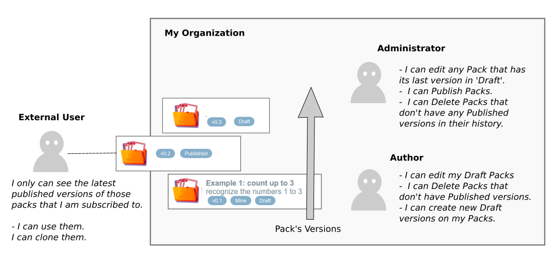
In the previous picture, there is a Pack called “Example 1” with three versions on its history: the v0.1 is the initial Draft Version, then a version 0.2 in Published status, and the latest one is the version 0.3 in Draft status again.
There is an External User subscribed to this pack, but he only can see version 0.2 because it is the latest Published Version. Version 0.3 is invisible to him despite being the latest one because it is in Draft status.
The Administrator and the Author in the Pack’s organization can see version 0.3, and as it is in Draft status, both can edit it, but not at the same time: while one user is working on the Pack and another user tries to edit the same Pack, a warning message saying that the Pack is locked will appear, but the Pack can be open in preview mode until the first user finishes working.
The Administrator can move the latest version to published status, making it visible for the External User.
The Author can create new Draft versions if new editions to the Pack are required.
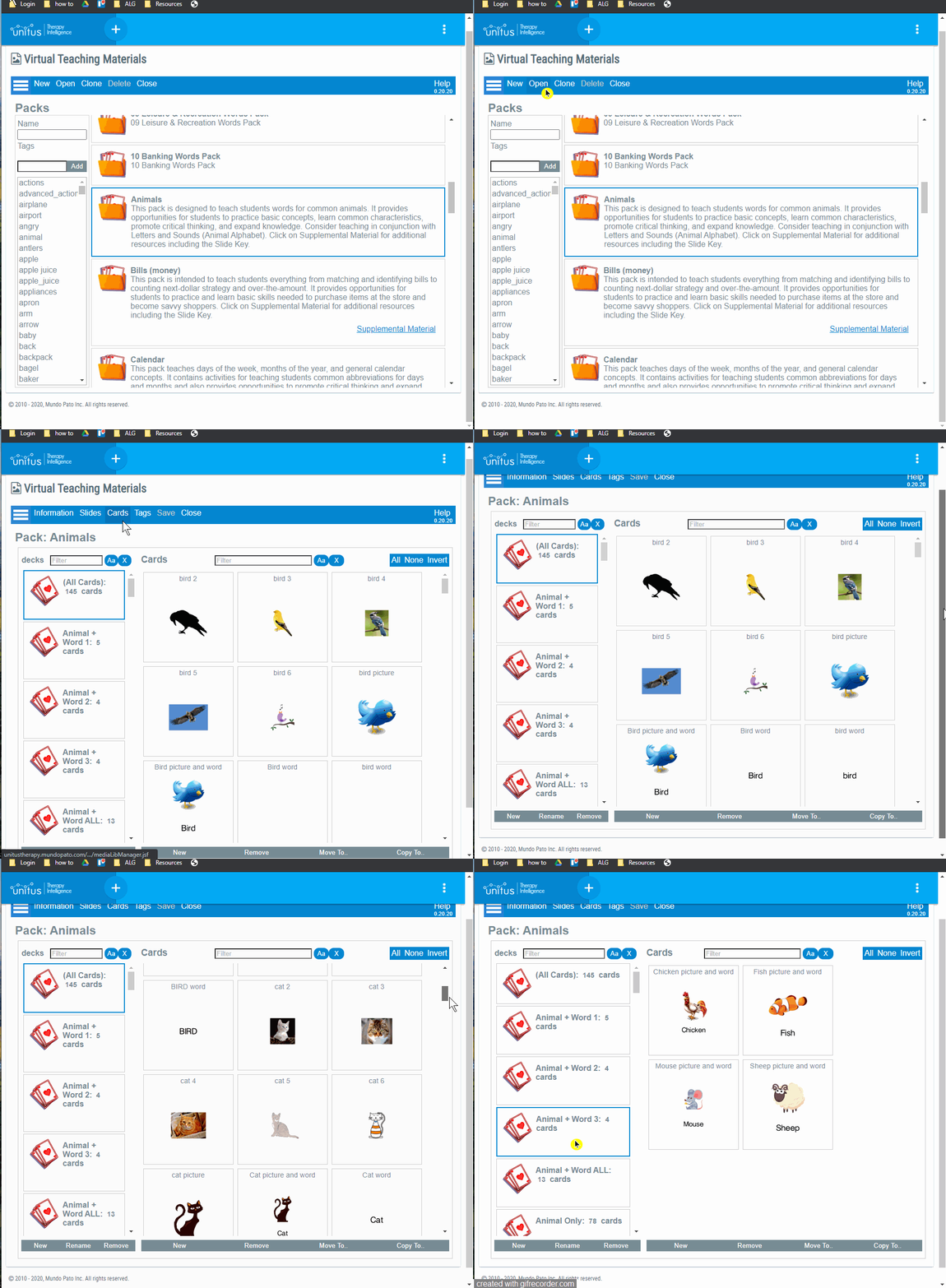
│ View the decks and cards available in a pack
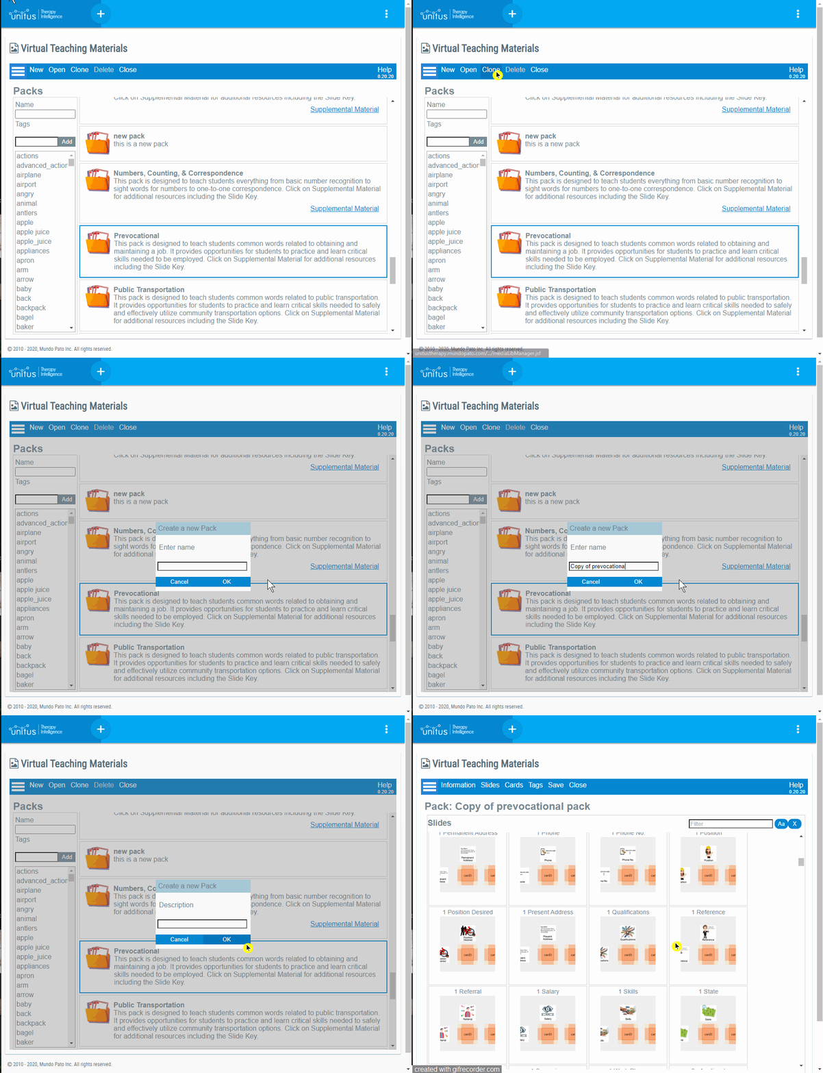
│ Clone an existing pack
│ Slides
Slides are the way how content is organized to be presented to the client during a VM Session.
They are like pages or screens that are presented one at a time to the client with the goal of executing some interaction or gathering some data.
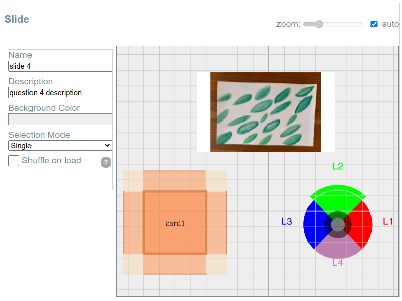
A slide can contain multiple resources like Cards, Random Cards, and Widgets. The screenshot presents a slide being edited that contains a Card in the top, a Random Card in the lower-left corner, and a widget (an Interactive Wheel) in the lower-right corner:
Slides can also be configured with Variables for data capture and effects like shuffling cards on load, and flipping or highlighting cards when clicked.
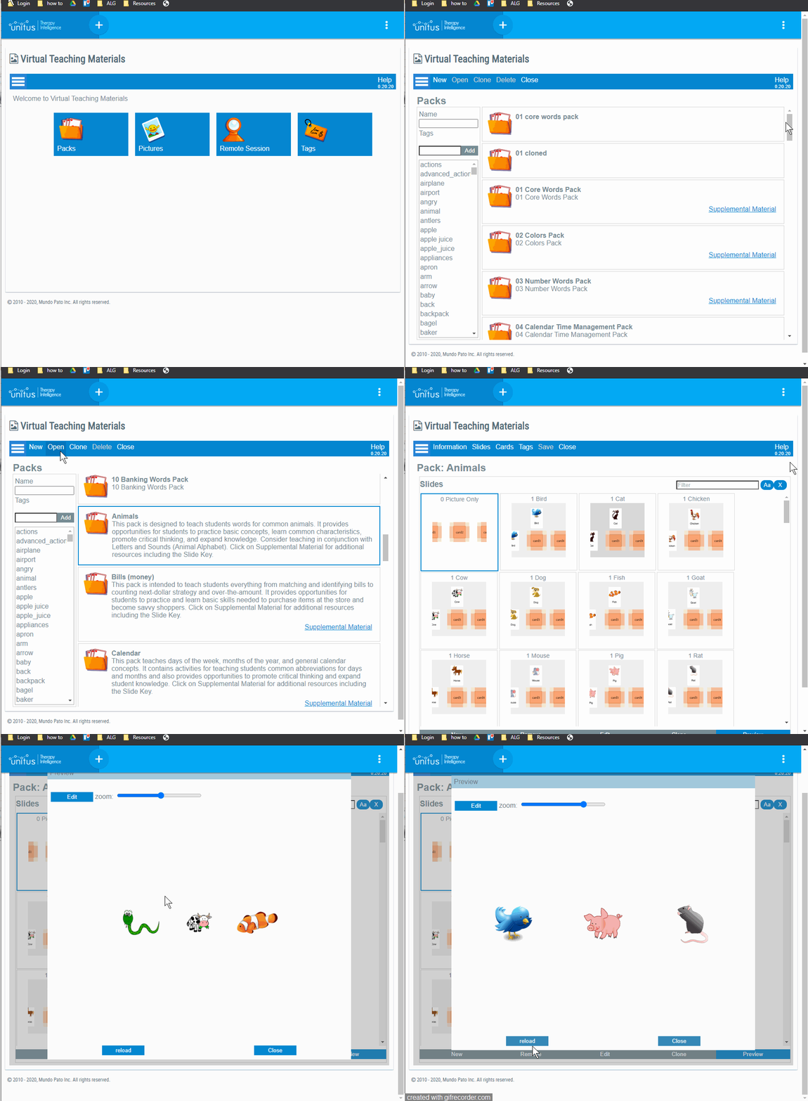
You can see the list of all the slides available in any Pack. Even if you can’t edit them (because the Pack is in “Published” state or you don’t have the grants) you always can Preview the slides to see how they would look during a real Session:
Slides can be created in different ways:
- Importing slides from another Pack.
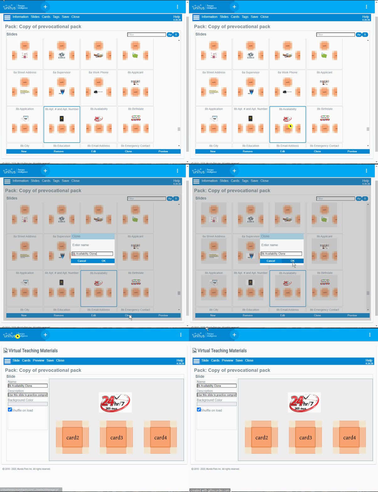
- Cloning an existing Slide within the same Pack, to rename it and edit it later.
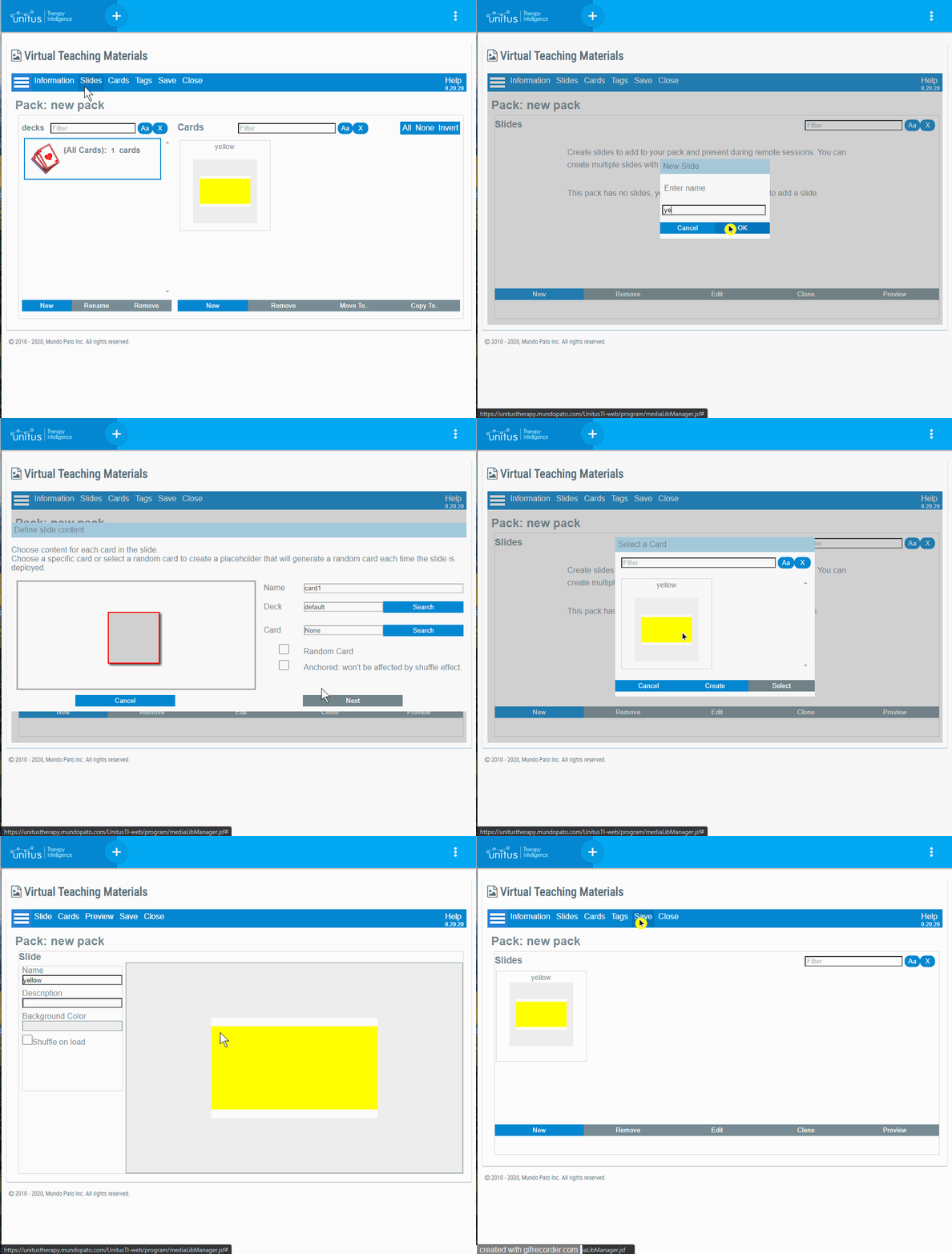
- Using the “New Slide” wizard to create a new slide from scratch.
│ Importing Slides
Slides can be imported from any other Pack.
Warning! Importing slides means that all the Widgets and Cards used by the Slide will be imported too! If the Slide uses Random Cards, special care should be taken as the Import Wizard will import ALL the cards referenced in the Decks associated with each Random Card (except for the “All Cards” deck).
By default, before importing a slide, the resources used by the slide (Widgets or Cards) are compared by name with those in the target Pack. If a resource with the same name exists in the target Pack, the resource won’t be imported and the existing resource will replace the original one in the cloned Pack.
If this is not the behavior you want, please be sure to rename your Cards, Decks, and Widgets before importing a new slide with repeated names.
|
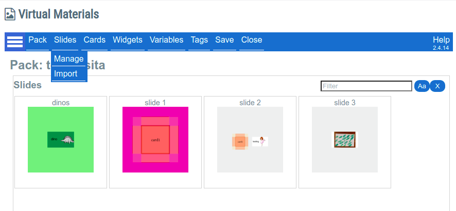
Step 1 Open the Pack where you want to import the slides and go to “Slides” then “Import”. |
|
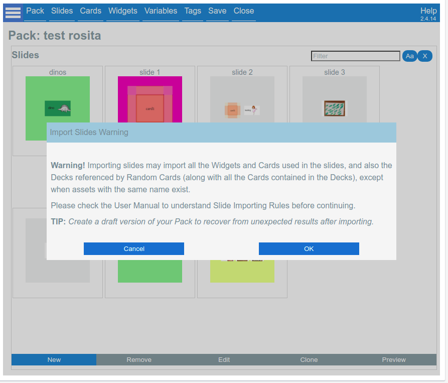
Step 2 The Import Slides Wizard will start, presenting a Warning regarding the potential risk of importing associated assets.
If you are sure that the Assets to be imported are not going to cause any problem in your target Pack, press OK.
|
|
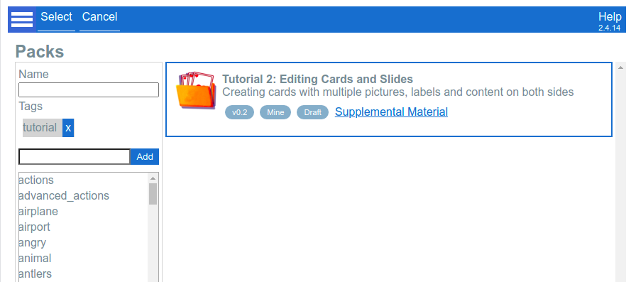
Step 3 Select the source Pack from where you want to import slides. |
|
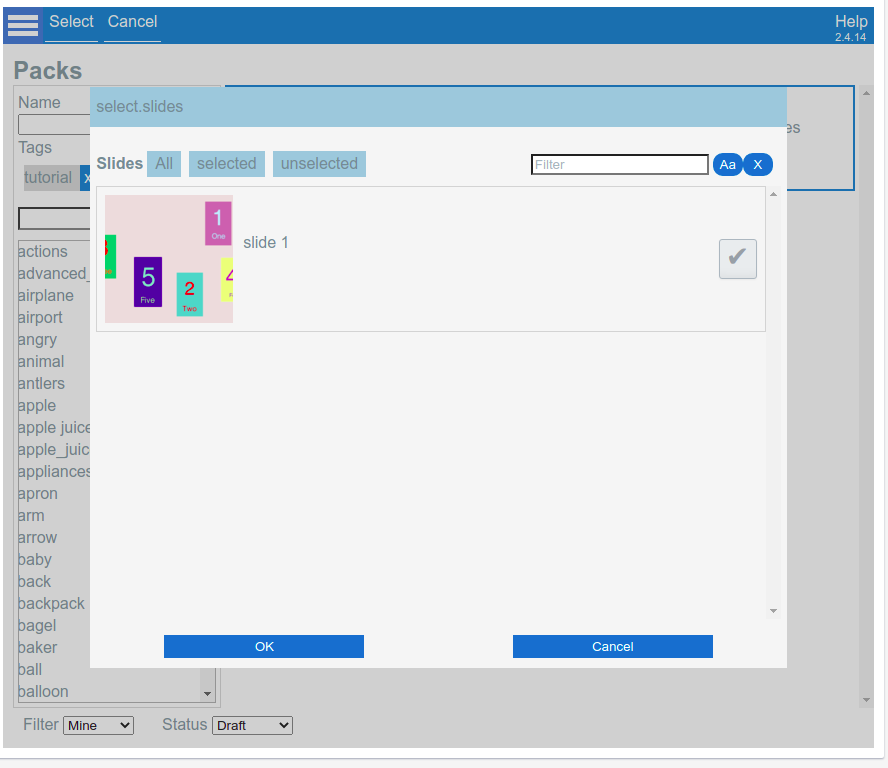
Step 4 Select slides in the Source Pack searching them by name and check the checkbox. You can import multiple slides at the same time. |
|
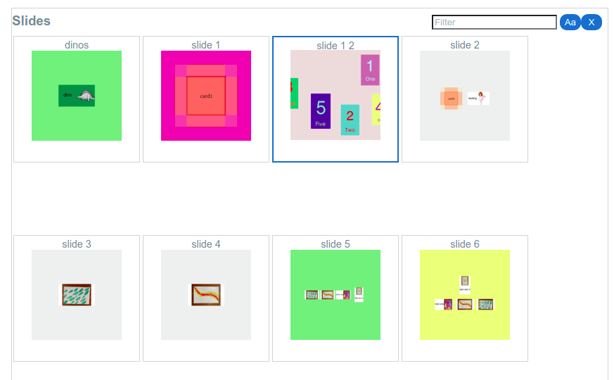
Step 5 After the importing process finishes, the slide list will include the new imported slides (highlighted in the picture at the left).
|
|
If you check the list of Cards, you will see that all the cards used in this slide were also imported. |
│ Clone a slide
│ Create a slide
The maximum number of slides that can be added to a pack is 450 slides.
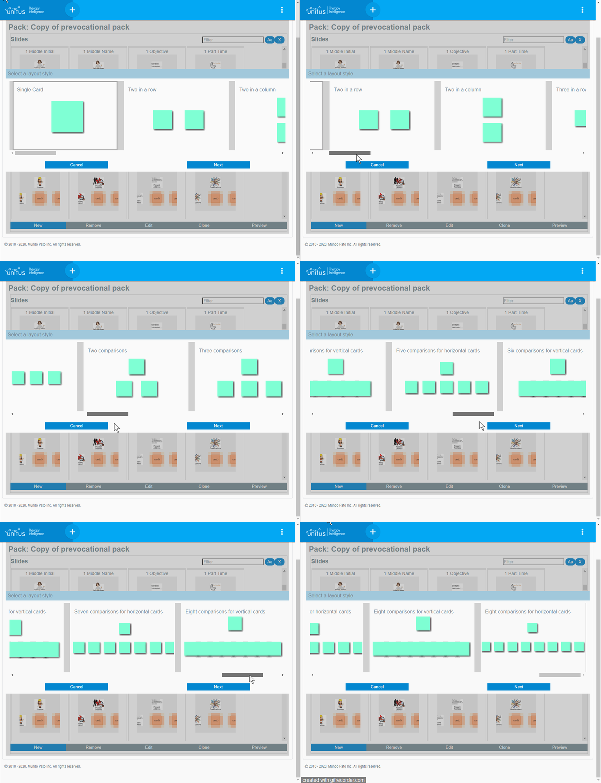
│ Available layouts to create a slide
│ Randomize cards positions
Sometimes it is necessary to change the positions of the cards in a slide, in order to prevent the client to memorize the location of the right answer. You can select an animation effect to be applied when the slide is loaded.
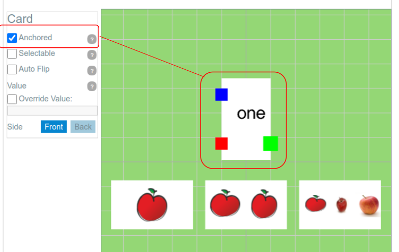
In the following example, we have a typical layout with a sample card on the top and three comparisons cards in the bottom. We want to randomize the order of the comparison cards, but kept the sample card fixed.
Step 1: Select the sample card and check the “Anchored” in the card properties:
Step 2 : Select the background of the slide, and then select one of the available effects: “Shuffle” or “Scatter”:
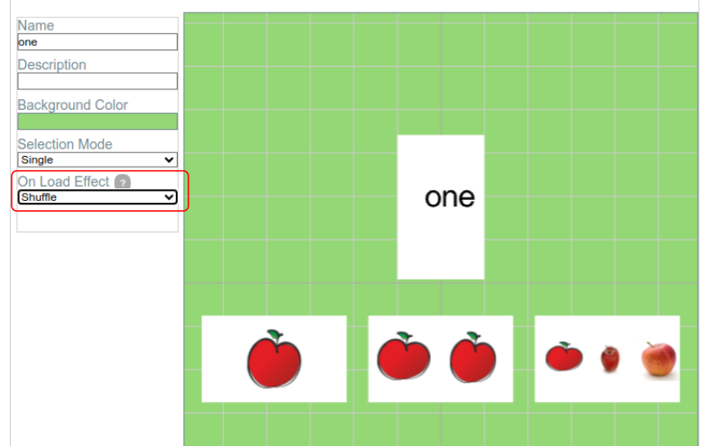
Now, every time you launch your slide (using the preview mode or during a session) the selected effect will be applied to all the non-anchored cards.
The shuffle effect
“Shuffle” will interchange the position of the unanchored cards, preserving the same layout.
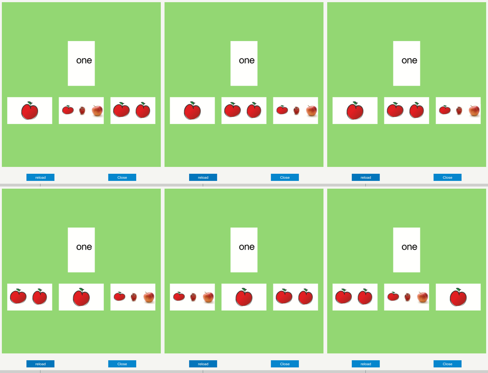
The Scatter effect
“Scatter” will disperse the cards all over the slide, applying a slightly change to rotations. This effect don’t preserve the layout:
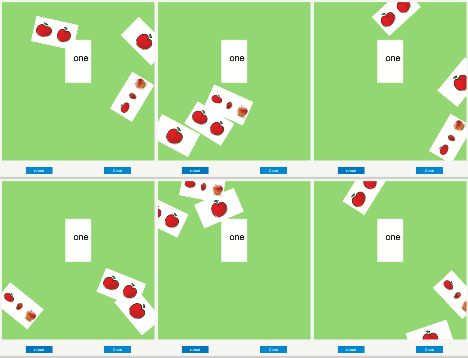
│ Update a slide
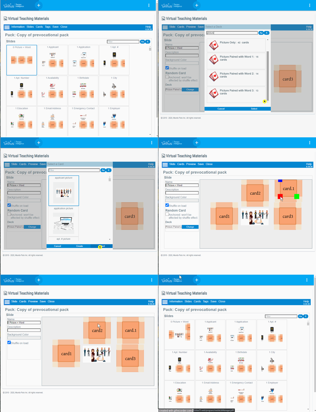
│ Add a Random Card to a slide
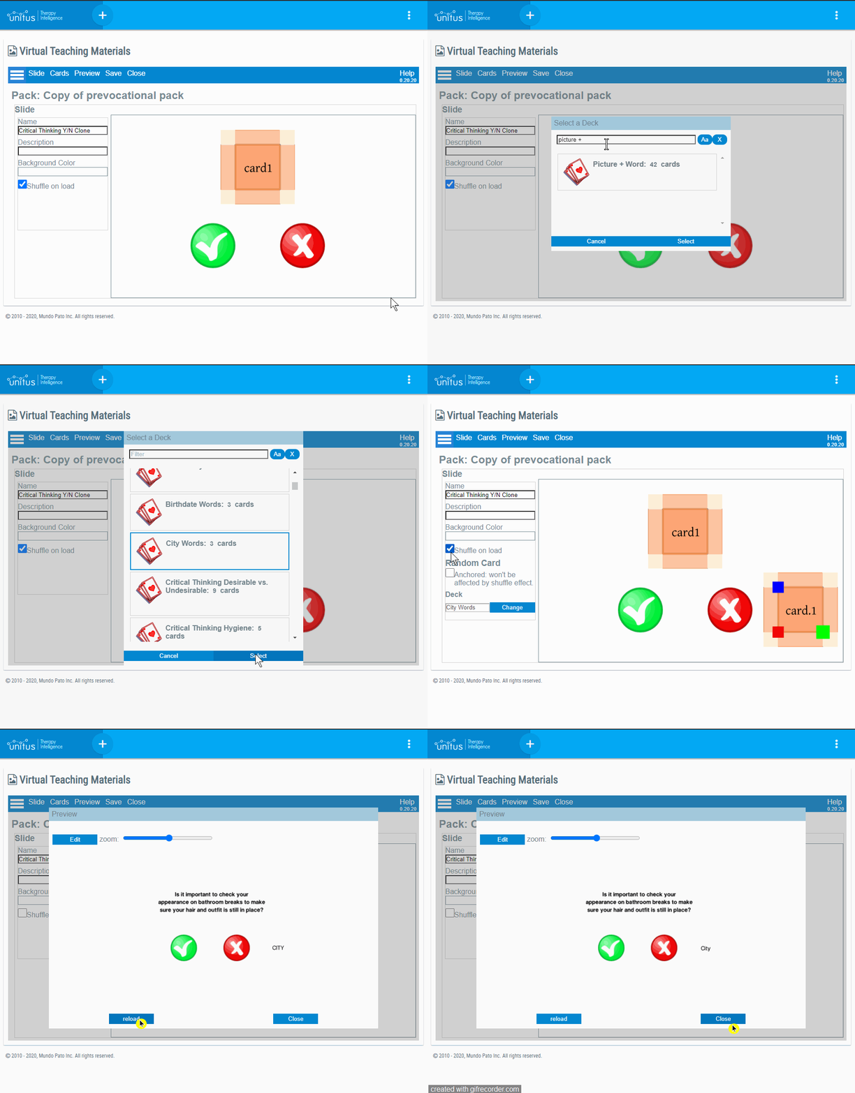
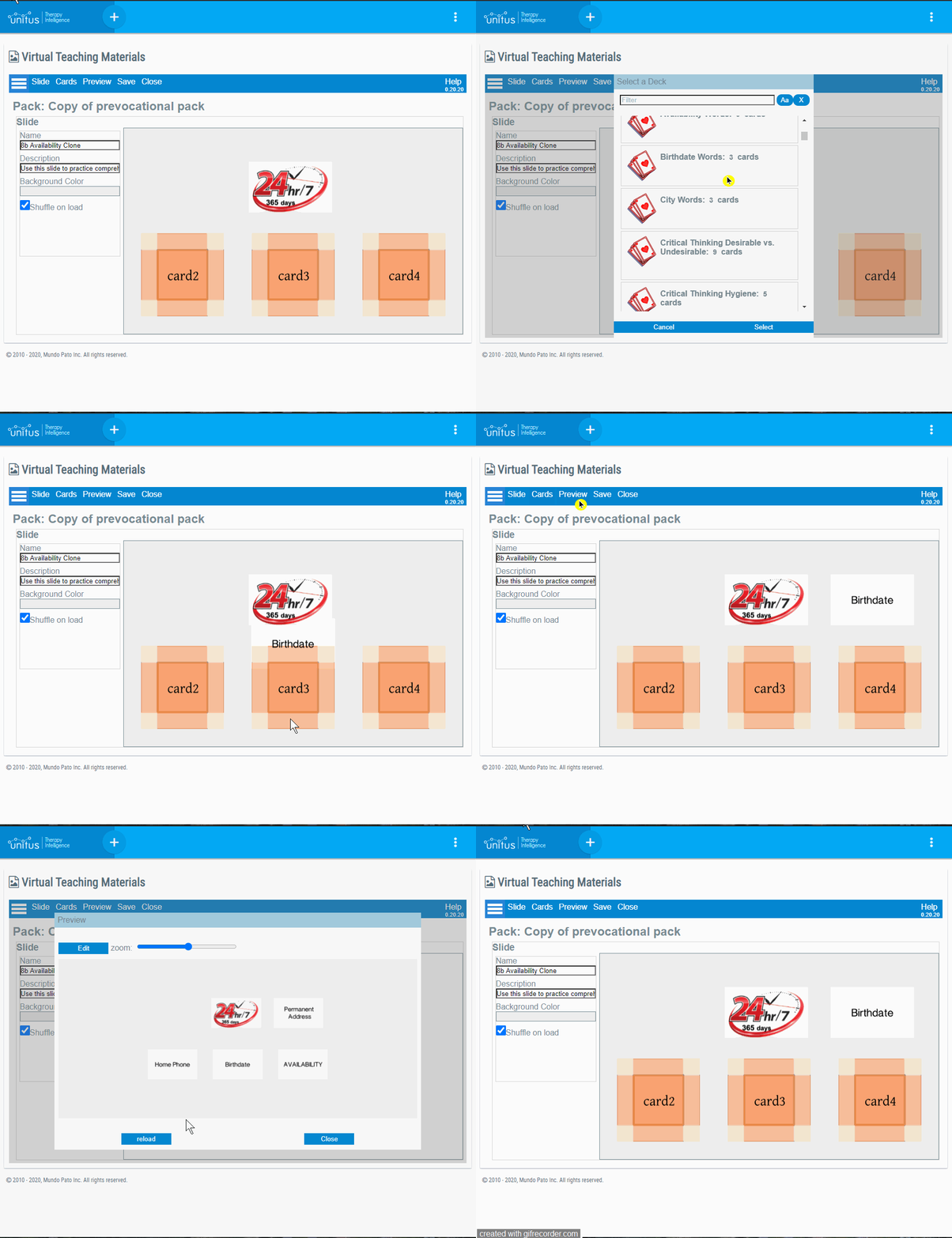
│ Add a card to a slide
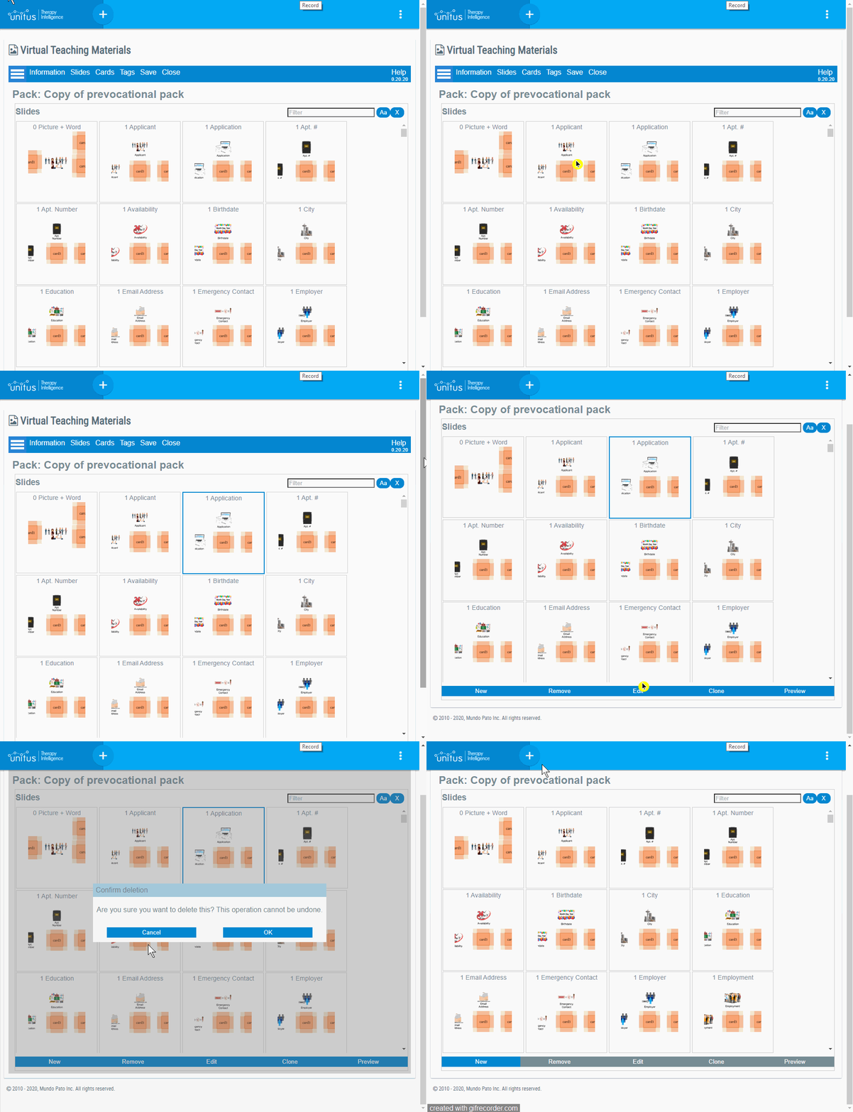
│ Delete a slide
│ Cards
Cards are used as the content for slides. You can reuse cards and organize them into decks (check out the Slides section for more help on how to add content to decks).
Tip : You can add up to 450 cards to a pack.
│ Create a card
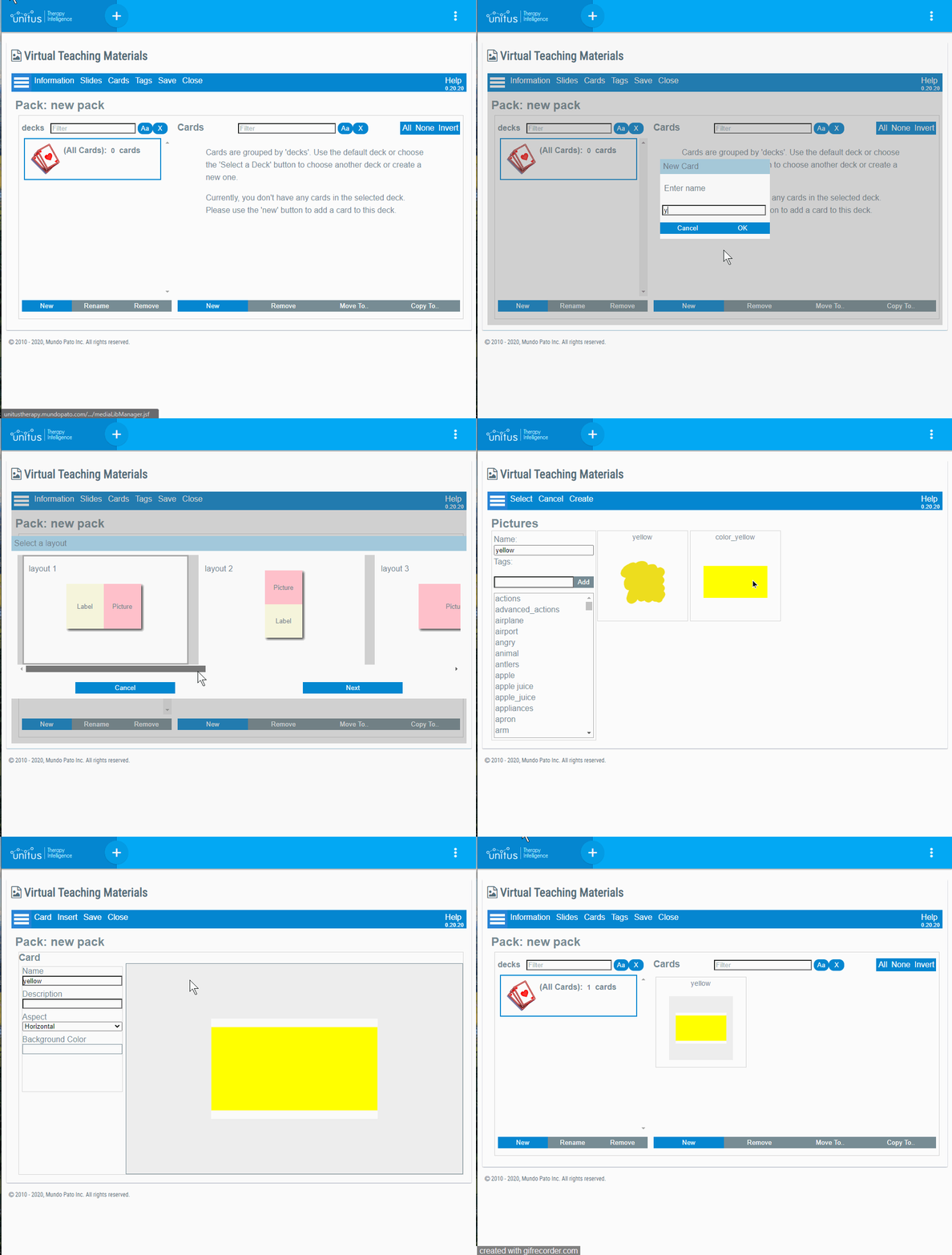
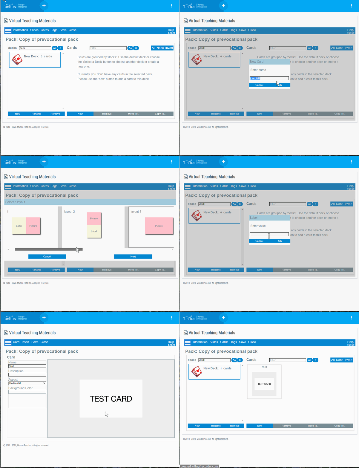
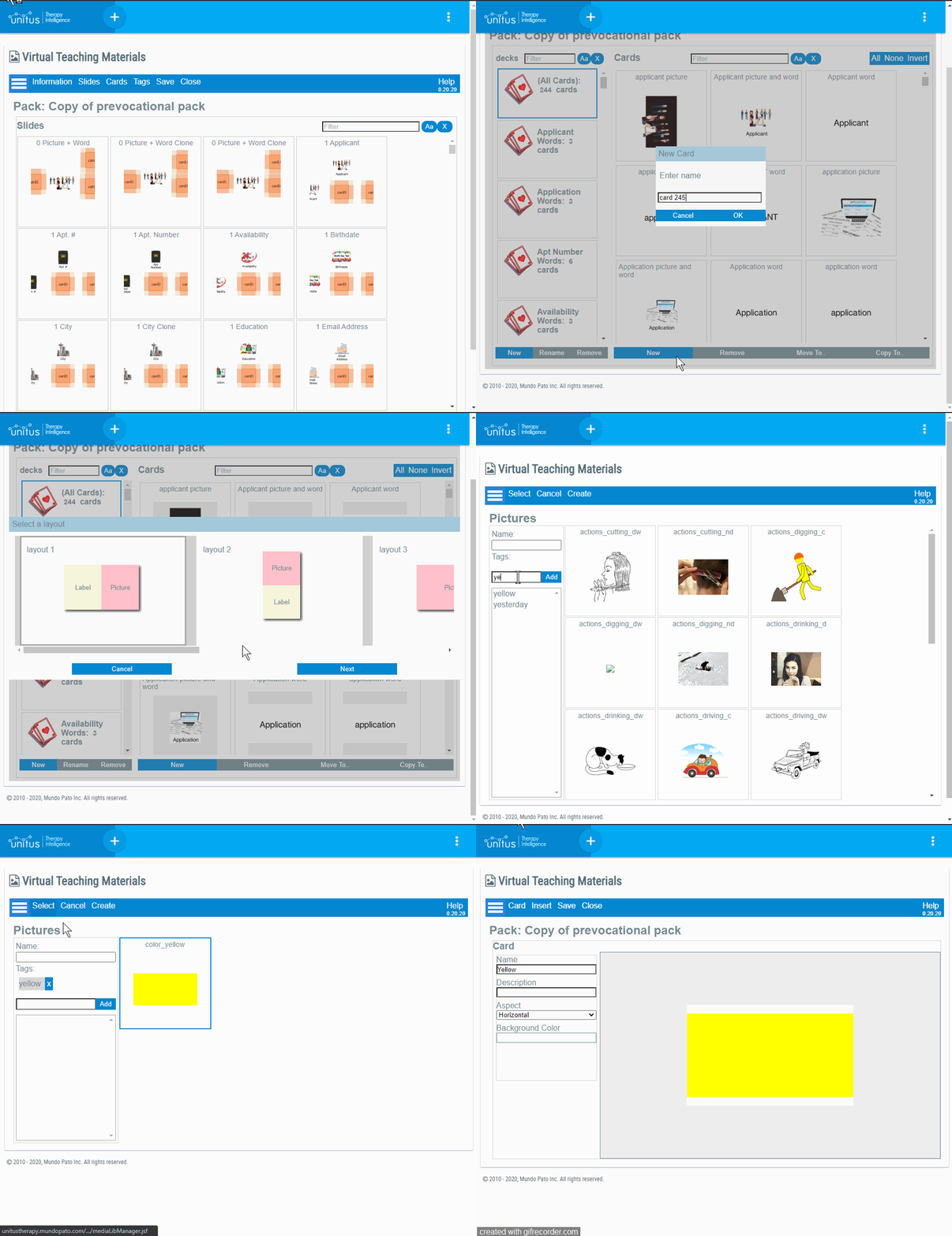
In order to create a new Card, select the “New” button in the Cards screen. This button will launch a wizard that will offer you a set of predefined common layouts. These layouts are very useful, but keep in mind that you are not limited to them. Once the card is created, you can continue adding additional pictures and labels to the front or the back of the Card.
│ Edit a card
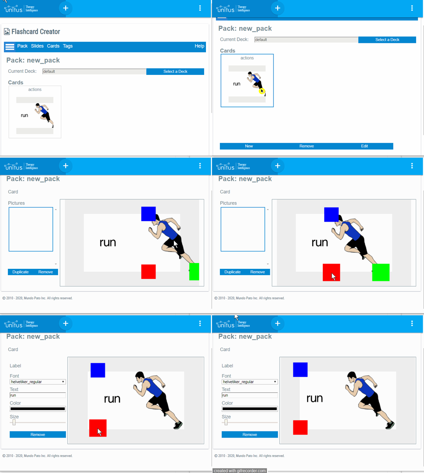
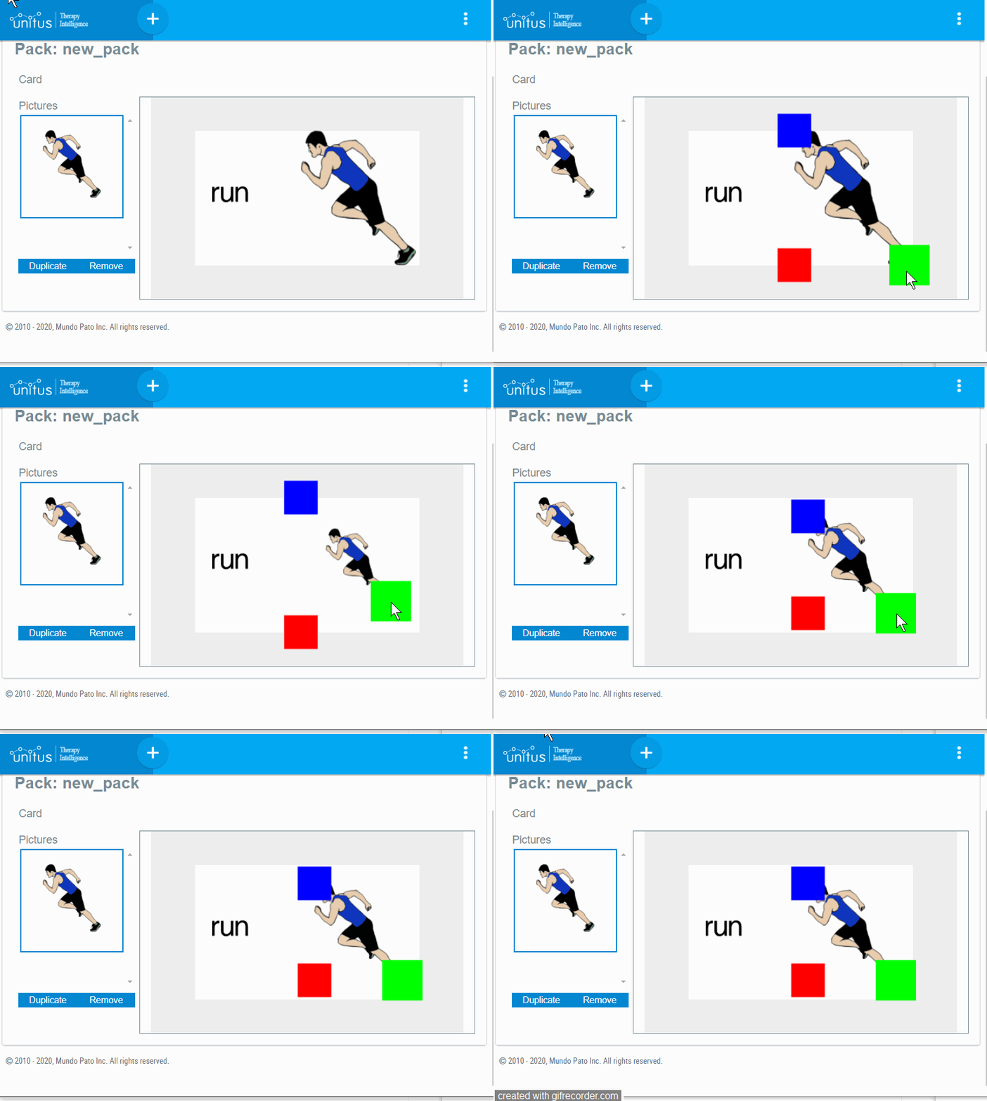
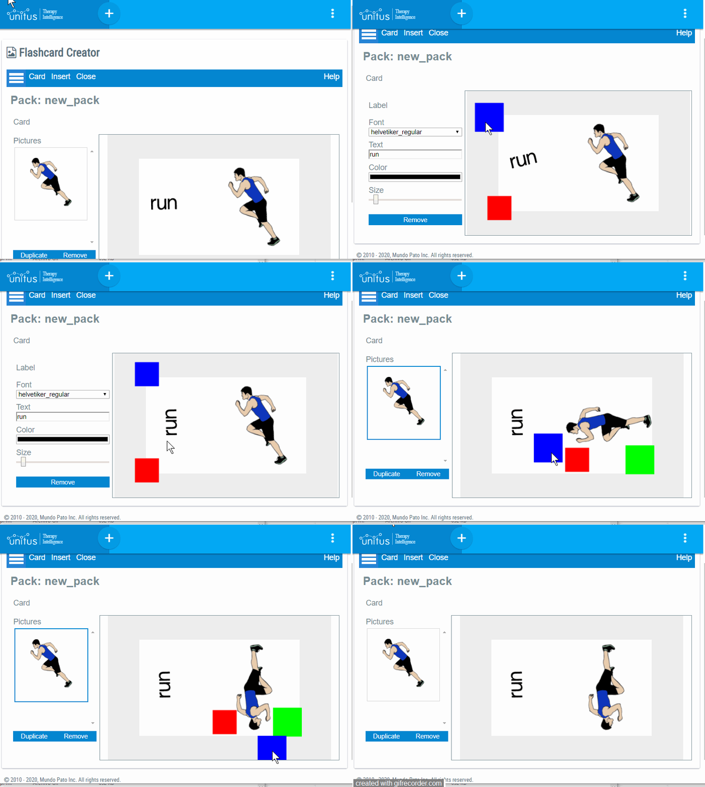
A card is composed of a front and a back side. You can add multiple images and labels to any side of the card, and also move, resize and rotate the images and labels within the card:
To Move: Use the red square |
|
To Resize: Use the green square |
|
To Rotate: Use the blue square |
|
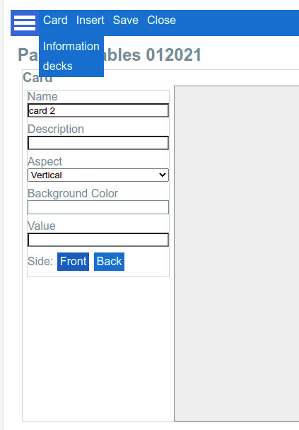
By selecting the menu “Card - Information” you will access some general properties of the Card. This panel can also be accessed by clicking the background of the Card:
Properties of a Card
Aspect: changes the proportions of the background of the Card. It could be either vertical (portrait), horizontal (landscape) or square.
Background color : Changes the background color of the card.
Value : This is an optional field used for compute dynamic values for the “Macros” functionality and/or for the Integration with Assessments .
When a card is inserted into a slide, her value can be overridden .
Side : Use these buttons to select the side of the card that you want to see or edit. |
│ Editing the two sides of a card
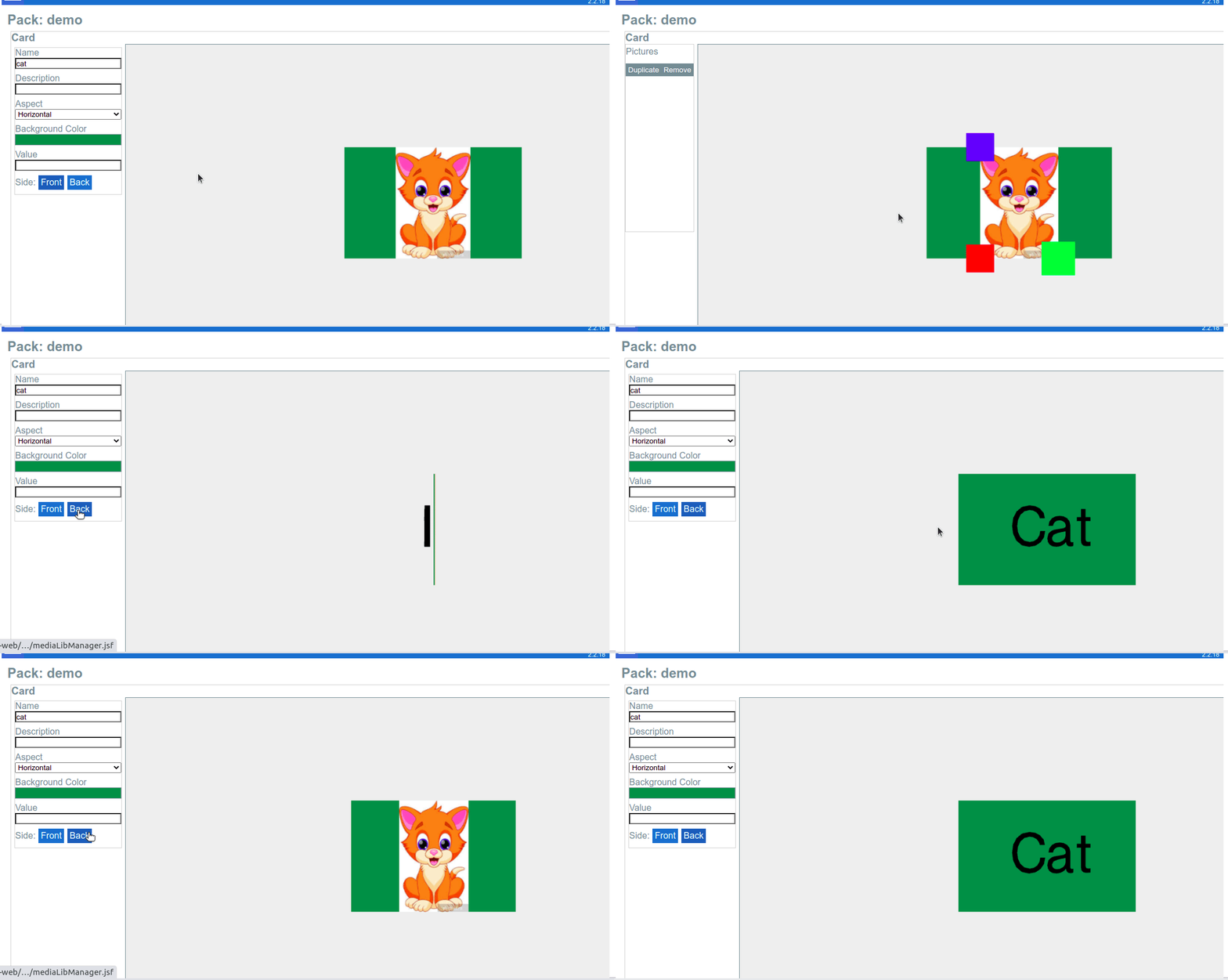
By using the “Front” and “Back” buttons you can add content to any side of the card:
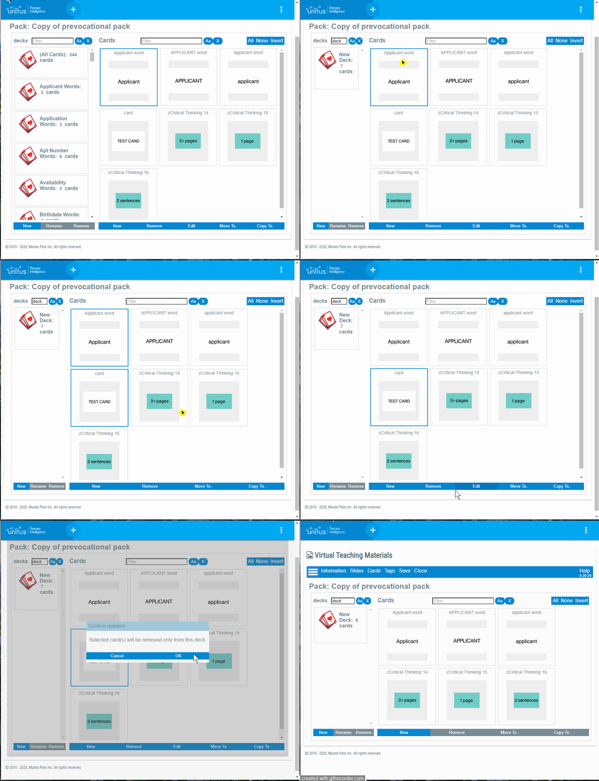
│ Decks
Decks are groups of Cards. They are very useful in combination with Random Cards.
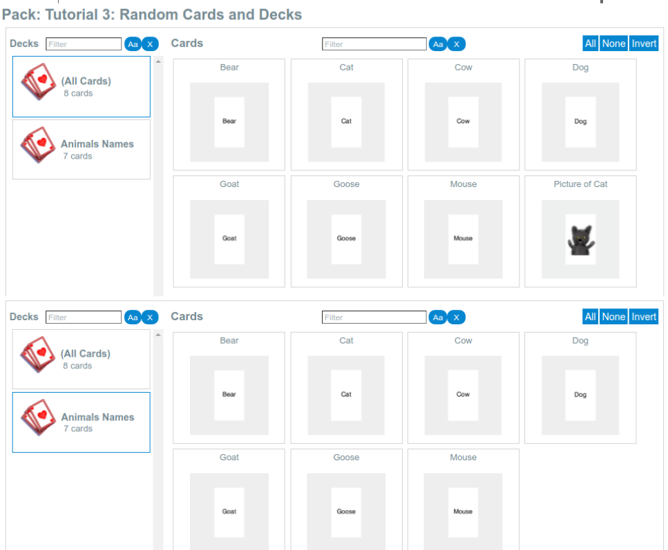
All the cards in a Pack belong to the “All Cards” deck by default, but they can also be part of any other deck.
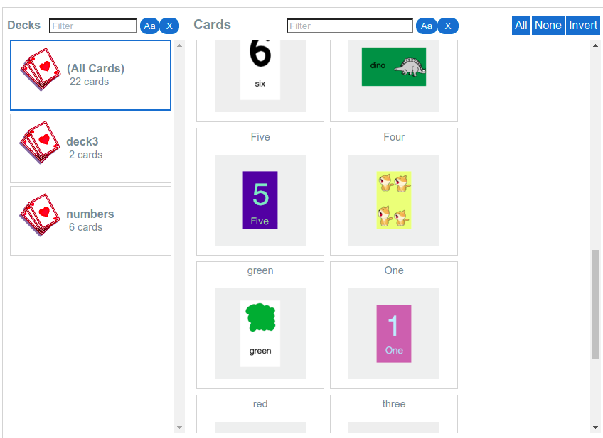
In the top of the following screenshot, the default “All Cards” deck is selected, displaying a total of eight cards.
In the bottom of the same screenshot, the “Animal Names” deck is selected, displaying only seven of the eight cards (the card with a picture of a cat was not assigned to this particular deck):
│ Create a deck
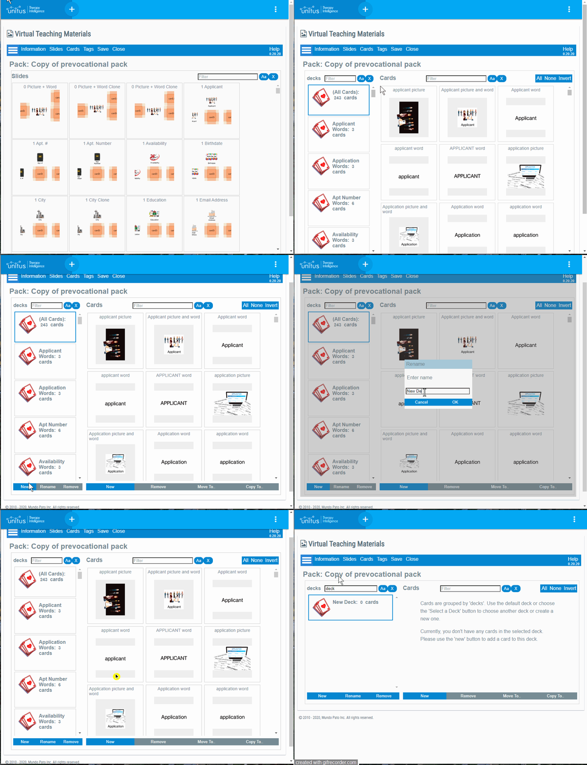
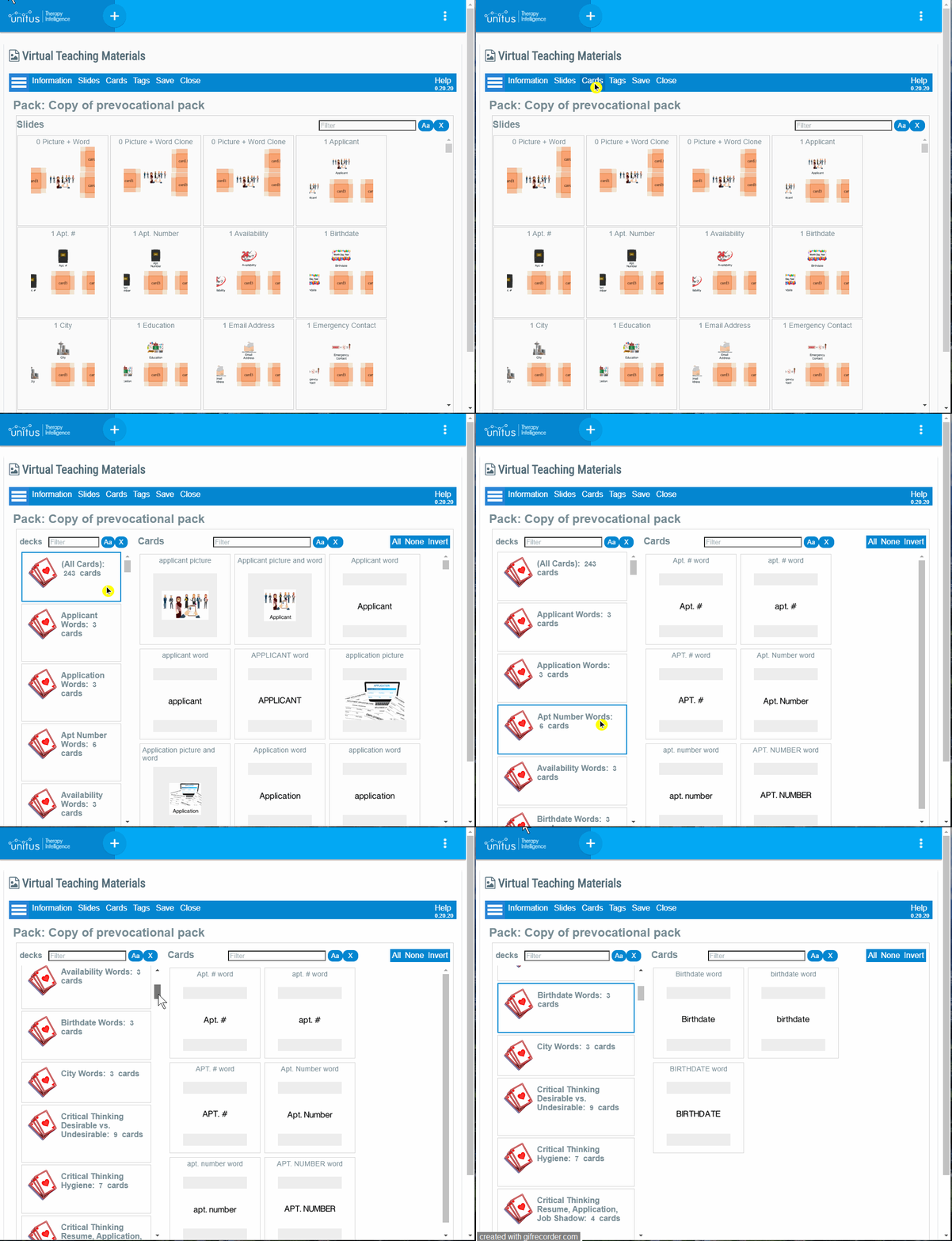
│ View cards available in each deck
│ Update a deck
│ Add a card to a deck
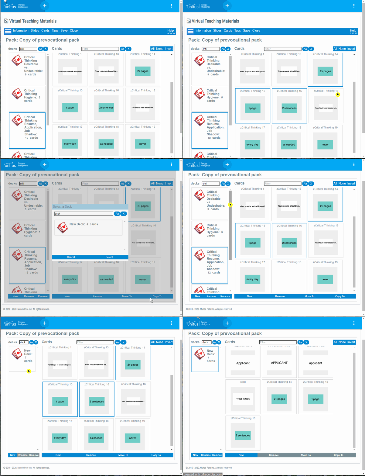
│ Copy cards to a deck (Copy to…)
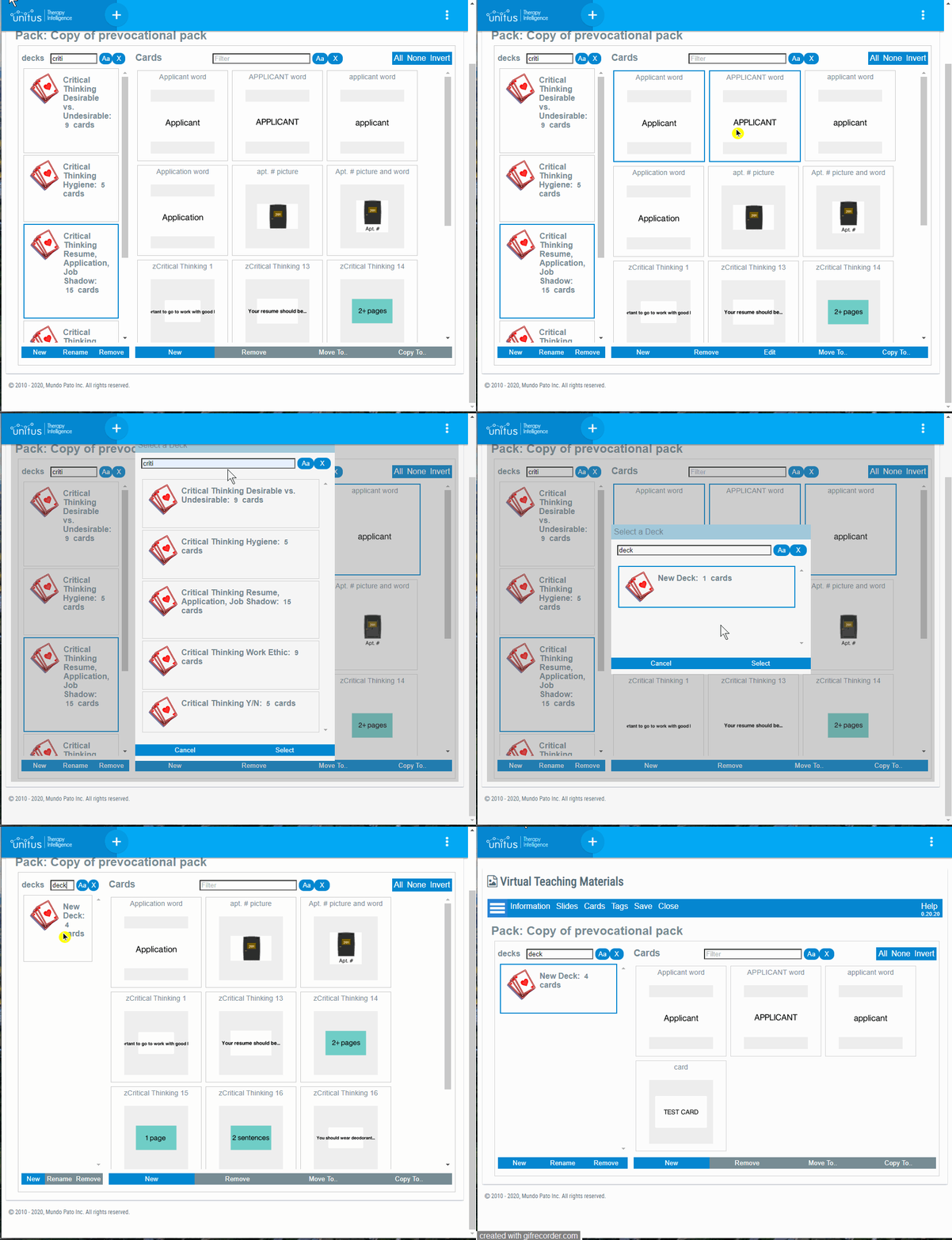
│ Move cards to a deck (Move to…)
│ Remove cards from a deck
│ Add a tag to a pack
│ Multiple/Single Selection
This feature allows you to determine whether you want a client to select a single card or multiple cards on a particular slide during a remote session. You can toggle this setting in the Selection Mode in the slide editor.
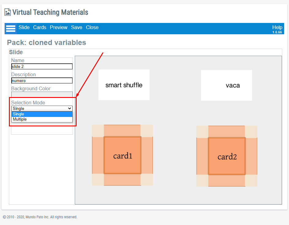
NOTE: The default response for this feature is Single.
Single Selection Mode |
Clients are able to select only one card/response at a time. For example, when having clients match, there is only one option to match to. Therefore, you would want this activity to be in single select mode.
|
Multiple Selection Mode |
This new feature allows clients to select more than one card/response at a time. This is particularly helpful for activities in which you want to select multiple cards at once. |
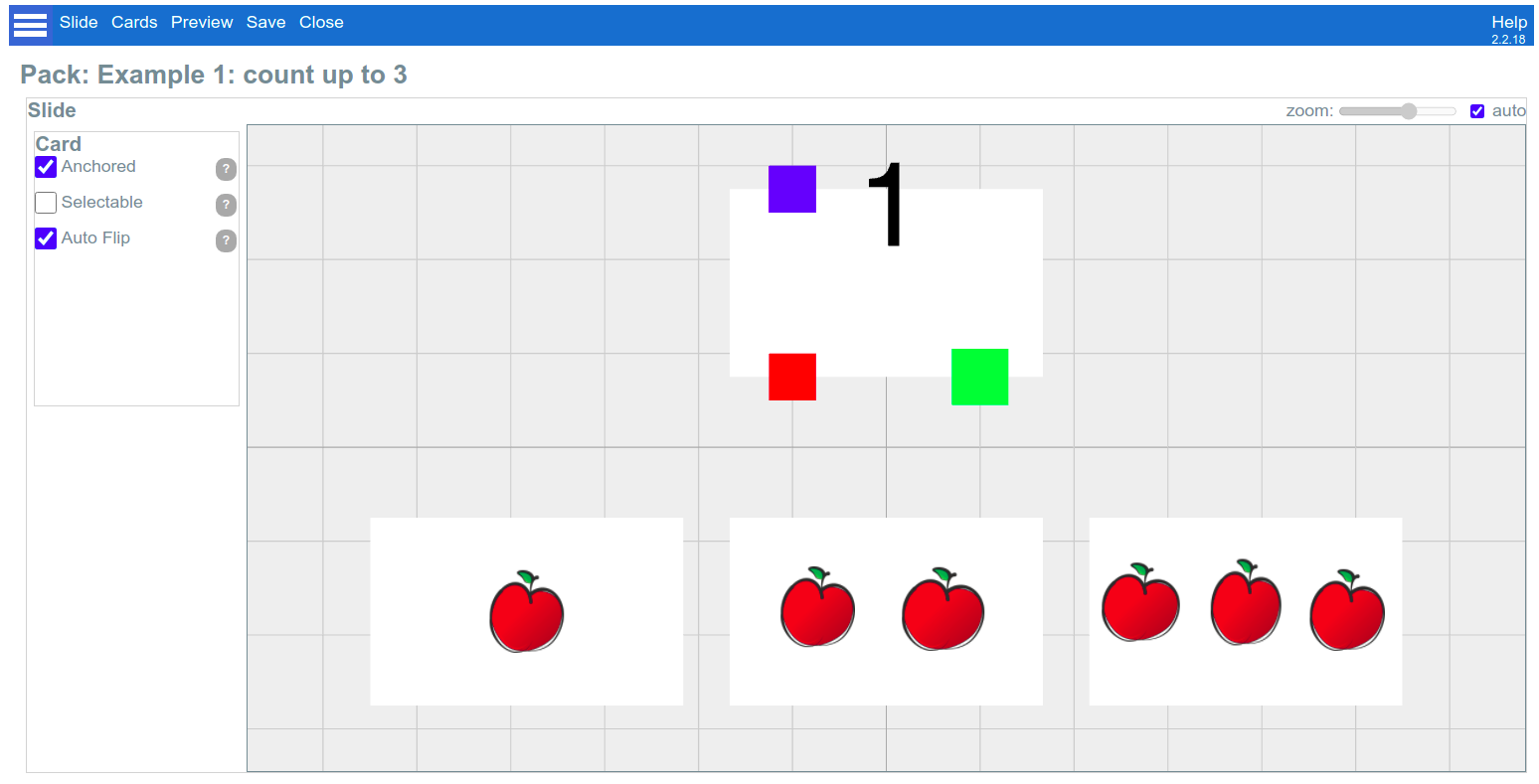
│ Selectable Feature
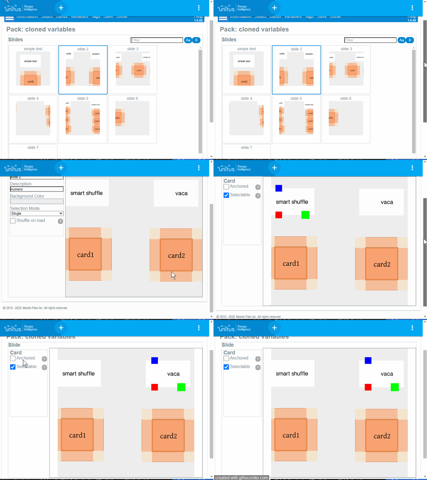
This feature allows you to select which Cards or Random Cards can be selected during the remote session. In the slide editor, when you select a card, the option will be available in the left menu (see the gif below for a demonstration)
│ Auto Flip
If a card has the Auto Flip option checked, then it will flip automatically when touched during a session.
│ Manual Data Capture
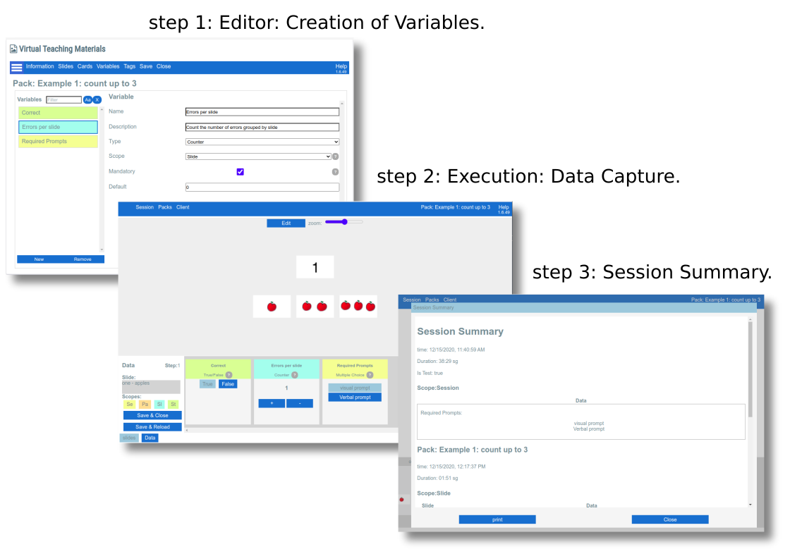
You are able to collect data directly on your computer screen during local and remote sessions. You can track overall session data, data for an entire pack, data per slide, and data per step. Once your session is complete, a full data summary is automatically generated. You can easily print or save it as a PDF document. Add Variables to a pack to enable this feature.
│ Variables
Add Variables to a pack to enable the ability to capture data (e.g. correct or incorrect responses, or frequency of response) during the execution of a session. With Variables, session data will be displayed at the end of a session in a summary report for the host to save to their device, print or download.
There are different types of variables (“data types”), like “simple choice” or “true/false”, each one with its particular configuration.
While editing a Pack, you can create as many variables as you need; therefore, these variables will be available for manual data recording during the execution of a session.
At the end of the session, a report is made available to you, with a detailed summary of the session’s activity: packs loaded, slides opened, time spent in each one, and the values recorded for each variable.
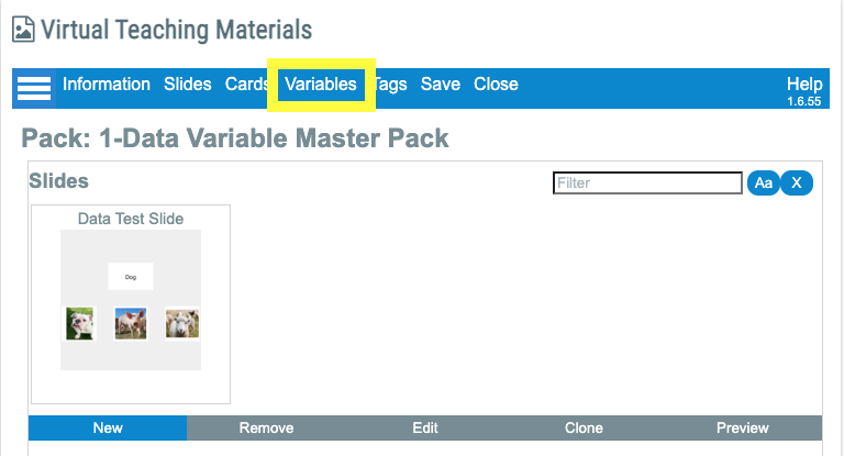
When you open a Pack, you will find an additional option called Variables added to the top on the blue bar. This is where you will create, import, and manage data.
Once you set up variables within a pack, you will be able to copy them by importing from one pack to another. This is explained in detail under Importing Variables.
By creating various combinations of data types with different scopes, you will be able to take data on just about anything you can imagine. However, in order to effectively learn how to create new data variables, you must first develop a clear understanding of all of the components and options available to you.
│ Create variables
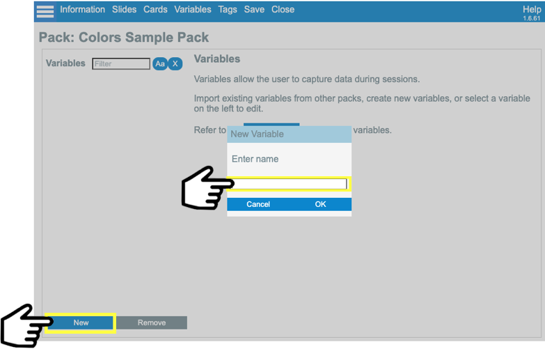
To create a new variable, select and open your Master Data pack.
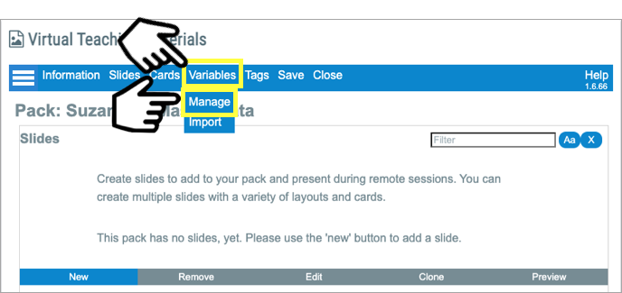
Click on Variables then Manage.
Select New, and enter the name “Test” or “Example Variable” in the name field.
You should now see the default variable screen which looks like this:
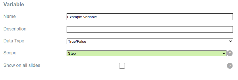
You can name your variables anything you want, but you cannot use the same name twice within a pack.
│ Common variables properties
Based on its type, each variable has specific properties. But all they share the following standard set of properties:
Property |
Description |
Name |
The name of the variable. |
Description |
Short description of the variable expected usage. |
Data Type |
The following types of data are available:
For more details, please see the section Types of Variables . |
Scope |
This property changes how the variables remember values during the session and how the data is displayed in the report. There are four scopes:
For more details, please see section scopes . |
|
A checkbox (available for “Slide” and “Step” scopes) that determines if a variable is displayed by default on all slides.
|
│ Types of variables (Data Types)
│ Data Type “True/False” Example:
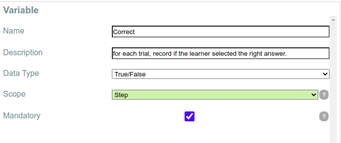
Sample Configuration: |
|
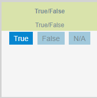
What it looks like in Execution: |
|
│ Data Type “Timer” Example:
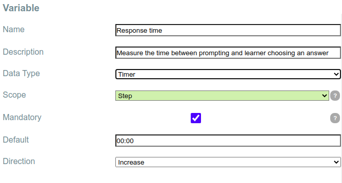
Sample Configuration: |
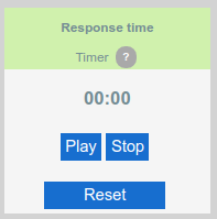
Default: Time in minutes and seconds that will set the starting value of the timer By default, it is 00:00 Direction: I ndicates if the timer counts the time upwards or downwards. It may be “increase” or “decrease”.
|
What it looks like in Execution: |
|
│ Data Type “Counter” Example:
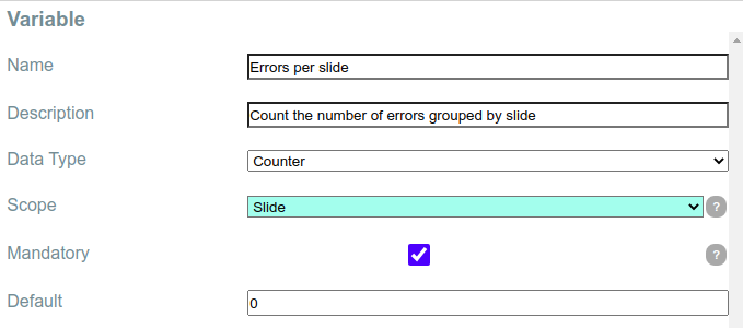
Sample Configuration: |
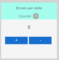
(“Default” is the initial value of the counter. The default setting is “0”) |
What it looks like in Execution: |
|
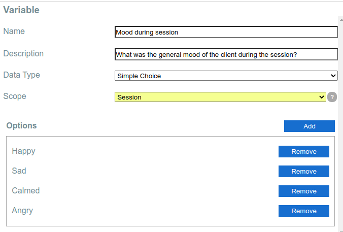
│ Data Type “Simple Choice” Example:
Sample Configuration: |
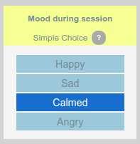
Options : List of labels that the user will be able to select throughout the session. During execution, only one option can be selected each time.
|
What it looks like in Execution: |
|
│ Data Type “Multiple Choice” Example:
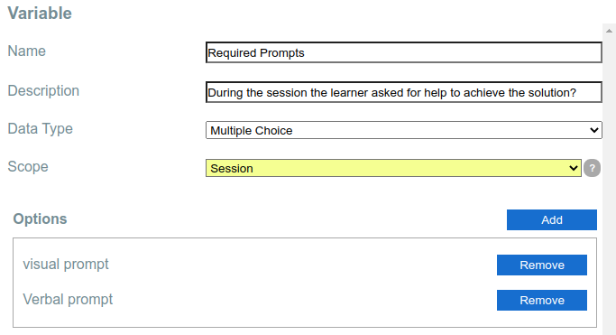
Sample Configuration: |
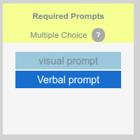
Options : List of labels that the user will be able to record throughout the session. During execution, multiple options can be selected each time. |
What it looks like in Execution: |
|
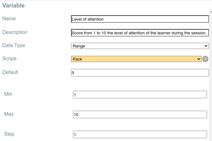
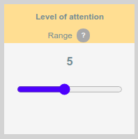
│ Data Type “Range” Example:
Sample Configuration: |
|
What it looks like in Execution: |
|
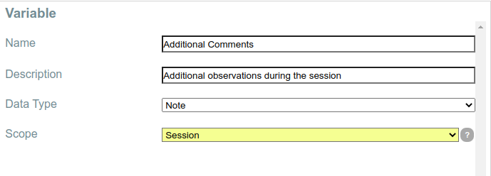
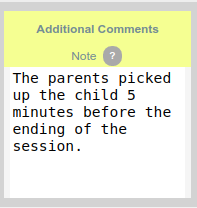
│ Data Type “Note” Example:
Sample Configuration |
|
What it looks like in Execution: |
|
│ Scopes
The scope is a Variable property that affects its behavior during the session execution. Specifically, the property sets how many times you can record different values for the same variable, and presents the results in the final session execution report.
There are four scopes: Session, Pack, Slide, and Step.
“Slide” and “Step” scopes are optional. To use them, you have two options:
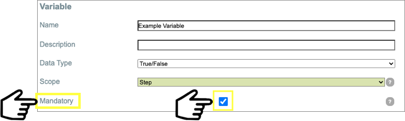
- By checking the “mandatory” checkbox, you will set the variable in all the slides.
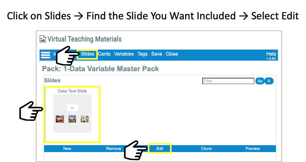
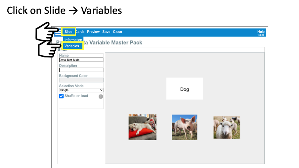
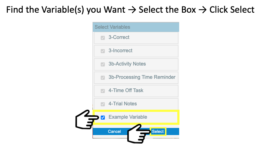
- Open the specific slides where you want to use the variable, and include it through the “variables” menu on each slide.
Each scope has a distinctive color that is used both in the editor and in the session player.
Scope “Session” |
A variable in this scope can hold a single value for the whole session. If you change the data value, the new data value will override the previous.
Intended usage: collect general data at the session level, like: “mood during the session”, “initial comments”, etc. |
Scope “Pack” |
Similar to the Session variable but keeps different data values for each pack loaded during the session.
Use this scope if you plan to open different packs during the same session and like to keep different data records per pack. |
Scope “Slide” |
Keeps values per slide. It means that you can load the same slide multiple times and keep a single data value per slide.
Intended usage: Use it when you want to record data related to the slide as a whole, no matter how many times you loaded it. Example: “Prompts required per slide”. |
Scope “Step” |
This scope is the most detailed. It will report a different data value each time you load a slide. If the same slide is loaded multiple times, multiple data values can be recorded.
Intended usage: per-step information, like “goal achieved”. |
│ Import Variables
You can import variables from a published pack. To import variables, follow the steps below.
- Open your Data Master pack and click on Variables then Import.
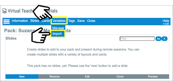
- Find the Styer-Fitzgerald Data Starter Pack and Select.
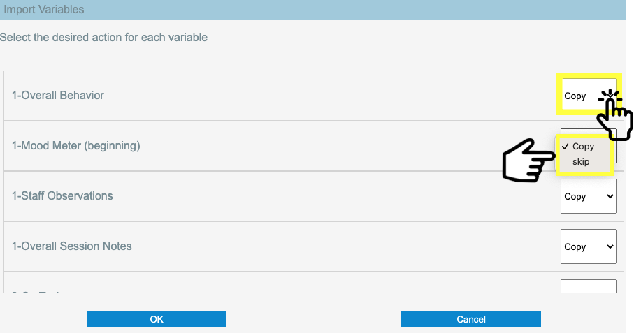
- You will find that all new variables default to Copy. If there are any data variables you do not wish to add, click Skip.
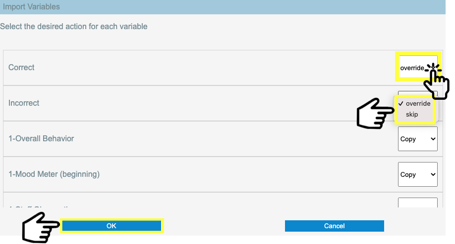
If you have named a variable the same name as one in the starter pack, the default for that variable will be Override. If you wish to replace that variable, leave it as Override. If you want to keep the variable you created, change it to Skip which will keep your variable instead of the one from the master pack. Or, if you want to keep both variables, cancel the import, rename your variable to something different, and restart the import process. Once you have skipped the variables you do not wish to add and/or the ones you do not want to change, click Ok.
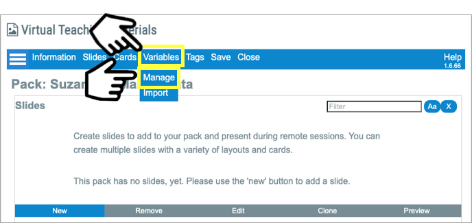
- You are now back to the pack’s main screen. Click on Variables then Manage.
- You should now be looking at all of the imported variables as well as any previous variables you added manually. Scroll up and down to view all of them. Your screen may look different than the example below depending on how you named your variables.
Once variables used to collect data are imported into a pack, they become independent and can be modified and individualized as desired
│ Macros
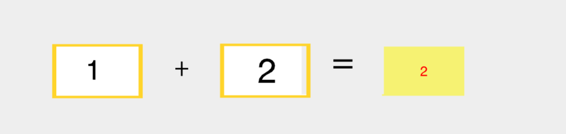
You can program cards to show a calculated number based on the card’s selection during the remote session. The card can display either the sum of their value or the count of cards selected during the remote session.
│ COUNT MACRO
|
||
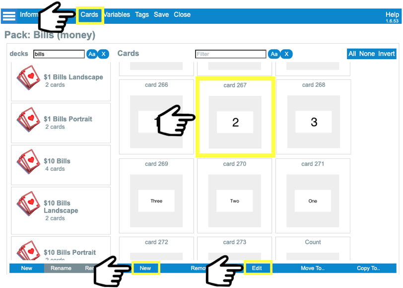
Create a new card or edit an existing card |
In your pack, go to the Cards tab, select “New” at the blue bar in the button or select the card you want to edit and select “Edit” |
|
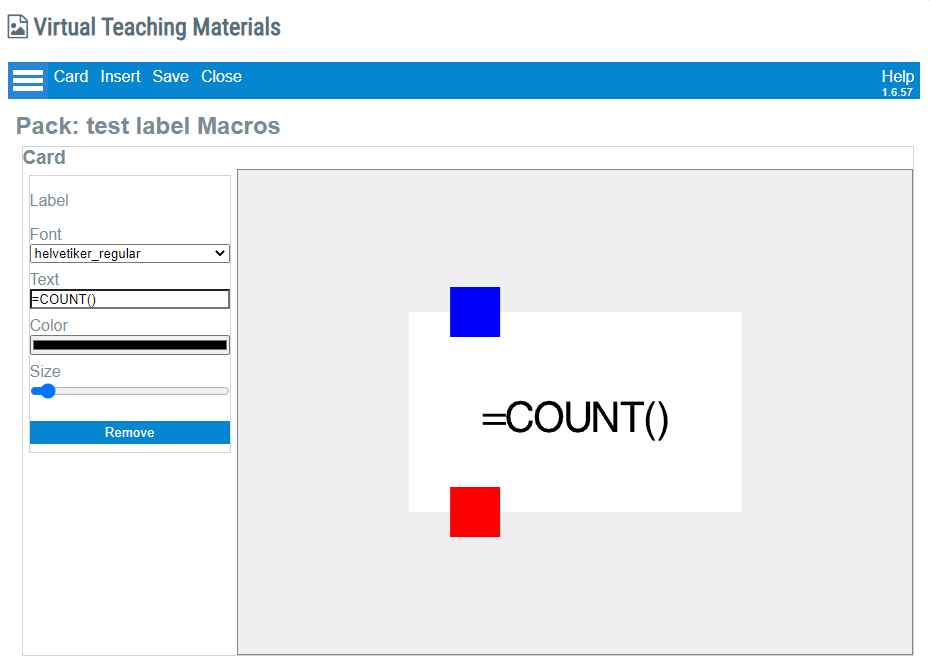
1. Card Configuration |
Create a card with the value “=COUNT()”. It is case-sensitive, so make sure you are writing it all in uppercase. |
|
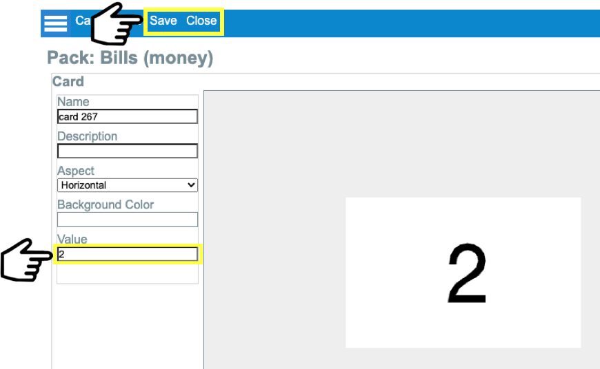
2. Value Configuration |
Go into cards, select a card, in the left menu bar you will fill the property “value” with the number that the selected card will add up. Save and close. |
|
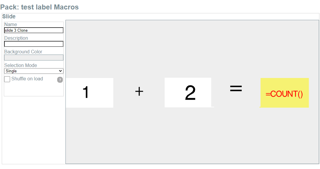
3. Slide Configuration |
In the slide, enable “selectable” in all the card’s properties that you will want to count. |
|
4. Execution |
In the remote session, select the selectable cards and see the count in the card where you set the count macro.
|
|
│ SUM MACRO |
||
1. Card configuration |
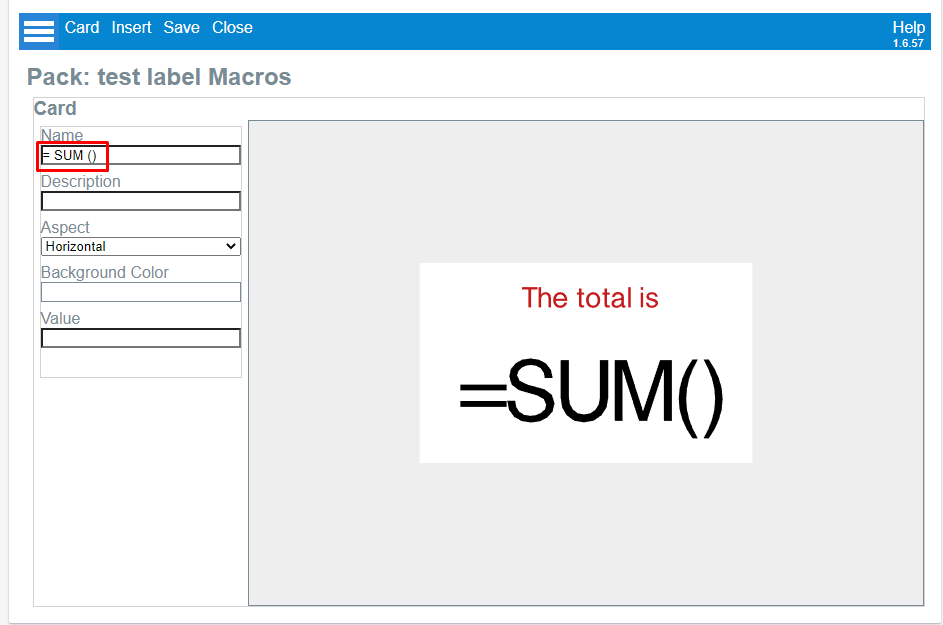
Create a card with the value “=SUM()”. It is case-sensitive, so make sure you are writing it all in caps. |
|
2. Value configuration |
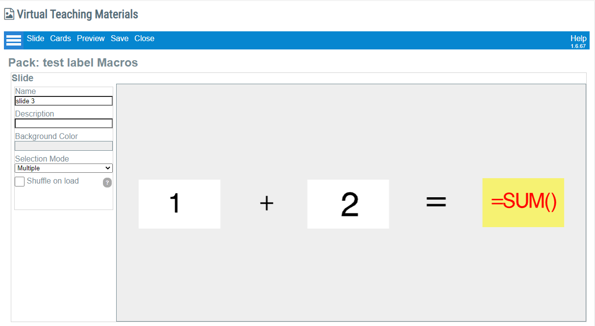
In the slide, select a card, in the left menu bar you will fill the property “value” with the number that the selected card will add up. Save and close.
|
|
3. Selection mode |
In Selection Mode, set Multiple |
|
4. Slide Configuration |
In the slide, enable “selectable” in all the cards properties that you will want to sum. |
|
5. Execution |
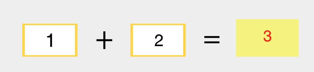
In the session, the card with the Sum macro will display the values of the cards added. |
|
│ Overriding Card Values in Slides
As described in the previous section, a card can be associated with a custom value. This is good if you expect to use the card always in the same way in all your slides, but what happens when you use the card in different slides, and you need the value in one slide to be different to the other slide?
The solution is to override the value of the card in each slide.
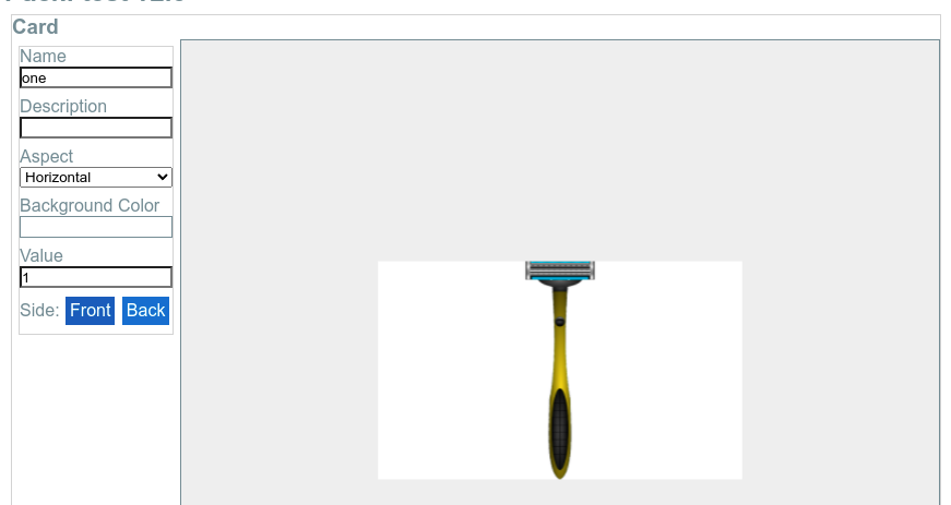
The following example presents a Card in the Card Editor. We can see that the value was set as “1”:
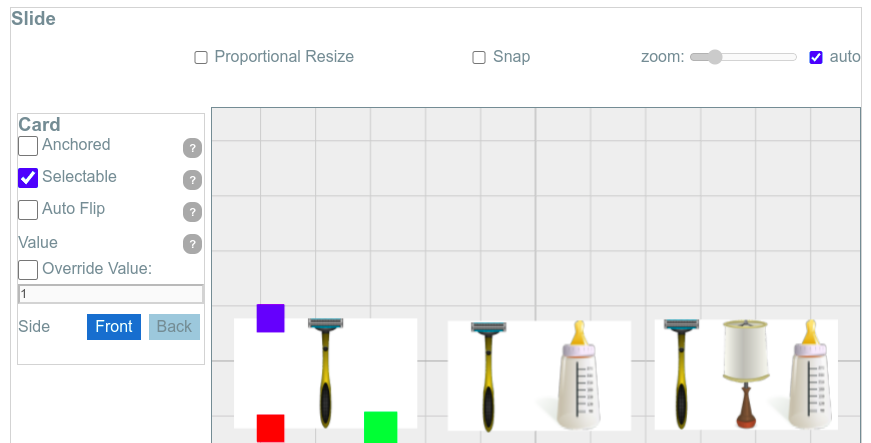
When we insert this Card into a Slide, by default the value will be that of the Card (“1”):
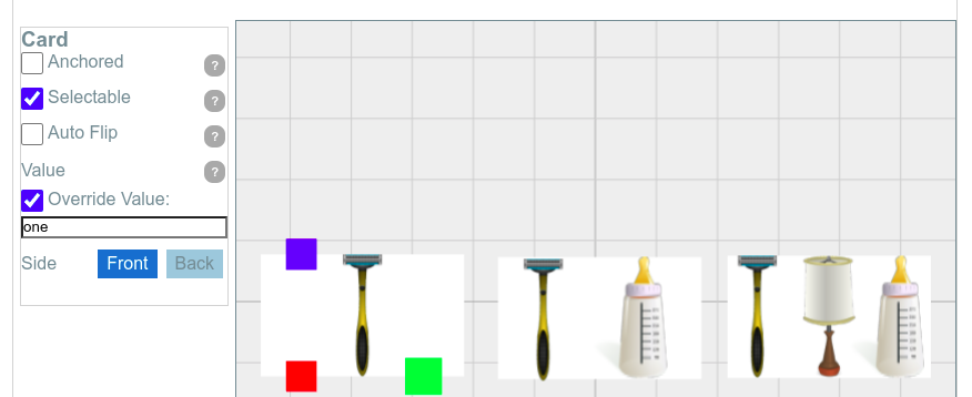
But we can check the “Override Value” checkbox and type something different (in this example, it is the word “one”). Notice that this new value will only have effect in this particular slide.
Override Value in Random Cards
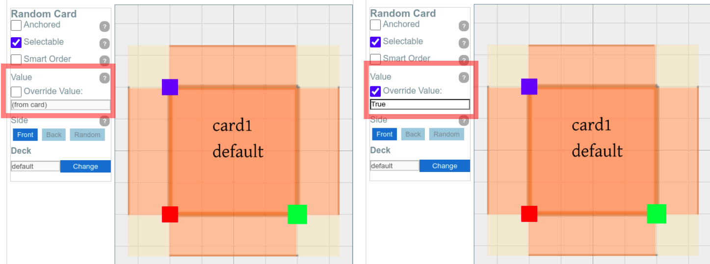
Similar to override values for specific cards, you can also override the value for a random card.
The procedure is the same, and in this case, it doesn’t matter what card is picked by the random card when the slide is loaded, the reported value will be the one defined for the Random Card and not the values coming with each Card:
│ Widgets
Widgets are interactive objects that extend the slide’s functionality by introducing new features like interactive data taking, animations, and more.
They are similar to the Cards because they are created in a Pack, outside any Slide, and you can insert them in as many slides as you want.
You can find the Menu “Widgets” next to “Cards” when you are editing a Pack:

Currently, the only available widget is the Interactive Wheel.
│ Interactive Wheels (Widget)
The Interactive Wheel Widget is a pie chart whose slices may be labeled and assigned to custom values.
- Wheels can be linked to Variables to implement Automatic Data Capture : Each time the selected options in the Wheel change, the associated variable value will be updated automatically.
- Wheels react to both screens during a Remote Session, allowing clients to capture data without master intervention.
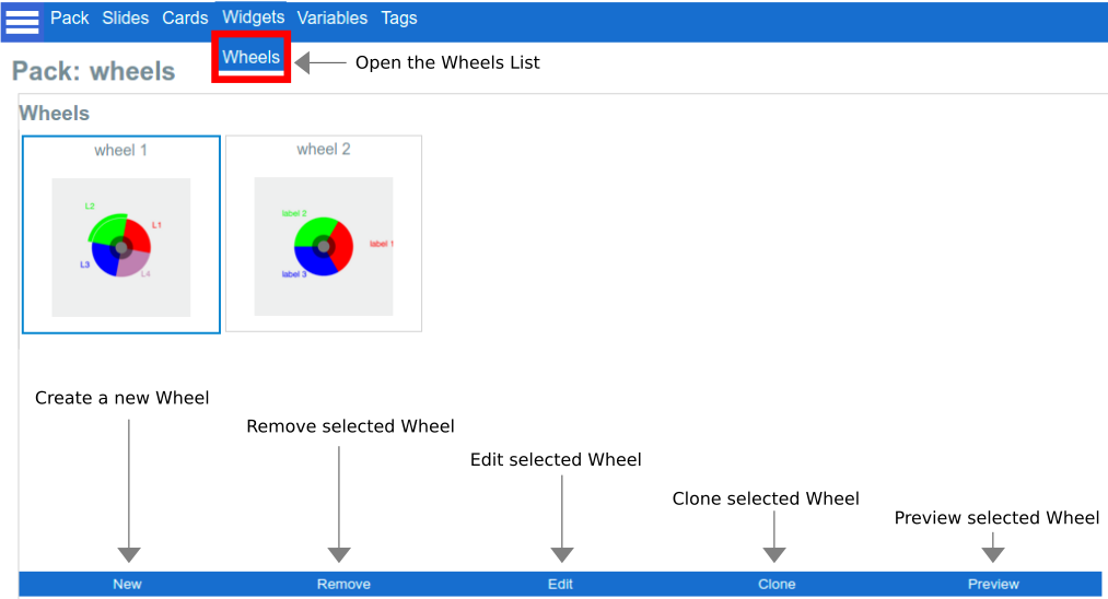
│ Editing a wheel
Newly created wheels have three default options at a single level, but right after you have created a new Wheel or select “Edit” an existing Wheel. The Wheel Editor screen will allow you to configure all the aspects of your Wheel:
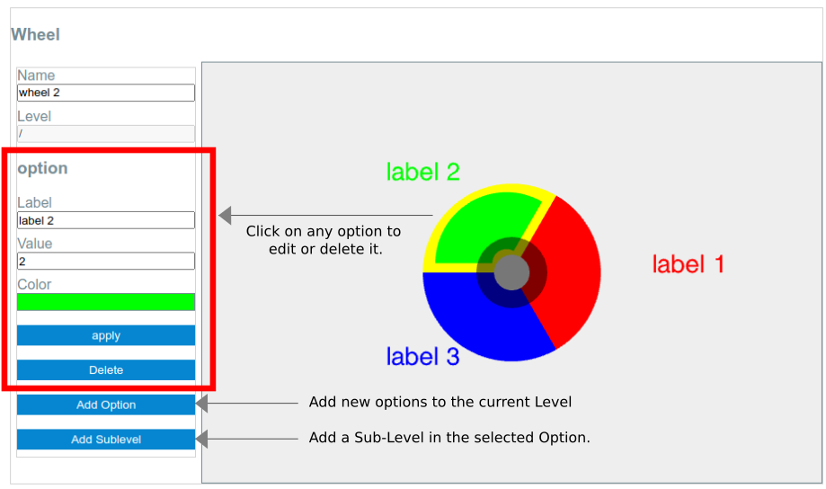
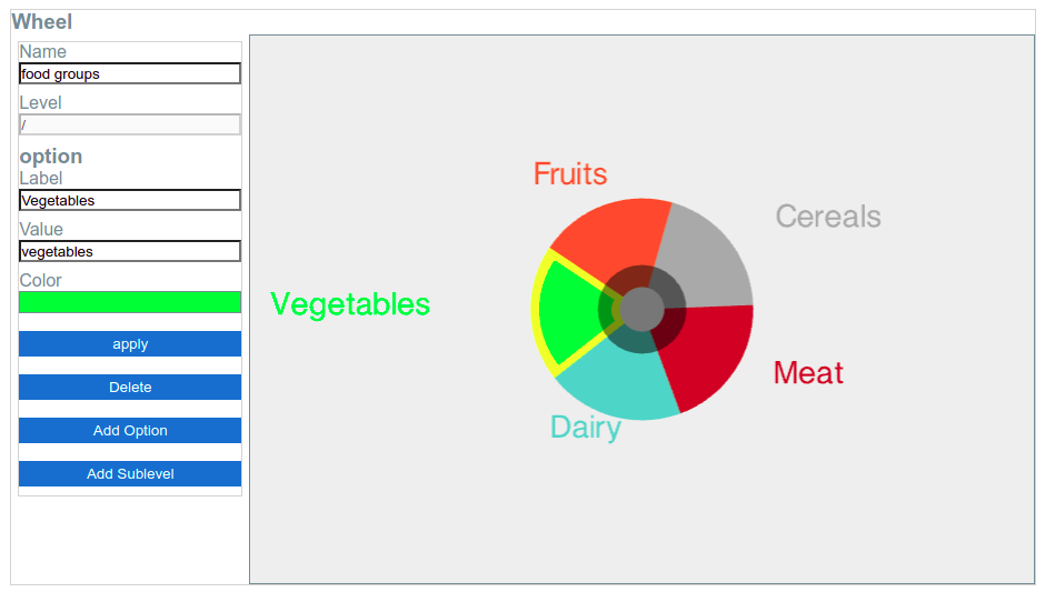
In the example below, we configured the wheel to represent the different Food Groups. Then, we applied the next steps to the Wheel:
- Click on the slice to select it.
- Change the label.
- Change the value (this is the value that the system will store during the Data Capture).
- Change the Color.
- Press “Apply” to see the changes in the Wheel.
- Select the next option.
As we only had three default options, we had to add two additional options:
- Click on the button “Add Option”
- Type the name of the new option.
- Edit the Label, Value, and Color as for the default options.
│ Adding Sublevels
Any Option can have a child wheel (Sublevel). Once you have added a Sublevel, the parent option will display a sublevel indicator (an additional colored segment) to indicate the presence of nested options.
By clicking on the sublevel indicator, the editor will display the new sublevel, and by clicking in the center of the wheel, you will go back to the previous level (like a “back” button):
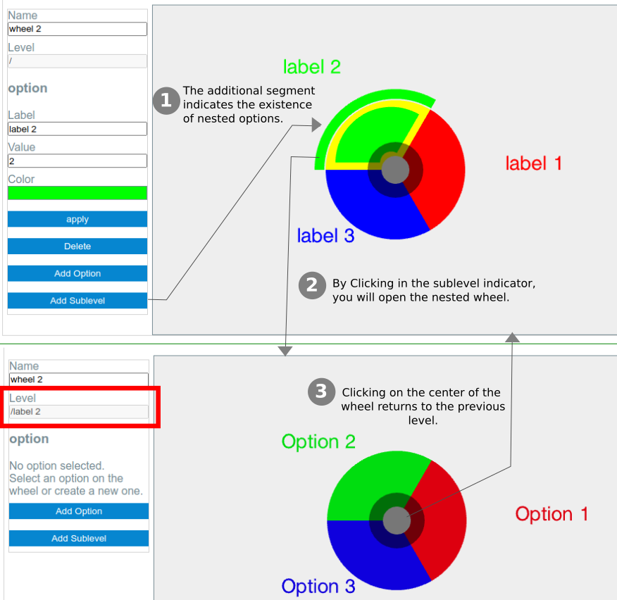
In the previous picture, at step 1, a new sublevel was added to “Label 2”, as indicated by the presence of the green arc. By clicking on it, we can see the sublevel just created (step 2). Notice that the level changed from “/” to “/label 2” (highlighted in a red rectangle): this helps to know what level we are currently looking at.
│ Using Wheels on Slides
Just like Cards, you can add Wheels to Slides. In addition, you can add multiple wheels in the same slide, mix wheels and cards and use the same wheel in various slides.
In this example, we want to create a slide with a Card and a Wheel. The idea is that the client should select in the wheel the food group that matches the picture on the Card.
- We start by creating a new slide with a single card; then we move it to the left to make room for the Wheel (You may need to disable the auto-zoom if not, the system will always place at the center):
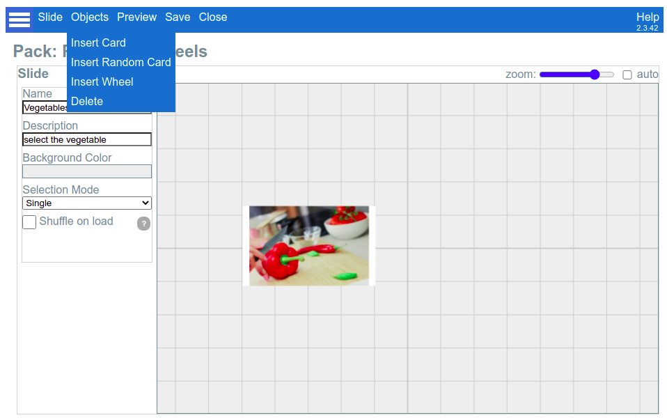
- In the “Objects” menu, we select “Insert Wheel”, and then we choose the “Food Groups” Wheel that we created in the previous section:
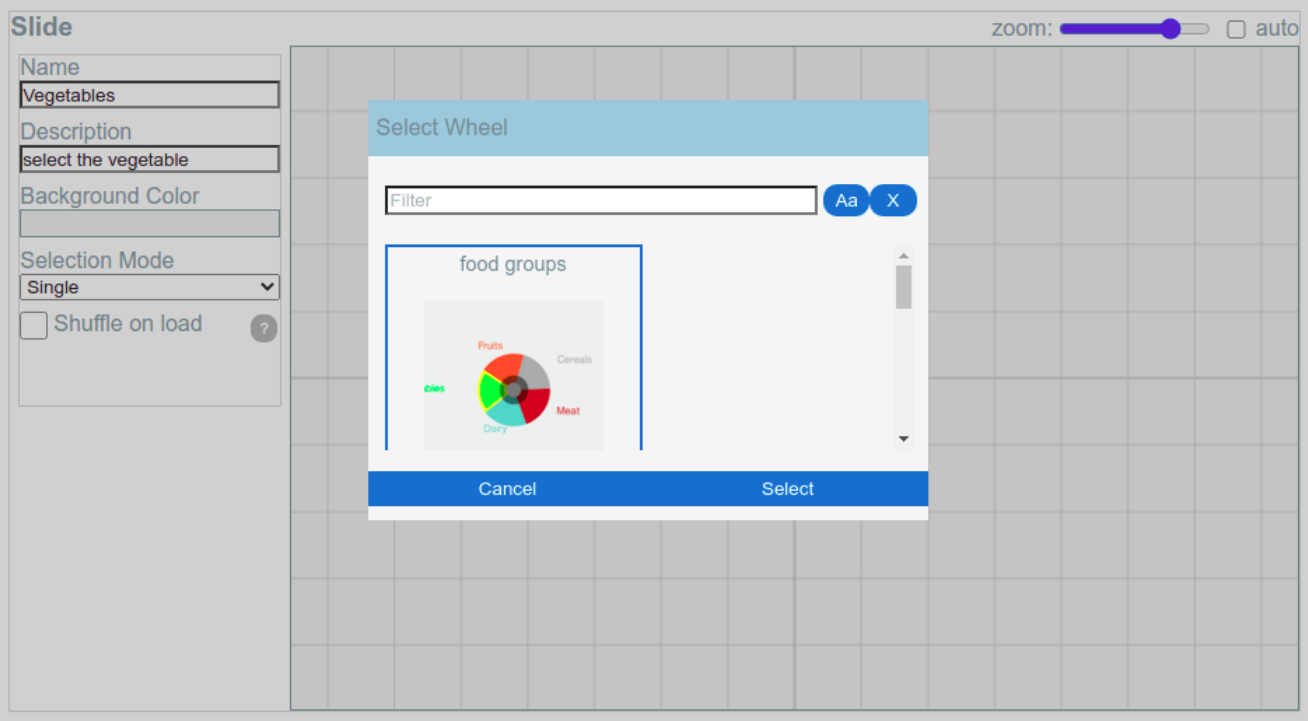
- The wheel appears in the center, so that it may overlap the card. The same as cards, we can click on it and use the red square controller to move it to the right side of the slide (It is OK to use auto-zoom again, so both the card and the wheel will occupy the whole area):
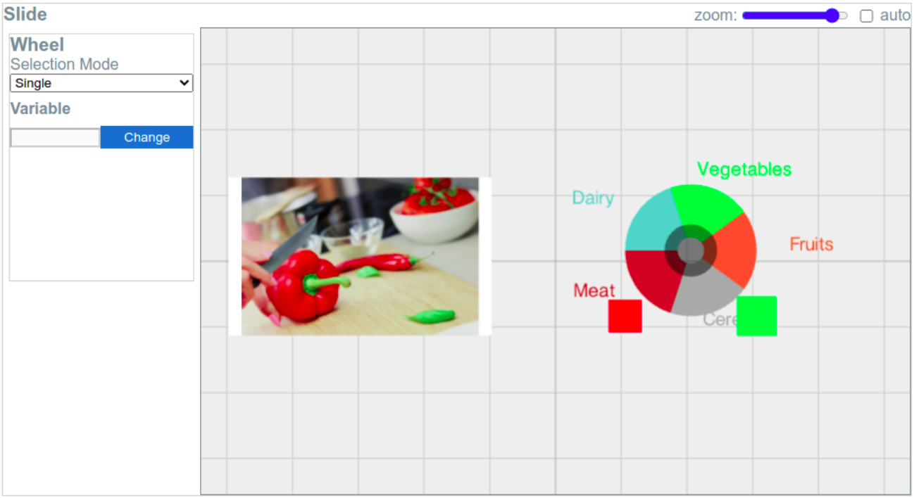
Notice that you can configure two options when using a Wheel in a Slide (see the previous picture): the Selection Mode and the Variable.
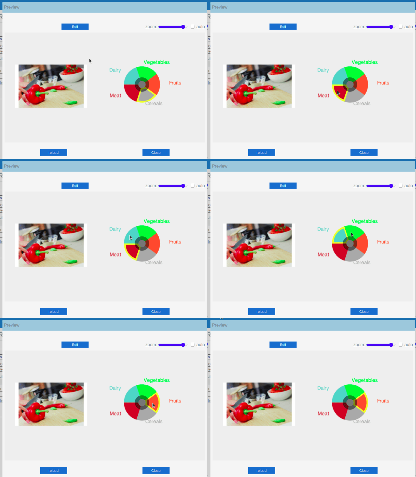
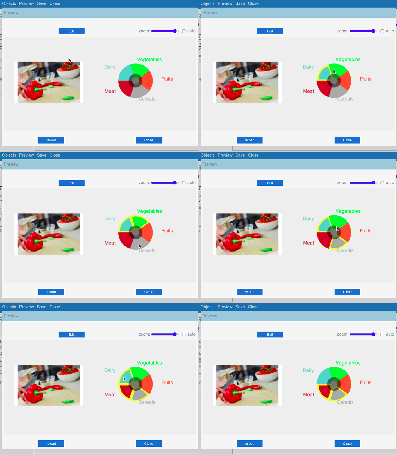
The selection mode indicates if the Wheel should allow multiple options to be selected simultaneously or just one. When “Single Mode” is enabled, clicking on another option will deselect the previous one during the session. In “Multiple Mode”, clicking in other options will select the new options too. Clicking in a selected option will unselect it:
Wheel with Single-Selection Mode: |
Wheel with Multiple Selection mode: |
|
|
│ Using Wheels for Automatic Data Capture
Wheels become really useful when you combine them with Variables. By doing so, you can implement Automatic Data Capture in your slides.
There are six types of Variables that can be used in combination with a Wheel (Boolean, Counter, Note, Range, Single Option, Multiple Options), and their behavior will change depending on the selection mode of the wheel (Single Selection, Multiple Selection).
The selection of the proper type of Variable depends on what kind of data you want to capture in the slide. We are going to present two different cases based on the “Food Group” example, and after that, present a summary of all the possible use cases.
│ Case 1: Recording the selected option in a Note.
When we first created the “Food Group” Wheel, we defined the “value” of each option to be the same as the “label” (but in lowercase, just to highlight that they are different things).
This arrangement is good if what you want is just to keep a track of what option was selected by the client.
To better understand the difference between “Label” and “Value”, just keep in mind that “Label” is what the client sees, and the value is a hidden text or number that will be displayed in the final report.
Step 1: Create a Variable
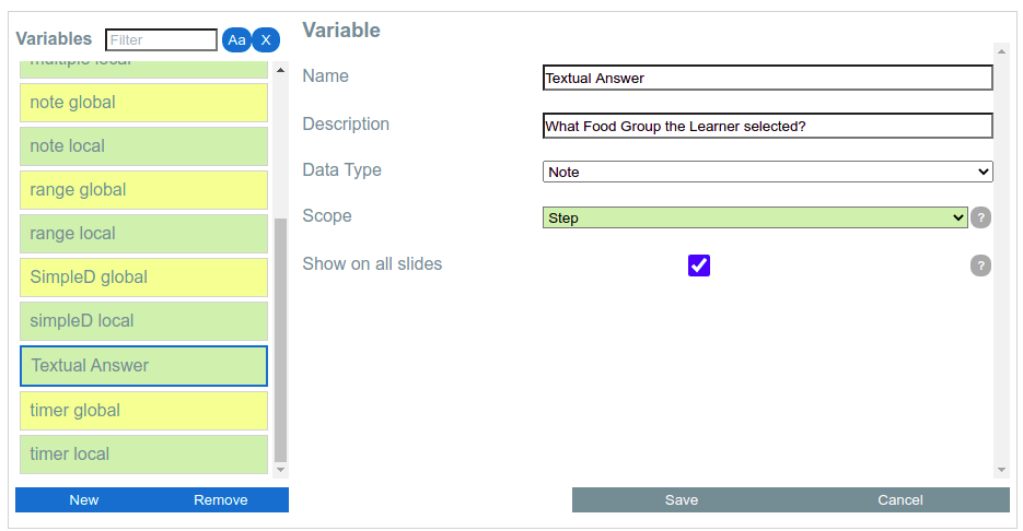
We should leave the Slide Editor for a while and visit the Pack’s Variables screen. There, we create a new Variable called “Textual Answer” with data type “Note” (as we want just to store whatever says in our wheel’s options value attribute) and select Scope = “Step”, “Show on all slides” = checked, because we want it to be used in all slides, with different answers reported per displayed slide:
Step 2: Link the variable to the Wheel
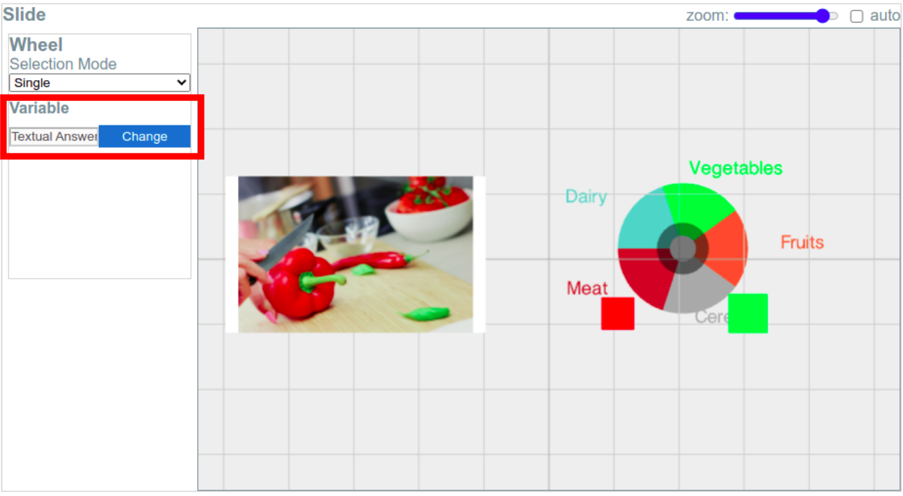
We go back to our slide, select the wheel and in the “Variable” option, we select “Textual Answer”. Now The Variable and the Wheel are linked, and selections made by the client or the user during a Session will be stored in the Variable, and displayed in the final report!
Step 3: Test in a Session
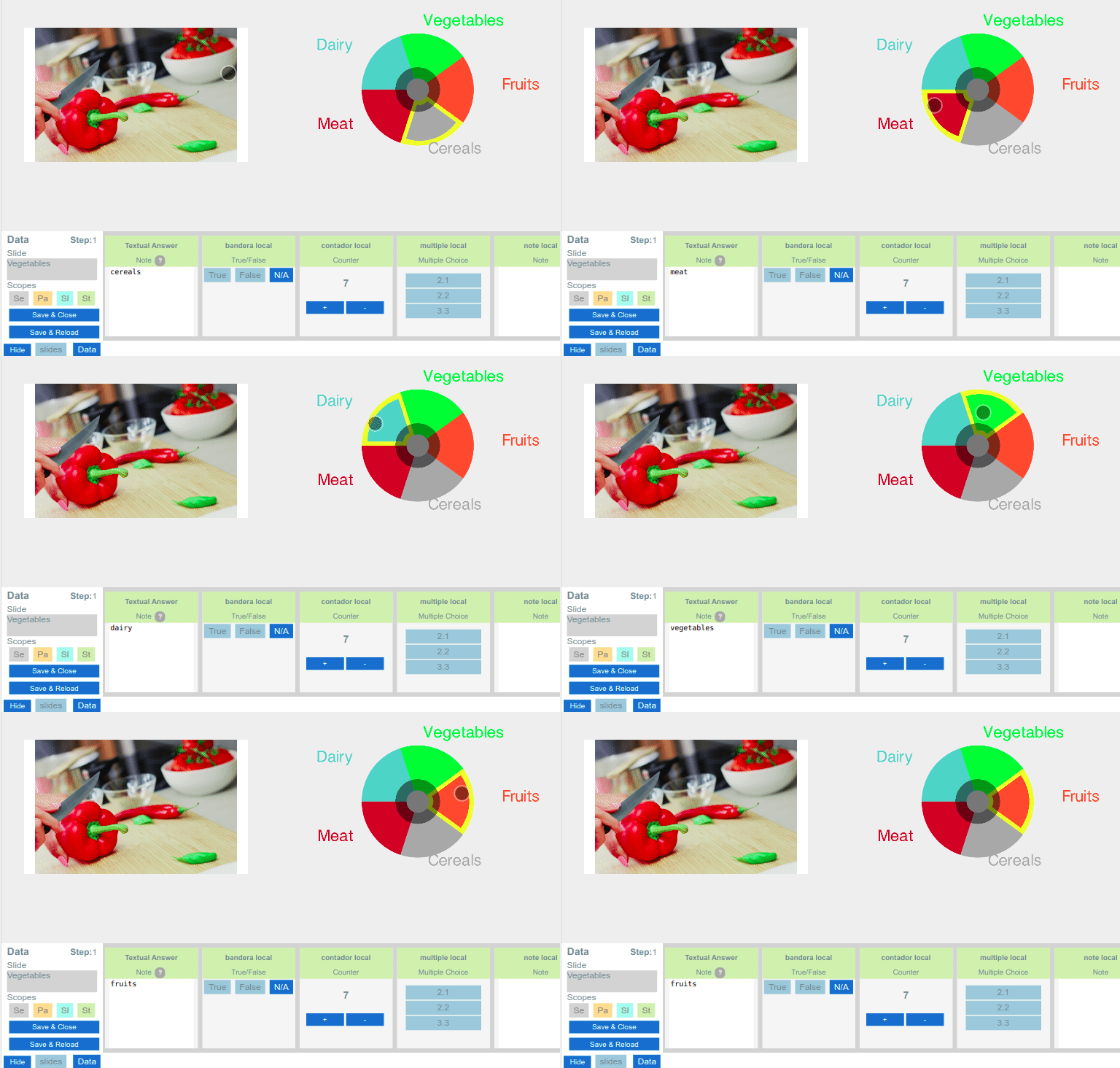
We run a Local Test Session to try the new functionality. Notice how the value in the data capture area changes every time the selected option in the wheel changes:
│ Case 2: Recording Success or Failure only
In this example, we are going to use a similar slide but with a different Variable Type: Boolean. We want to store just if the client selected the right or wrong option, and we are not really interested in recording what was the value selected.
We will clone both the Slide and the Wheel to keep the original example. These were the preliminary steps:
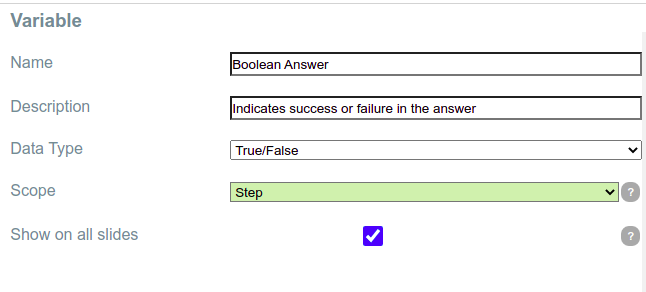
- Create a new Variable, called “Boolean Answer” of type “True/False”.
- Clone the Wheel “Food Groups” as “Food Groups Boolean”
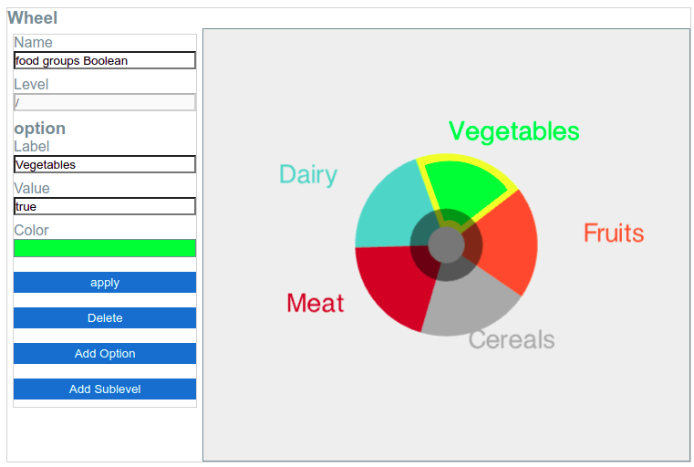
- Edit the cloned wheel: Change the value of the option “Vegetables” from “vegetables” to “true”.
- Clone the Slide “Food Groups” as “Food Groups Boolean”
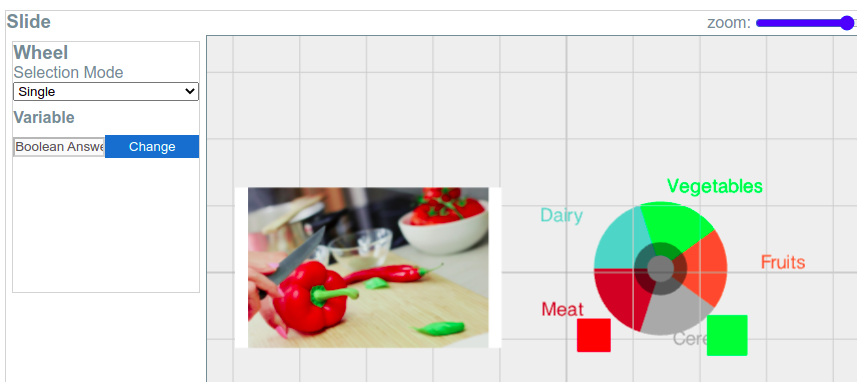
- Edit the cloned slide:
- Delete the wheel (should be the original one).
- Insert the new cloned wheel (“Food Groups Boolean”)
- Link the cloned wheel to the variable “Boolean Answer”
These are some screenshots illustrating some steps of the process:
Step 1: Creation of a new variable of type True/False.
Step 3: Changing the value of the option “Vegetables” to “true” in the cloned Wheel:
Step 5: Edition of the cloned slide. The Wheel had been replaced by the cloned one and linked to the new Variable:
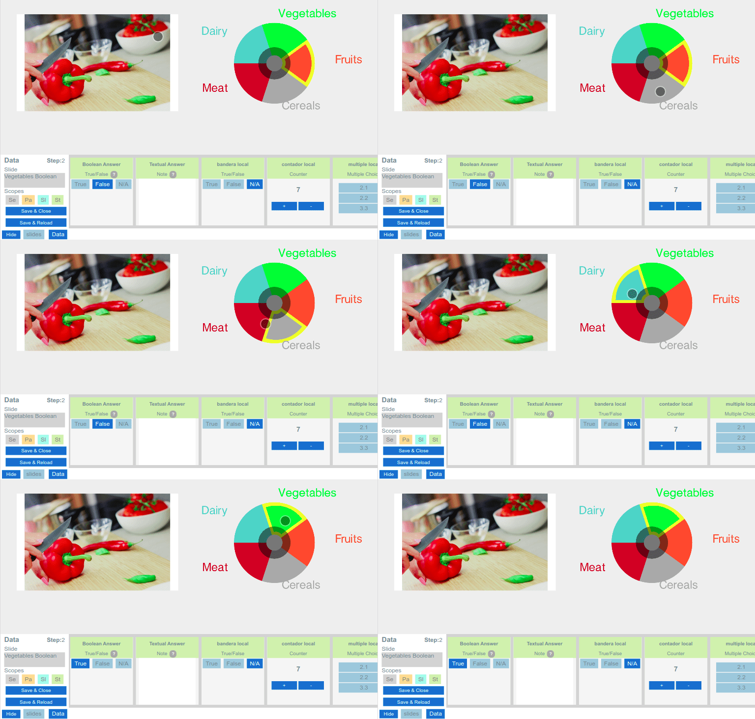
After applying all the previous changes, this is the final result. Notice that the Variable “Boolean Answer” only indicates “true” when “Vegetables” is selected. There is no need to change the values of the other options to “False” because the rule says that anything different from “true” will be treated as false.
│ Other cases for Automatic Data Capture with Wheels
In the previous sections (Case 1 and Case 2) We had explored the behavior of the Wheels when they are connected to the Automatic Data Capture system, first with a Text Note and finally with a True/False (Boolean) Variable.
There are other Variables that can be used, and the behavior may change depending if the linked wheel is in Single or Multiple Selection Mode.
The following table summarizes all the combinations:
Wheel’s Selection Mode |
Variable Type |
Expected Behavior |
Use Case |
Single |
True/False |
True if the selected option’s value is either “true” or “TRUE”, false in other cases. |
Indicate success or failure. |
Multiple |
True/False |
True if ALL the selected option’s values are either “true” or “TRUE”, false in any other case. |
Indicate Success or failure, should select all the right answers. |
Single |
Counter |
1 if there is one option selected, 0 if nothing is selected. (ignores values). |
|
Multiple |
Counter |
Number of selected options. (ignores values). |
|
Single |
Multiple |
Selects the Variable’s option that matches the Wheel’s selected option value. [1] |
|
Multiple |
Multiple |
Selects all the Variable’s options that match the Wheel’s selected options values. [1] |
|
Single |
Note |
Stores the value of the selected option. |
|
Multiple |
Note |
Stores a comma separated list of the values of the selected options. |
|
Single |
Range |
Selected option’s value, capped to Range limits. |
Allow the client to select a qualitative option, but store a quantitative value (Rubric). |
Multiple |
Range |
Addition of selected option’s values, capped to Range limits. |
Create a single score based on multiple selections from the client. |
Single |
Single |
Selects the Variable option that matches the Wheel’s selected option’s value. |
|
Multiple |
Single |
Selects any Variable’s option that matches some of the selected Wheel’s options values. |
|
Single |
Timer |
No effect. |
|
Multiple |
Timer |
No effect. |
|
[1] Notice that while the Wheel’s options store Labels and Values as separated fields, for Variables like Single Choice and Multiple Choice there is only one field. As they don’t have the concept of “Labels” the mapping is done between Variable’s values and Wheels options values.
│ Module II: Pictures

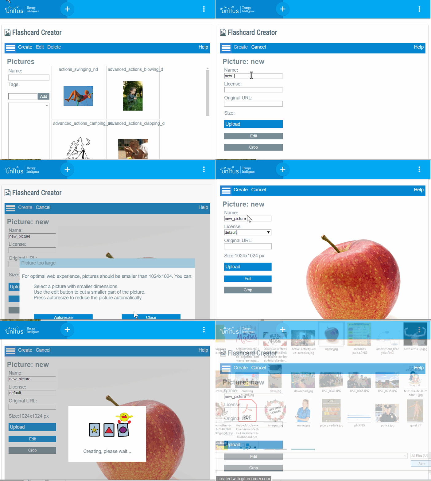
│ Create a new picture
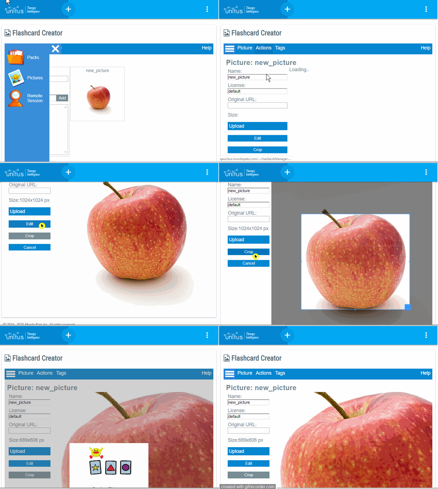
│ Crop a picture
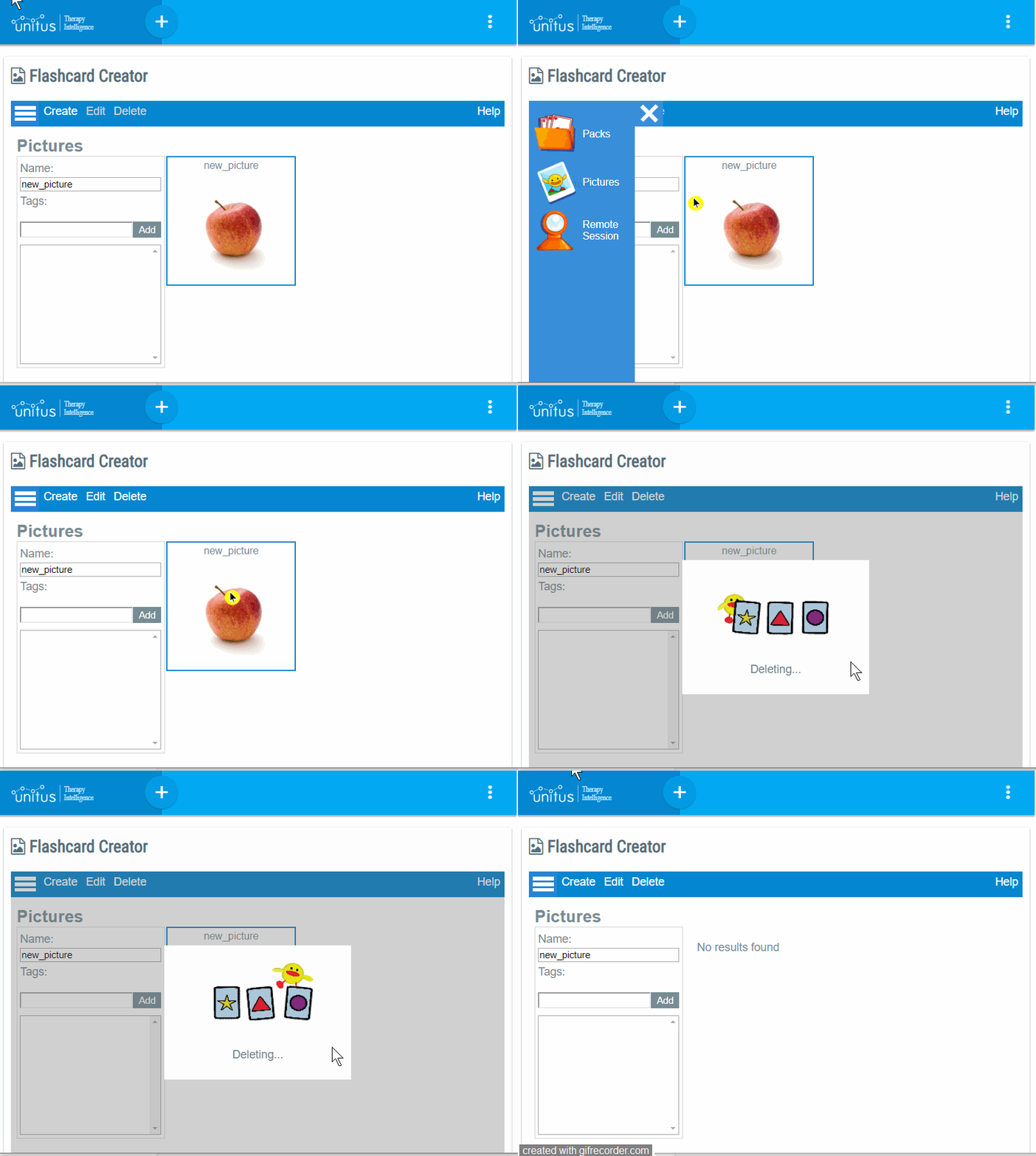
│ Delete a picture
│ Module III: Tags

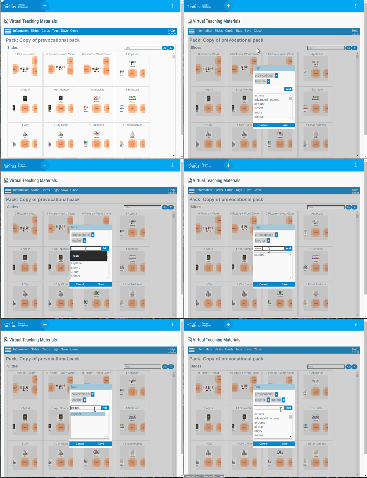
Tags can be added to packs and pictures to search for them easily in areas where a pack or a picture is selected.
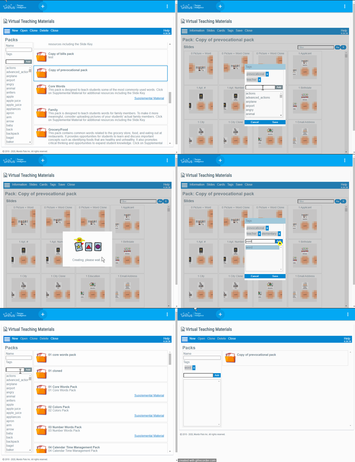
│ How to add a tag to a pack
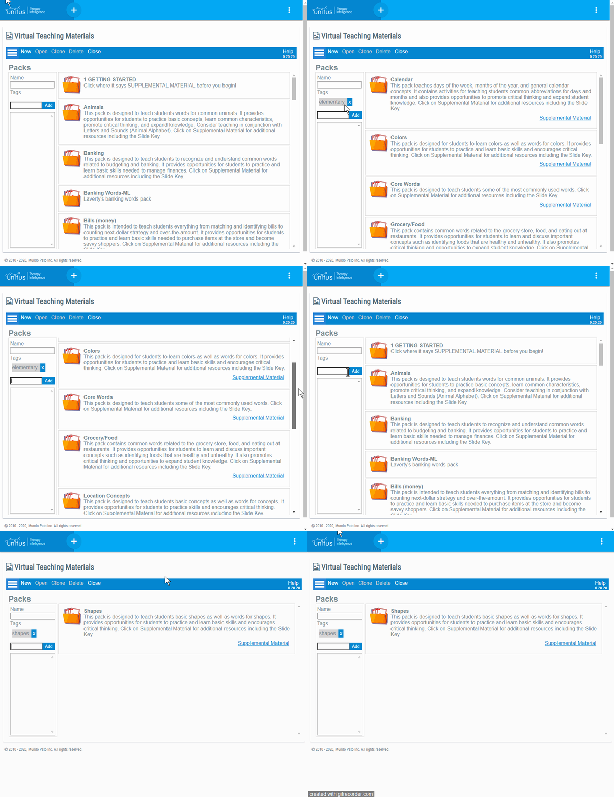
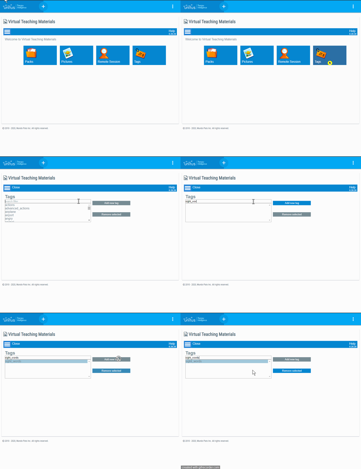
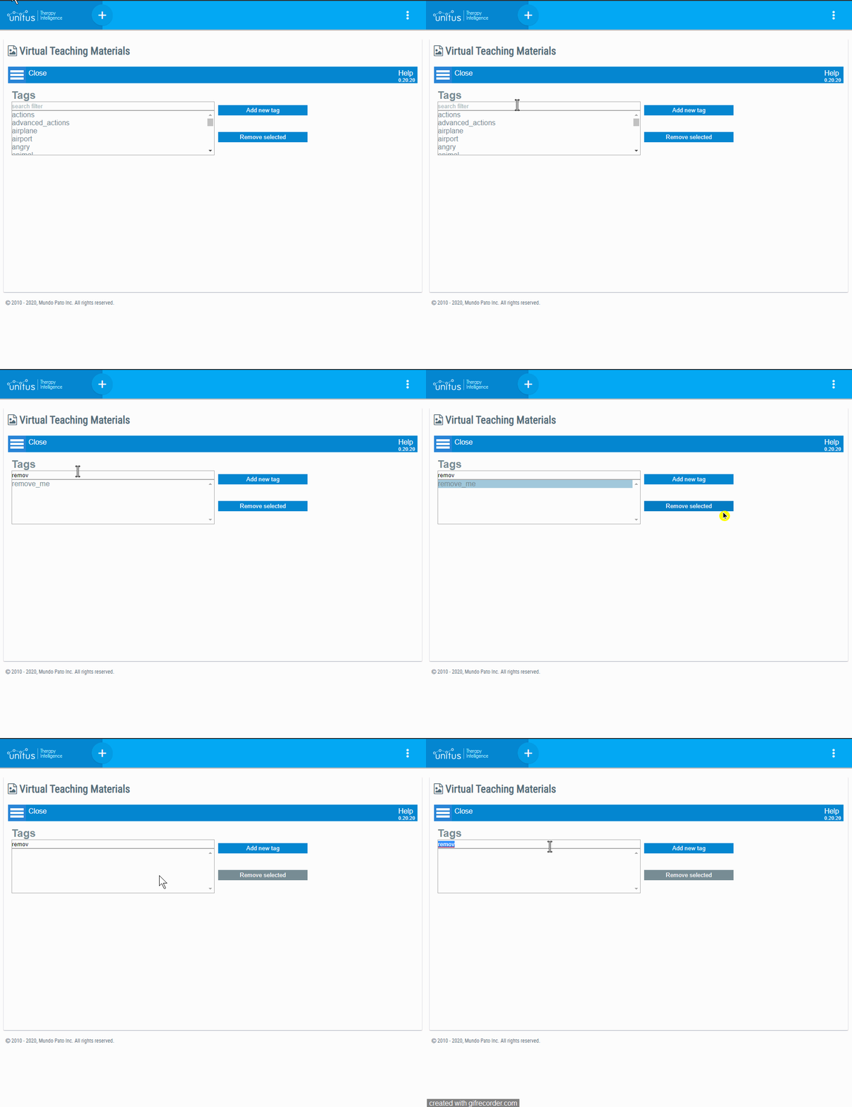
The example below shows you how to access the tag area, how to add a new tag, how to add an already created tag and how to search by tag in the pack library.
Please keep in mind that you can only add tags to the packs that are not published and that your role allows you to.
In the popup window for tags, while you are writing the tag word there is a list below of the available tags that you can use, if the tag that you want to add is not listed below hit enter and an alert message will ask for confirmation to create the new tag.
│ Areas where you can filter packs by tag
│ In the Pack library
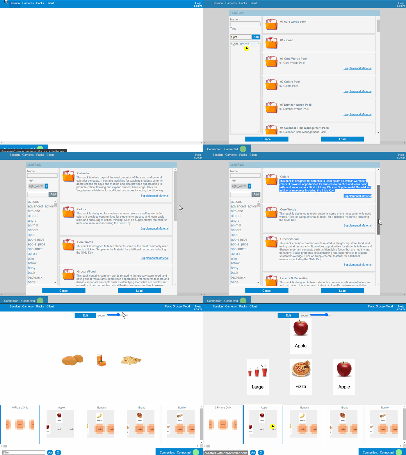
│ In the remote session
│ How to add a tag to a picture
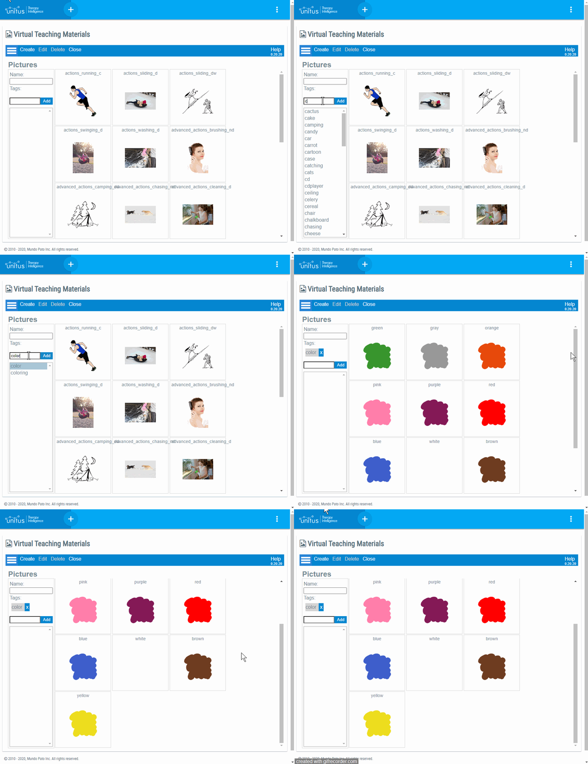
│ Areas where you can filter pictures by tag
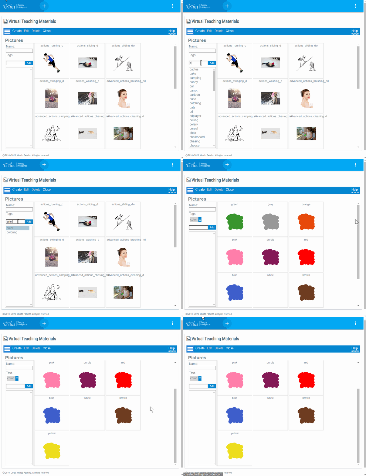
In the picture library
Adding pictures to a card
│ Create a new tag
│ Remove a tag
 │
Module IV: Integrating VM
│
Module IV: Integrating VM
Integration with Assessments
Slides in VM can be integrated directly into an assessment, so the selected slide will be loaded in the area right between the question and the answer.
The procedure to embed is as follows:
- In VM, open the pack that contains the slide that you want to embed.
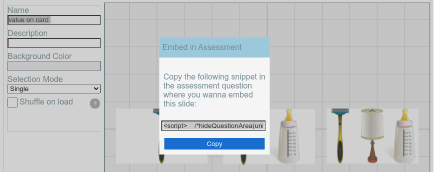
- Edit the slide, and select the menu option “Slide -> Embed into Assessment”:
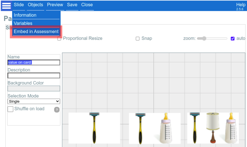
- Now a dialog with the option to Copy a snippet of code to the clipboard will be presented. Press the button. This is all that is needed in the VM side.
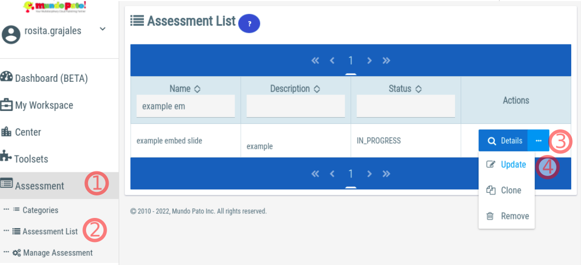
- Search for the Assessment where you want to embed the slide and open it for edition (this will close the VM Toolset screen):
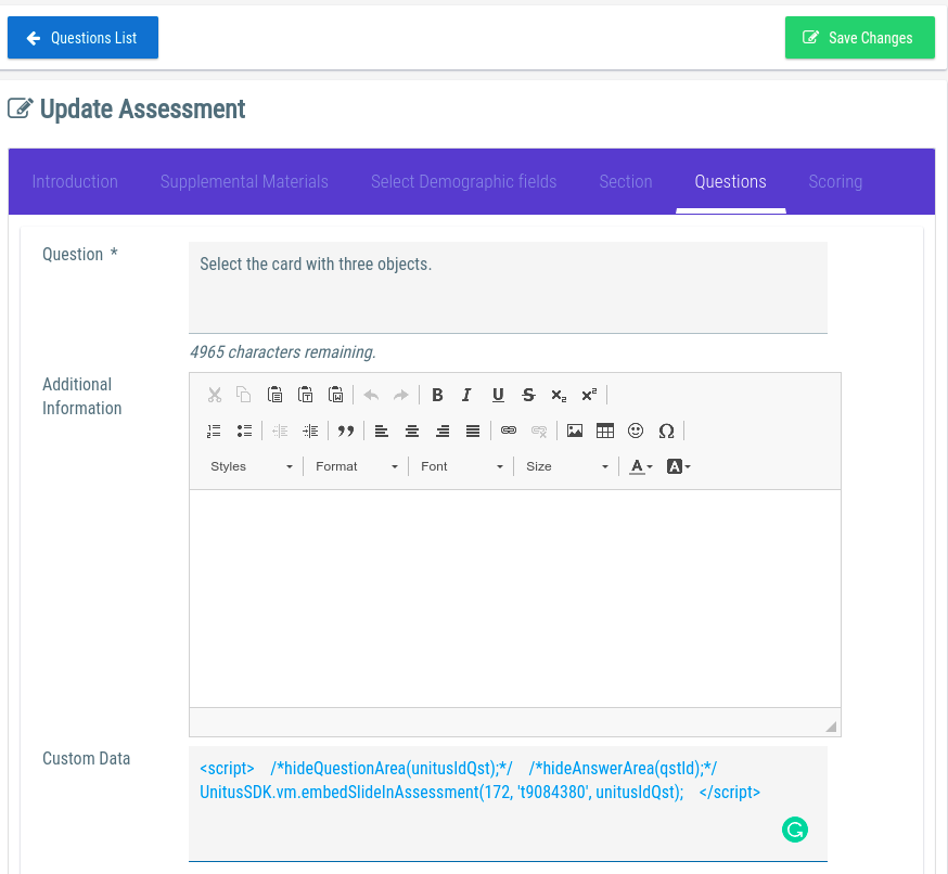
- Create or edit the question where you want to embed the VM Slide. In the “Custom Data” field paste the snippet that you copied from VM:
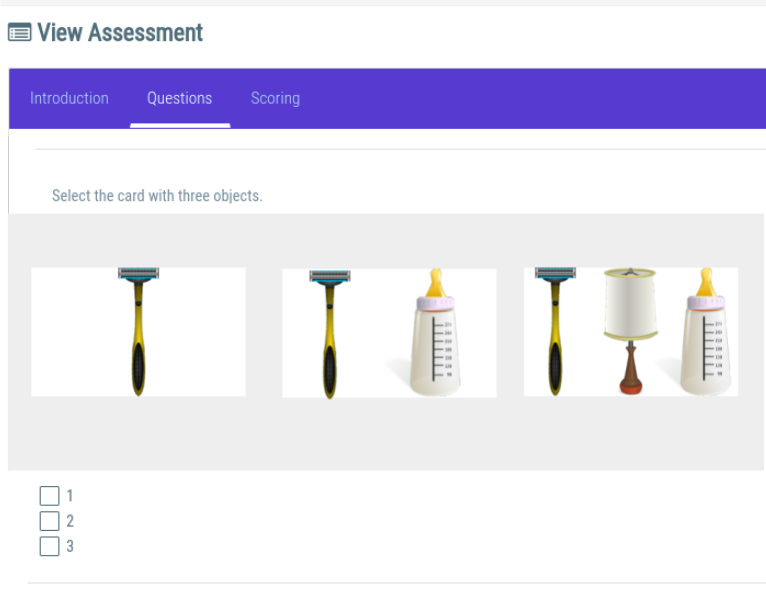
- Now you can Preview the assessment, and see the Slide being loaded right below the question:
Assessment advanced configuration
By editing the snippet of code provided by VM, when you paste the code in the “Custom Code” field, you can hide the question or the answer areas where the slide is embedded.
The Snippet already provides the code for doing both things, only that these instructions are commented out by default (disabled).
This is an example of a snippet of code as it is produced by VM. We had colored in red the disabled instruction for hide the question area, and in green the disabled instruction to hide the answer area:

To enable one or both of them, you need to remove the /* and */ characters that wraps the desired instruction. Let’s suppose we want to hide the Answer Area:

Now, after saving the question and running the preview mode, the answer area is not visible:

Assessment automatic Answers
The feature of hiding the answer area exists because sometimes you may want that the interaction in the Slide automatically reports the selected answer to the Assessment.
To achieve this effect, we need to guarantee that the values of each card matches the answers of the Assessment question.
Continuing with our previous example, we see that the question says “Select the card with three objects” and the answer is a multiple choice with the options “1”, “2”, and “3”. What we want is to associate the values “1”, “2” and “3” to each one of the cards in the slide.
Note: For details about how to assign values to cards in slides, please refer to this section .
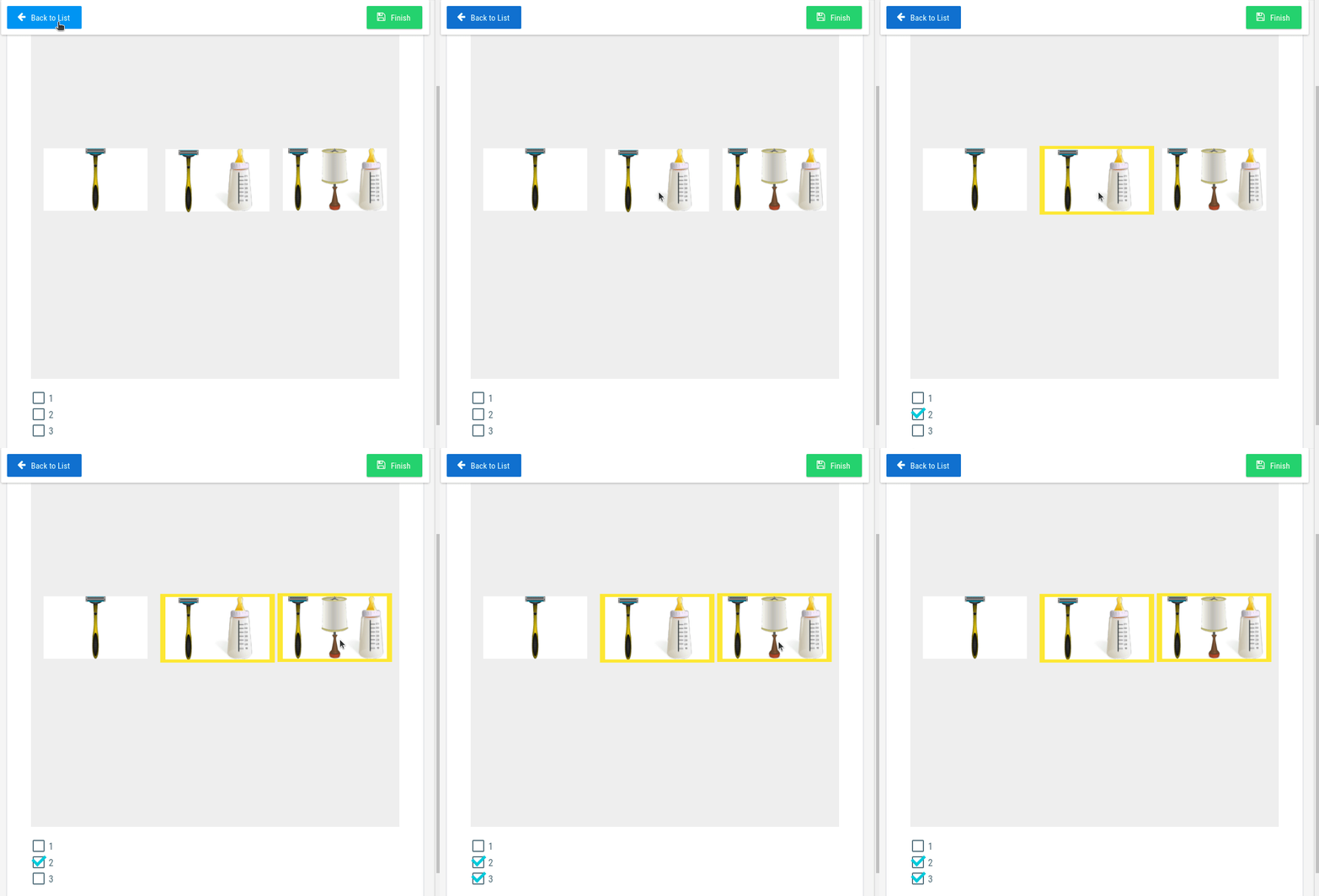
Everytime a selection of a card occurs in VM, the value assigned to the card will be notified to the Assessment Question. if there is an exact match between the value and the answers in the assessment, the answer will be updated :
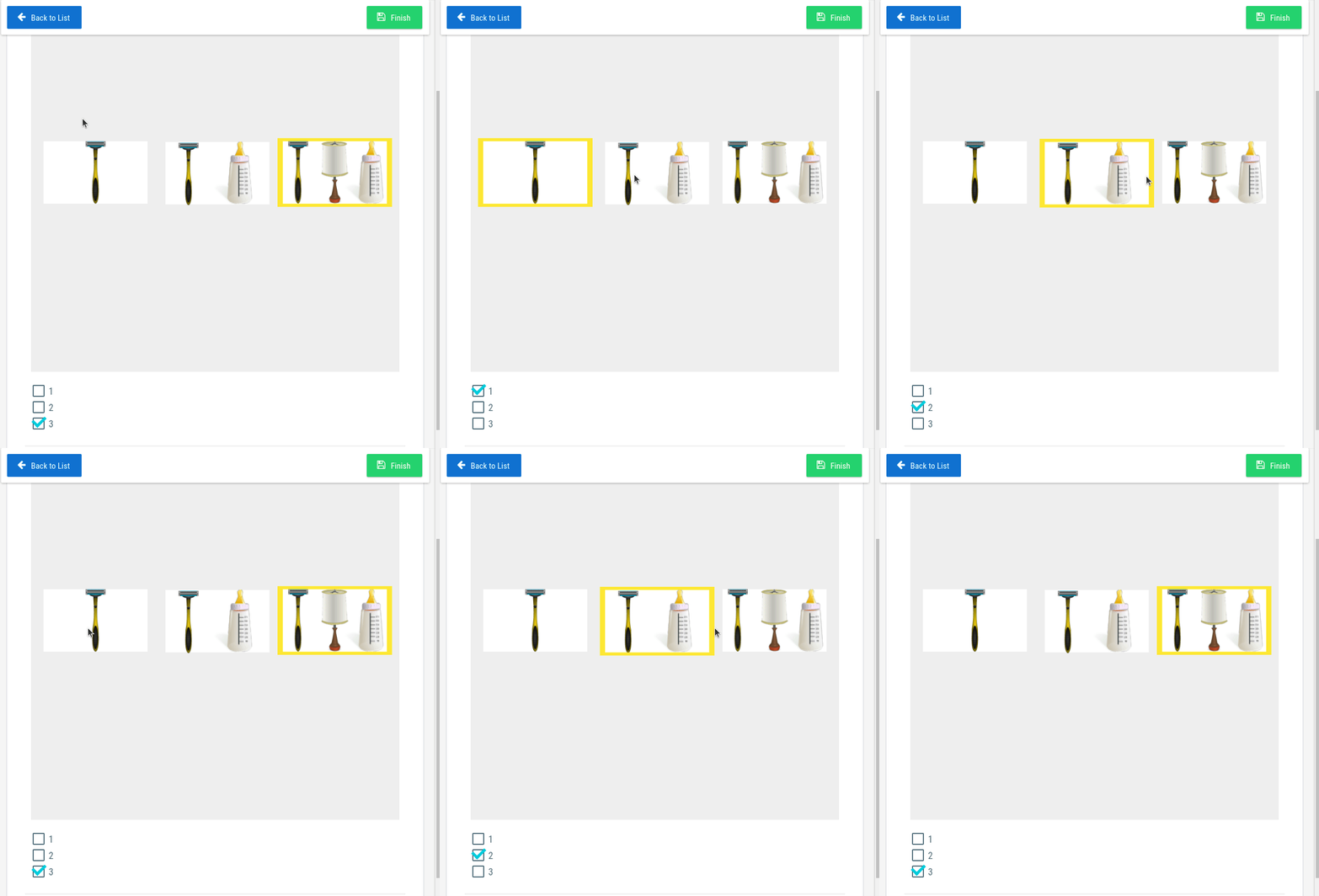
Notice that it also works for multiple selection, you just have to configure the slide with “selection mode: Multiple”:
│ Custom HTML Generator for Assessments
The same “Custom Data” field used to embed a VM Slide into an Assessment Question can be used to write totally customized interactions without using any Pack or Slide.
While writing these interactions from scratch is possible, it demands basic knowledge of Javascript and HTML, and therefore is more suited for developers. If this is your case, please visit the Mundopato’s developers guide for advanced details.
For non-technical users (and for developers that want to play with examples) the VM now includes a tool with some predefined templates where you can fill a few parameters in a form and then copy-paste the generated code into your Custom Data’s Assessment Question.
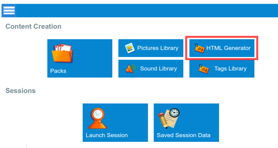
To access the HTML Generator, look for the option in the main screen:
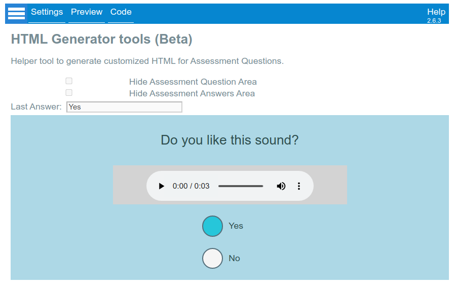
Once you enter the Settings Screen, you will be presented with a list of Layouts. Each Layout will request a different number of parameters, depending on the design. For example, the first layout presents a question, an audio player and Yes/No options:
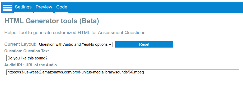
You can try your settings in the “Preview” screen:
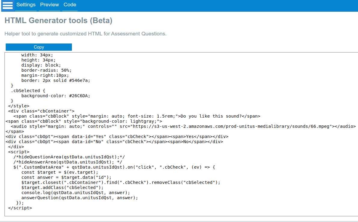
Finally, in the Code Screen you can copy the block of code, and proceed to your Assessment Question to paste it in the Custom Code Field, similar to the way how we paste the code to embed a VM Slide .
│ Using Pictures in the custom HTML code
You can use the pictures stored in the Picture Library in your custom HTML code.
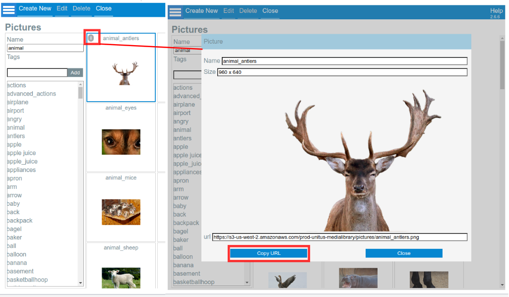
To obtain the URL of a picture, select the “information” icon and use the “Copy URL” button, as follows:
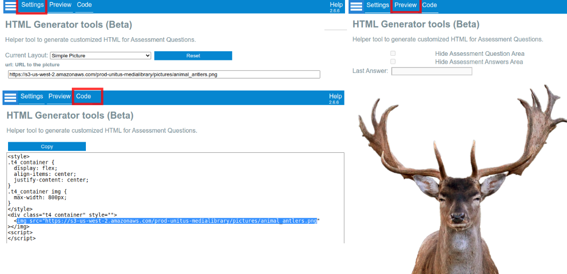
Then you can use this URL in either in the HTML layouts that make use of pictures or directly embed in a element:
│ Audio Library
Similar to the Picture Library, VM offers an Audio Library section whose initial goal is to serve as a store for audio files that you can use with your custom code for Assessments.
Important: the current version (2.6) doesn’t offer yet the ability to use the audios from the Slides. This is a planned feature to be released in the future.
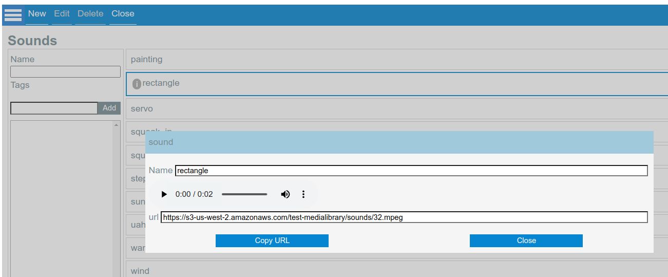
After you upload your Sounds, you can click on the information icon to listen to the audio and also there is a button “Copy URL” that facilitates to use the Audio with the HTML Generator templates or with custom code written by a developer .
│ What is new
Version 2.6 (Jun 2022)
- New Feature! HTML Generator: A helper tool to produce customizable interactions to use in Assessment Questions. Learn More
- New Feature! Audio Library: Can use VM to store Audio Files and use from Assessment Questions. Learn More
- Picture Preview: Can copy the URL of your pictures to use them from Assessments Questions . Learn More
Version 2.5 (March 2022)
- New Feature! Slide Editor: Can override values for Cards and Random Cards. Learn more
- New Feature! Integration with Assessments: can embed a Slide into an assessment’s question Learn More
Version 2.4 (October 2021)
- Slide Editor: Can define what side of a Card or Random Card should be presented when the slide is loaded.
- Slide Editor: Random Cards display the name of the Deck.
- New Feature! Import Wheels, Cards and Slides from other Packs.
- New Feature! Clone multiple Cards in the same Pack.
Version 2.3 (July 2021)
- New Feature! Interactive Wheels: The first of our new “Widgets”: an interactive, multi-level wheel that can be used for Automatic Data Capture. Learn more
- New Feature! Color Picker : Now renamed to Color Editor, allows you to customize a palette of colors that are persisted between sessions.
Version 2.2 (April 2021)
- Packs: Pack’s versioning
- Authors can create new draft versions of a Pack on top of existing Published versions. They can also revert to previous versions, down to the latest Published version. Learn more .
- Card Editor: Support for multiline labels
- Labels in a card can include multiple lines.
- Card Editor: Ability to add content to the back of a Card
- In the editor, cards can be flipped to add pictures and labels to any side of it. Learn more .
- Slide Editor: Autoflip
- During the sessions, a card with Auto Flip enabled will flip when the client touches it. This is independent of the selectable flag. Learn more .
- Session Execution: Autozoom
- In the session screens the zoom bar presents an “auto zoom” checkbox that will help to focus the content of the slide to the available screen space.
- Session Execution: Enhancements for IPAD-Safari
- Various enhancements had been added specifically for IPAD-Safari to enhance the user experience.
Version 2.0 (December 2020)
- Manual Data Capture
- Authors can create custom variables like text areas, counters, timers and multiple choice that can be used to record different values during a session. A detailed report is generated and stored for future reference. Learn more .
- Label Macros
- Similar to the macros in a spreadsheet, you can type “=SUM()” or “=COUNT()” in a label to dynamically react to the selected cards in the screen. This feature works in conjunction with the new “value” field for the cards. Learn more .
- Multiple Selection
- In the Slide Editor you can now select between “Single” and “Multiple” selection modes, allowing the client to select multiple cards at once. Use in combination with Label Macros to add dynamic values to your slides. Learn more .
- Cards: new Value field
- In the Card Editor, you can use a new “value” field to store custom values that will be used for the addition of counting with Label Macros.
Version 1.0 (April 2020)
- Initial Launching